
10 tips on using components in Figma

Using components in Figma will take your design workflow to the next level. In this article, I’m going to explain what components are, how they work, and give you a set of best practices you can use to incorporate them into your design workflow. Let’s start.
👉 All examples in this article were created with UI Prep’s Design System UI Kit, the highest-quality and most flexible design system UI kit for Figma.
What are components?
Components are UI elements that can be reused across our design projects. A component can be a button, an icon or even something complex like a data table. The advantage of using components in designs is any time you make a change to a component it updates all the component’s instances automatically saving you time on otherwise repetitive and tedious work. This speeds up your design workflow, makes your design system more consistent, and makes it much easier to maintain and collaborate with other designers.
Understanding component behavior
Let’s review one important concept before we jump into components best practices and tips: master components and component instances.
- The master component is created when you first turn a UI element into a component and defines the properties of the component.
- The instance is a copy of the master component you can reuse across designs.
Instances are linked to master components. When you make changes to a master component it applies the changes to the instance. In the layers panel you can identify which elements are master components and which are instances by the icon. Master components use a 4 diamond icon and instances use a single diamond icon.

The important thing to remember is an instance inherits all changes made to the master component excluding instance overrides. I’ll go into more detail on instance overrides later on.
Organizing and structuring components
Now that we understand how components work and why they’re important to use, let’s walk through best practices for organizing and structuring components.
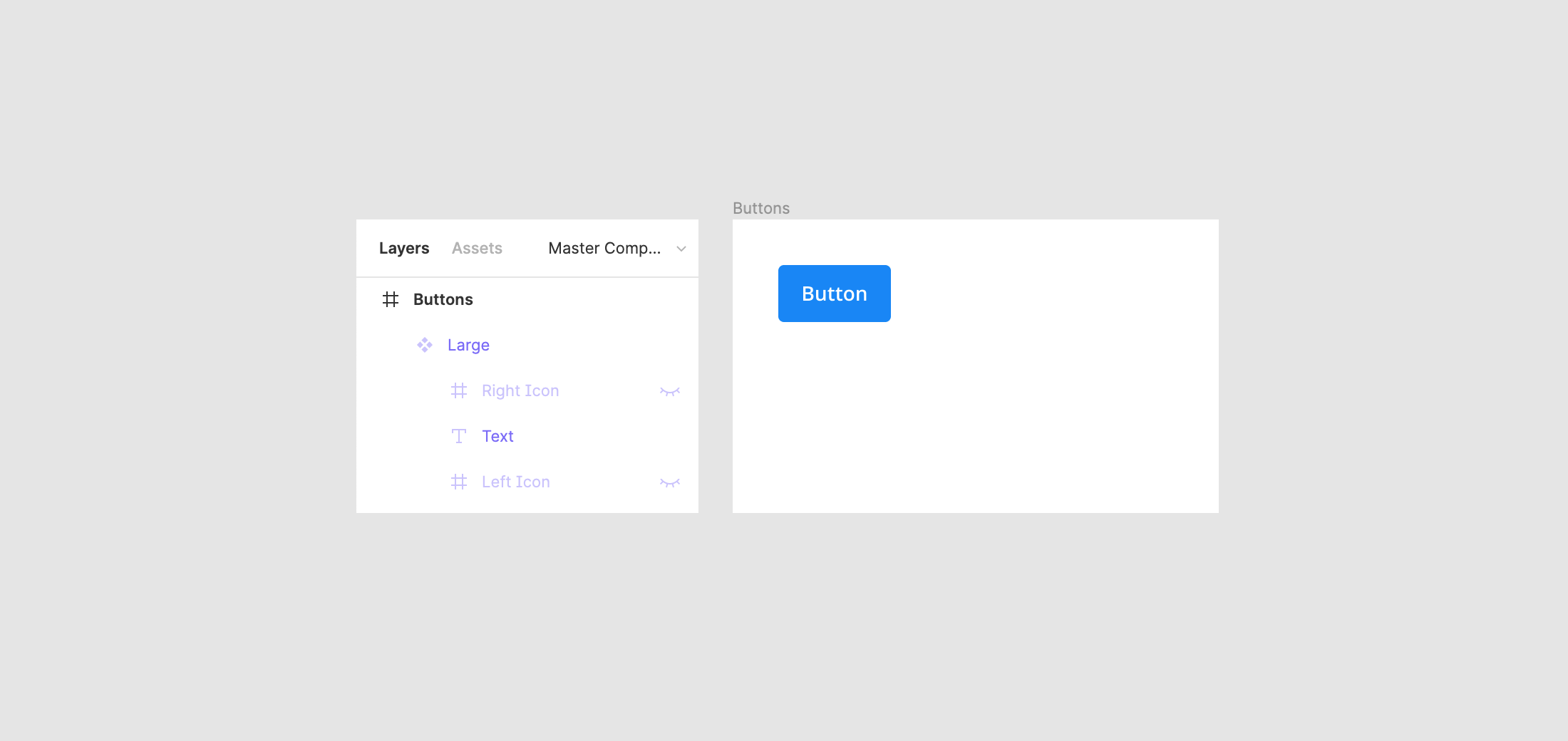
1) Use clear naming conventions and frames to organize components
A good organization and naming system makes it easy to find components in the assets panel, swap related components, and increase the usability and adoption of the system by other team members. Two of the most useful conventions to use when thinking about how to organize your components are forward slash naming and frame containers. Using both of these conventions gives you a robust and flexible organization framework. Here’s how they work.
Forward slash naming
Forward slash naming is a component naming convention that uses forward slashes to create an organized hierarchy for your components. For example, if you had input fields with supported states, you could use the forward “/” naming convention like this:
- Input/Field/Text — Active
- Input/Field/Text — Default
- Input/Field/Text — Disabled
- Input/Field/Text — Feedback
- Input/Field/Text — Filled
- Input/Field/Text — View Only
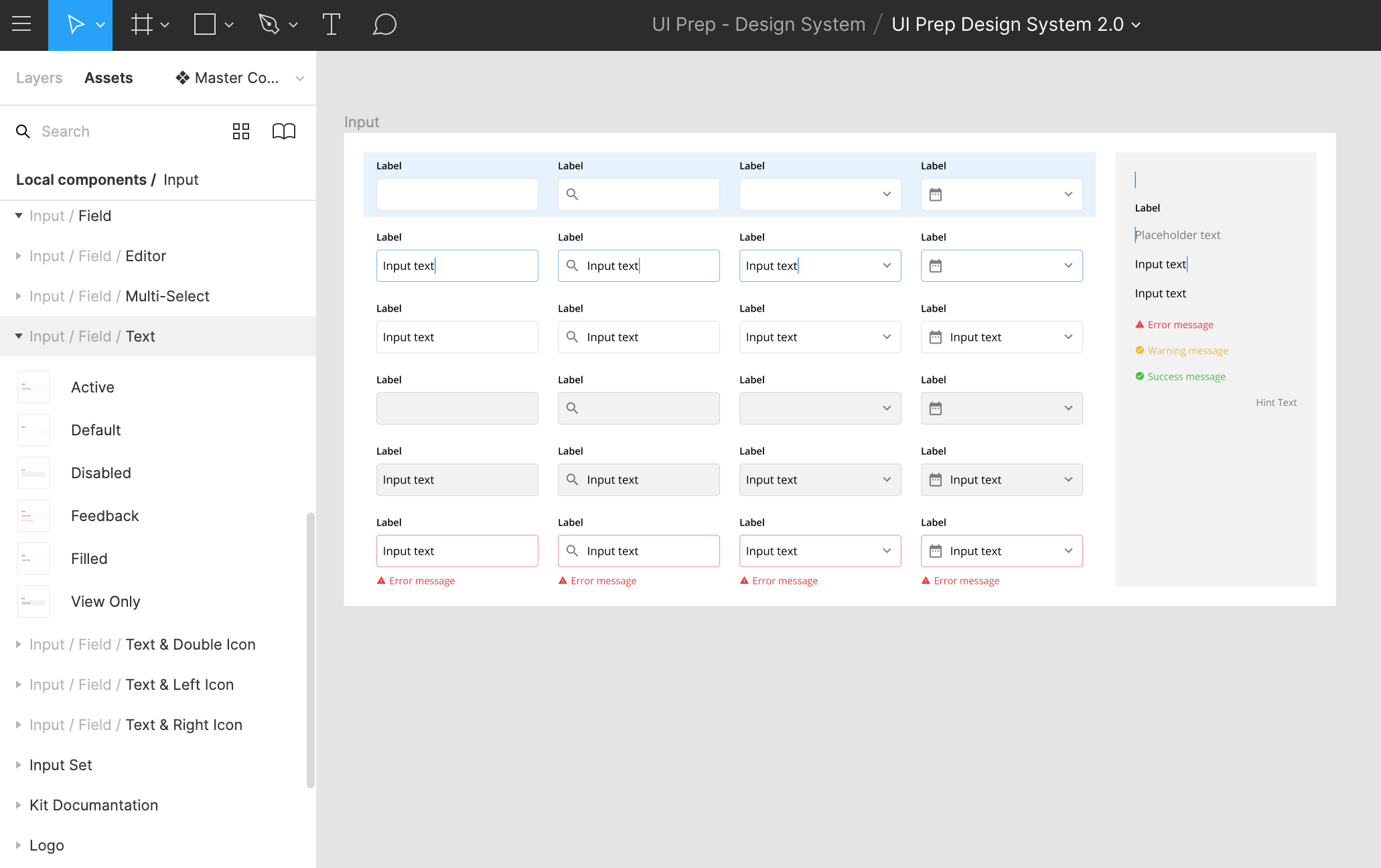
For access to a wider subcategory of “related components” in the instance menu you can combine the last two labels, ie. input type (text) and input status (default), by separating them with a dash instead of a slash. This is particularly useful for larger categories with many subcategories. You can see this in use in the assets panel above.
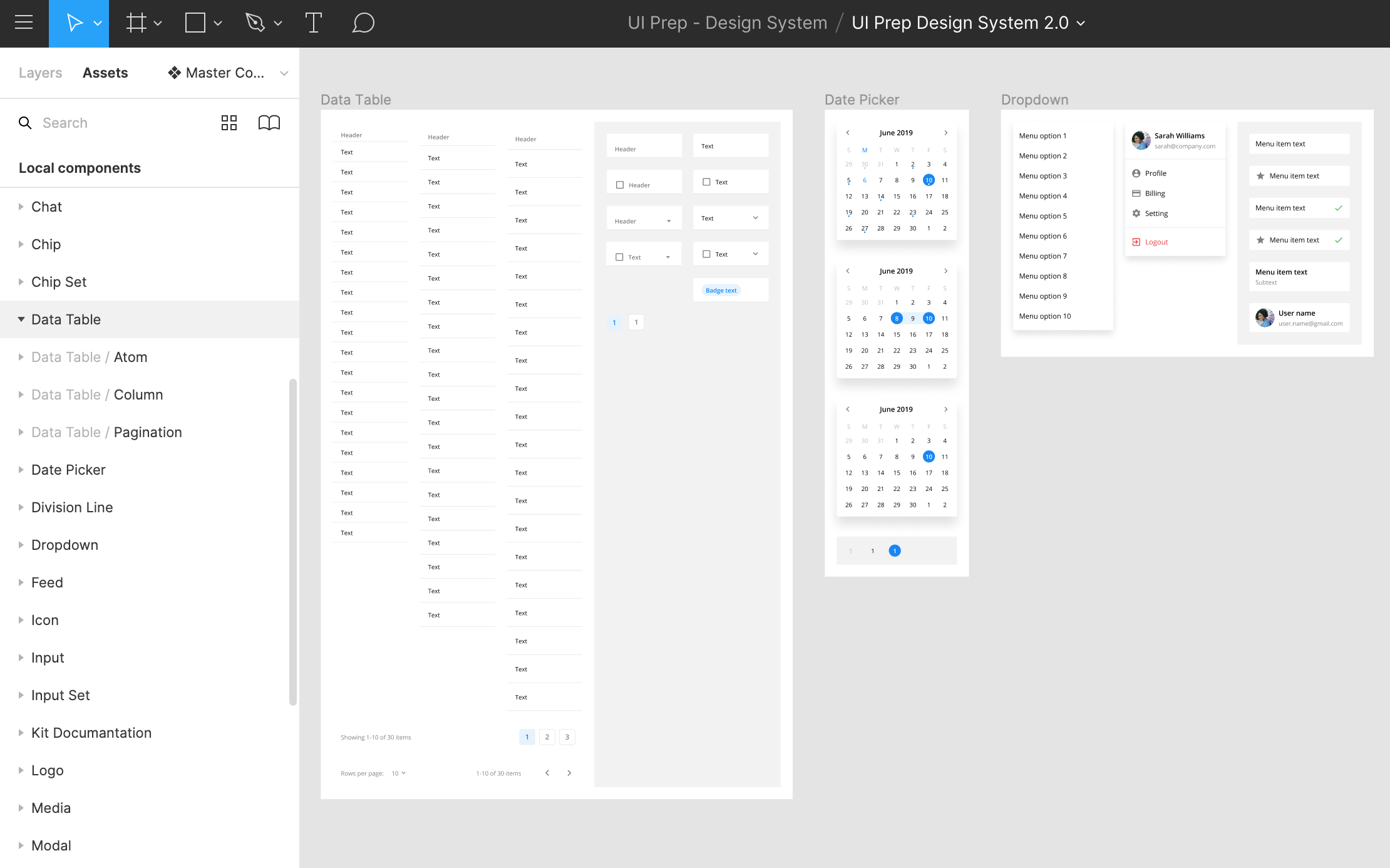
Frame containers
Group and organize your components into collections using frames. This makes your component names shorter and makes it easier to visualize component relationships.
When you combine both conventions you get the best of organizing your assets panel and instance menu with the self-documenting nature of using containers to organize your components.
2) Choose easy to understand method for structuring component states and variations
As your components grow you’ll need to have a system in place to manage and structure component states and variations. If you don’t have a way to organize different states and variations of a component your system will start to become unruly and painful to use.
There are a few methods to help you manage these dependencies. Each has pros and cons and depending on how your team works one method may be more applicable to you than the other. I’ll breakdown each method and share the tradeoffs of using each method.
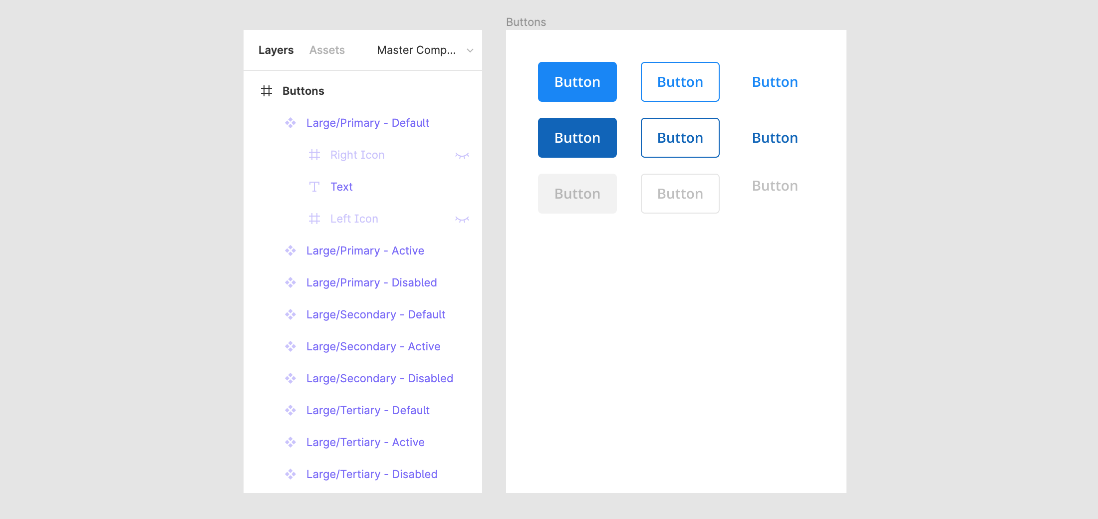
a) Separate master components for each variation
This method is simple and straight-forward. You use a separate master components for each variation or state you need to support. It’s self-documenting nature makes it easy to understand and use.
Pros:
- Easiest way to maintain consistency.
- Fastest way to change the state or variation of an instance.
- Ability to change multiple instances at the same time.
- Ability to save text overrides when updating the state or variation.
Cons:
- More components in assets panel and instance menu.
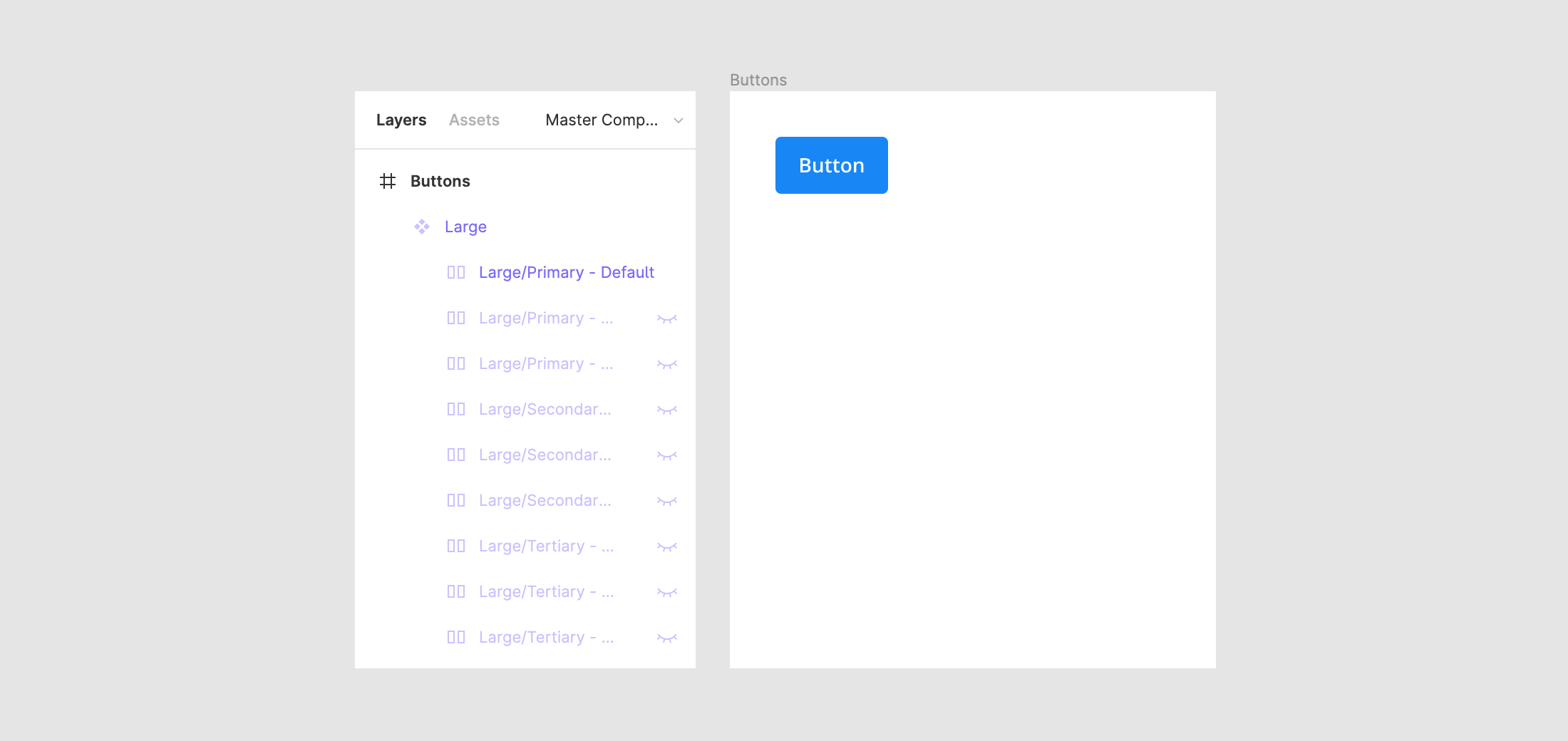
b) Nest all variations into a single master component
This method uses a single master component with all variations nested inside it. While this seems like a great alternative to the shortcomings of (a) above, it does present its own unique challenges.
Pros:
- Fewer components in assets panel and instance menu.
Cons:
- Difficult to discover variations.
- Not possible to change multiple instances at the same time.
- Not possible to preserve text overrides when updating the state or variation.
c) Create overrides for all variations using single master component
This method uses a single master component and creates all variations using instance overrides.
Pros:
- Fewer components in assets panel and instance menu.
- Faster initial setup.
Cons
- More difficult to maintain consistency.
- Takes more time to update instance if multiple overrides are required.
Keep in mind it’s not an either/or decision. You can use a hybrid approach to support different component states and variations. That said, I recommend using A (separate components for each state or variation) as your primary method. Use B and C if the component lends itself to nested variations or simple instance overrides like the profile avatar example above.
3) Use nested atomic components as global building blocks
A well structured component system is easy to maintain and reason about. One of the best ways to make components more maintainable is to use atomic components. The concept is inspired by Brad Frost’s atomic design methodology, where an atom represents the smallest incremental property of a UI element. You can think of these atomic components as building blocks. For example, the shape of a button or an icon.
The best approach for this is to create a set of reusable atomic components with the sole intention of nesting atomic instances inside other related components. Take textfields as an example. We can turn a textfield’s shape into an atomic component and nest it’s instances inside every other textfield component we create. This means all textfields use the exact same building block (i.e., the atomic instance) and if the shape of textfields were to change, all we’d need to do is update the atomic component and all other textfield components would update too. Using an atomic approach allows you to seamlessly apply globalized changes to components which makes it much easier to maintain your system.
Working with components
You have a clear system for structuring, organizing and maintaining your components. Now let’s review some best practices on creating components to improve your team’s workflow and productivity.
4) Set up constraints and layout grids for predictable behavior
Once you have the core design set for a component, take some time to set the constraints and layout grid (as needed). Setting these properties from the beginning makes it easier for other team members to understand the intended responsive behavior of a component as it’s resized. This will save you time as you work to support responsive behaviors across your product.
One note on layout grids. Using a layout grid in a component is only necessary if your component is more complex and requires granular control over distributing its elements as its resized.
5) Preserve text overrides on instance swaps
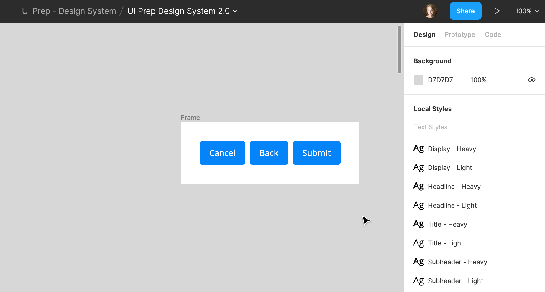
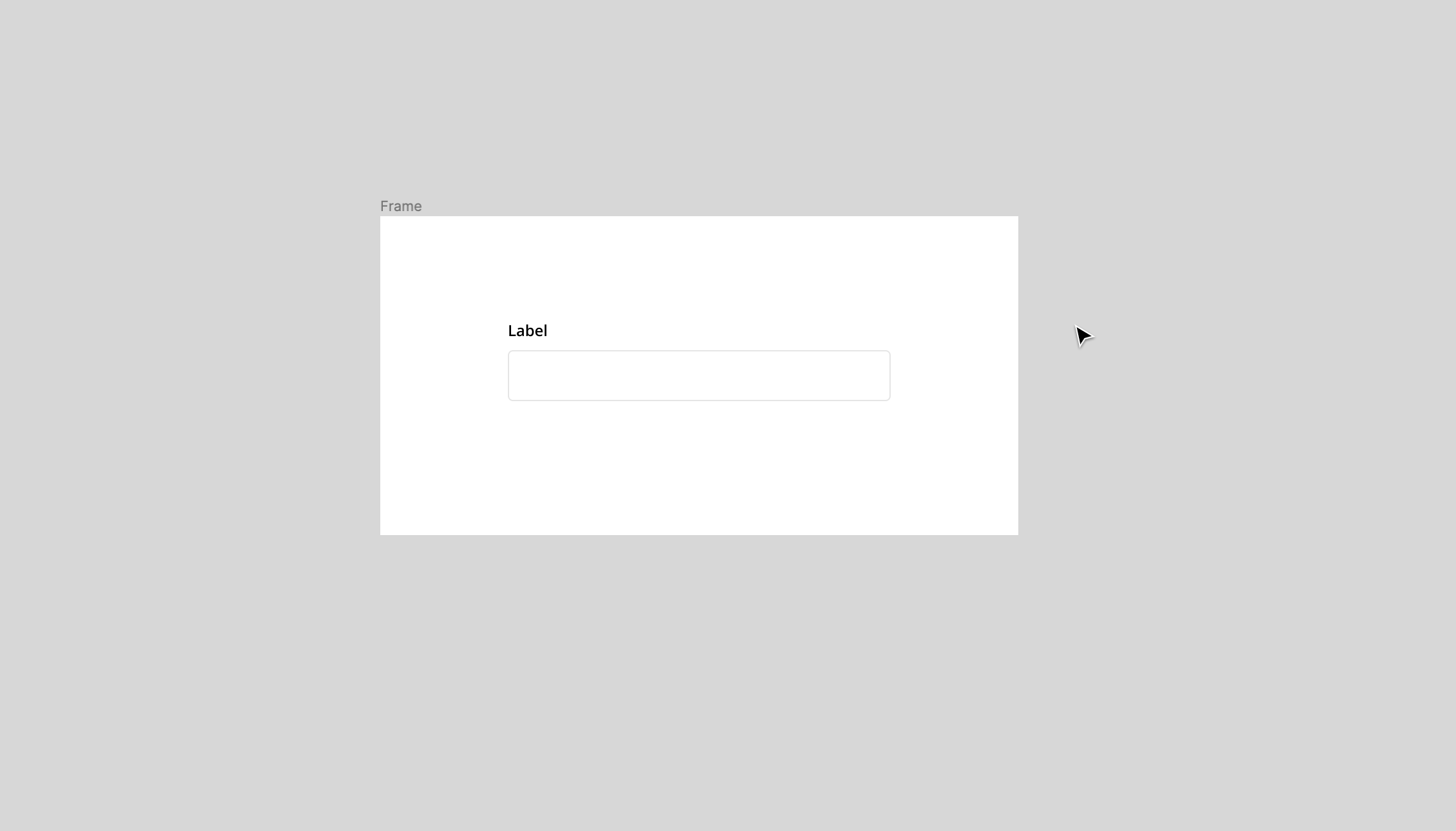
One of the great things about Figma is you can preserve text overrides when you need to swap instances. To do this make sure the text layer within each component share the same name (e.g., “Button Text”). If you don’t do this your text overrides will not persist and you’ll need to manually update the text after you swap instances.
6) Use Clip content to reduce repetitive instances
Since components act like frames for all intents and purposes, we can utilize the clip content feature to toggle whether or not elements that extend beyond the bounds of the component are cropped or hidden. While you won’t use clip content for every component, it’s very useful for components with repeated elements like data tables and lists. For example, if you have a list component with a varying number of rows depending on the scenario. Using clip content allows you to resize the list and show more or less list rows using only one master component. Remember, you need to have proper constraints setup for this to work. If you don’t, expanding or reducing the bounds of the component will break it.
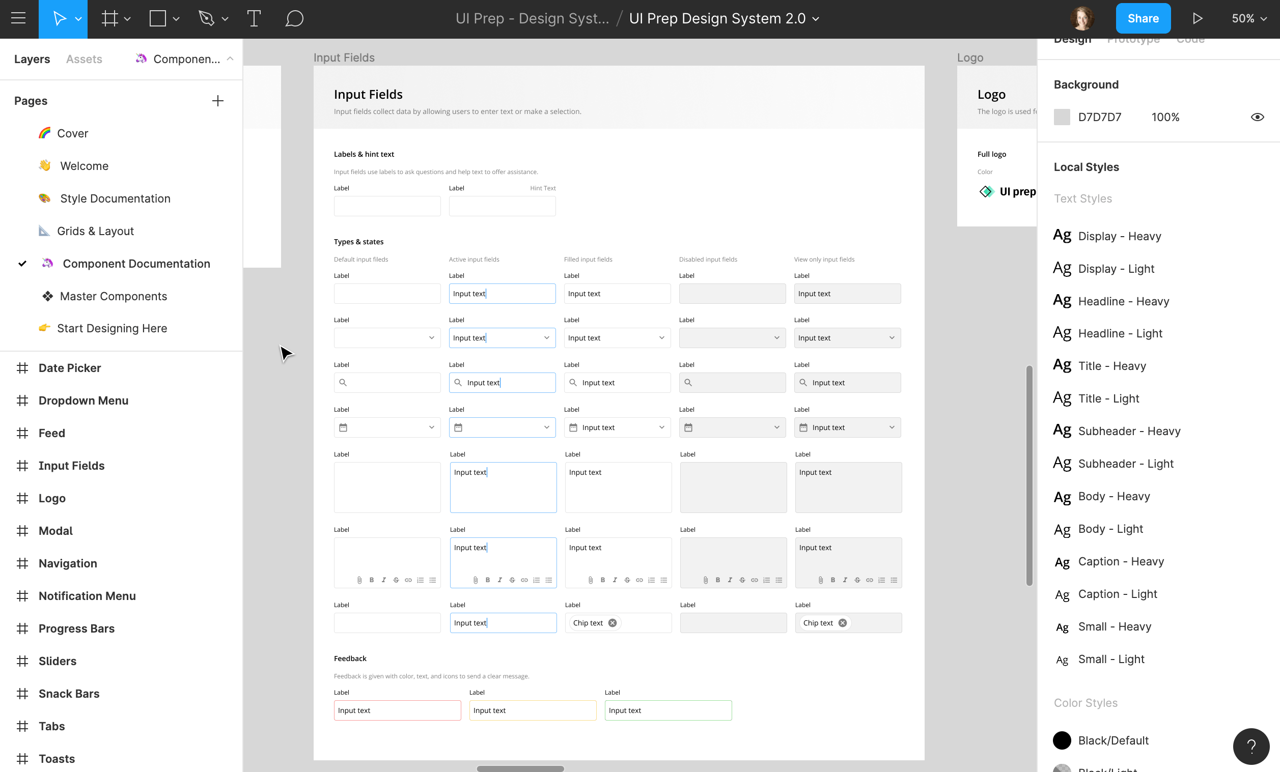
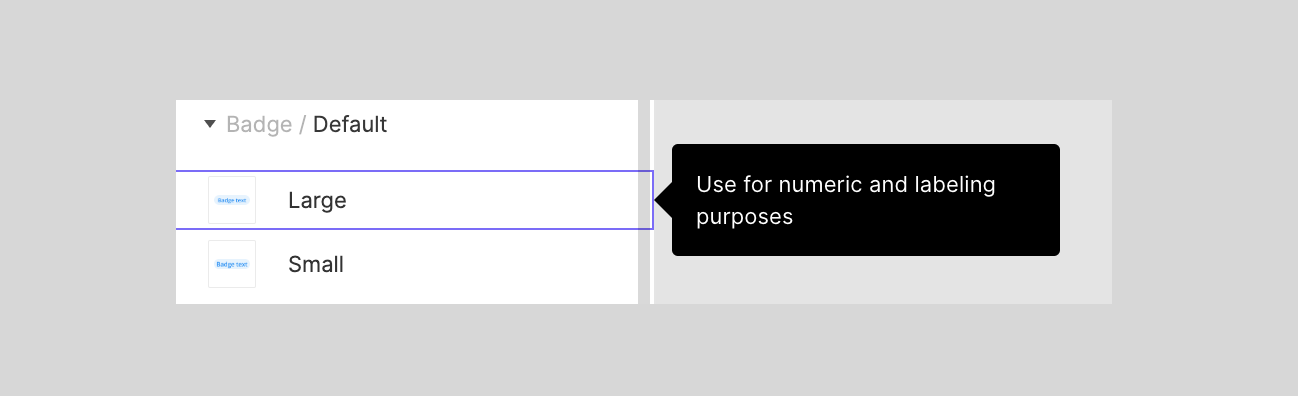
7) Add component documentation
Master components come with a description field where you can add information about the component’s usage, behavior, and other relevant context. A component’s description appears when you hover over it in the assets panel.
The goal of documenting components is to provide relevant, necessary information to give team members enough context to understand how the component works and fits into the product. Don’t go overboard and document every single master component. The most common reasons to add documentation to a component are to provide clarity on a nested component or to provide accompanying context on a particular component’s state/variation. It’s much better to create a self-documenting system than to have to maintain hundreds of component descriptions.
8) Use instance overrides to adapt components across different user contexts
There will be times when it’s necessary to make updates to an instance’s inherited properties. You may need to make tweaks and adapt instances depending on use-cases and context. Remember, an instance inherits all default properties from its master component. This is where overrides come in. An override allows you to “override” properties of an instance without breaking the link with its master component.
Overrides give you the right balance between flexibility and consistency. They give you the flexibility to create distinct, localized instances to fit different contexts in and provide consistency by continuing to inherit updates from the master component.
Here’s all the properties you can override:
- Text: Font, Weight, Size, Line Height, Letter Spacing, Paragraph Spacing, Indentation and Text Content.
- Color: Fill, Stroke, Background Color, Opacity.
- Effects: Drop Shadow, Inner Shadow, Blur.
- Advanced: Size of entire component, Swap nested instances, toggle on/off layers
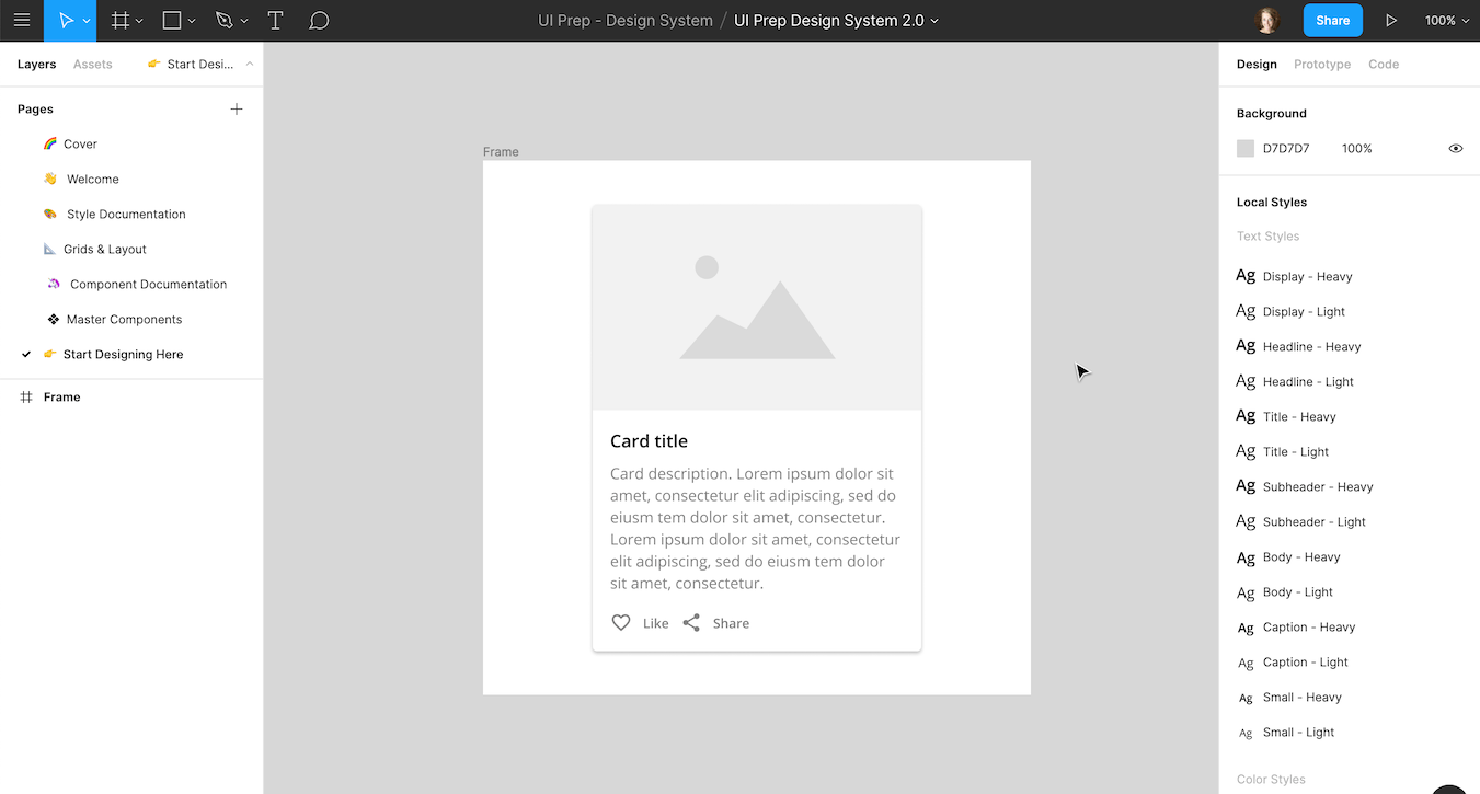
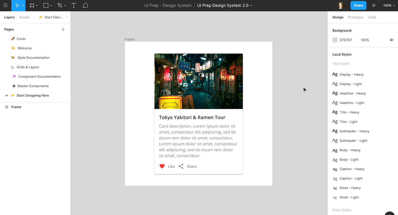
The following two examples show how to set overrides and how these overrides persist even when the master component updates.
If you make overrides to an instance but later want to revert back to the originally inherited properties, you can reset an overridden instance. You have the option to reset all overrides or reset a specific override.

9) Quickly swap related components
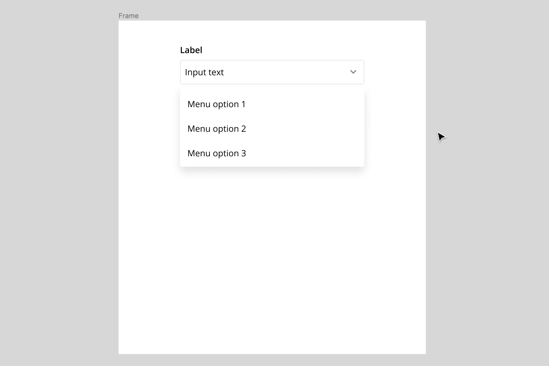
As your components grow in number, searching the assets panel and instance menu to find the right component can be tedious. Lucky for us, Figma has a shortcut. The quick way to swap related components is to use the context menu. Simply right click on the instance you want to switch and go to the Swap instance item. A submenu will appear with a list of related components.
10) Detach an instance to remove relationship from master component
If you want to completely remove the relationship between an instance and its master component, you can detach it. When you do this the instance becomes an independent frame and will no longer inherit changes from the original master component. This is helpful when you want to create a new component altogether.
Work smarter
Building a high-quality component system is not easy. It takes time, patience, and a willingness to explore ways to work better and more effective as a designer. That's why we created UI Prep, a designs system UI kit with all the necessary layouts, icons, styles, components, naming conventions, and documentation to start a new website or product. We use it as the starting point for every new project to save ourselves days of work, and so can you!
Download the UI Prep designs system to learn best practices and save valuable time on your next website or product!
🧠 Learn More about UI Prep Design System

Want more design insights like this?
See our full catalog of articles covering Figma tips and Design System best practices.