
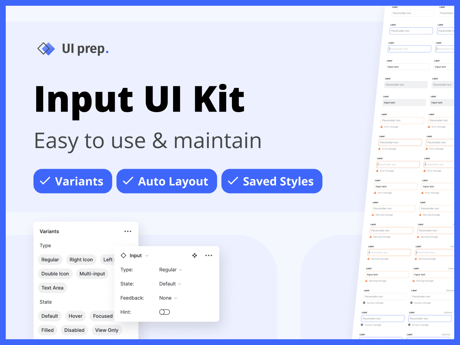
5 Tips to Design Maintainable Inputs in Figma

Designing and maintaining input components is crucial for any design system and can be a huge undertaking when starting from scratch. They are one of the most used components, and one of the most complex to build. This is because there are so many different types and states to account for, not to mention multiple resizing behaviors within one component. Optimizing them for easy use and maintainability will go a long way to ensure they are used correctly and can grow & evolve along with your designs.
Use these 5 tips to build your inputs right from the start and save yourself countless hours and headaches in the future.
👀 Keep an eye out for the (free) Figma input UI kit at the bottom!
1) Use Variants
Use variants to make designing with input components faster, easier, and more consistent. With variants, you can simply select *the* "Input" component, then adjust the property values based on your design needs. Rather than sifting through multiple versions in the assets panel or making ad hoc overrides from memory.
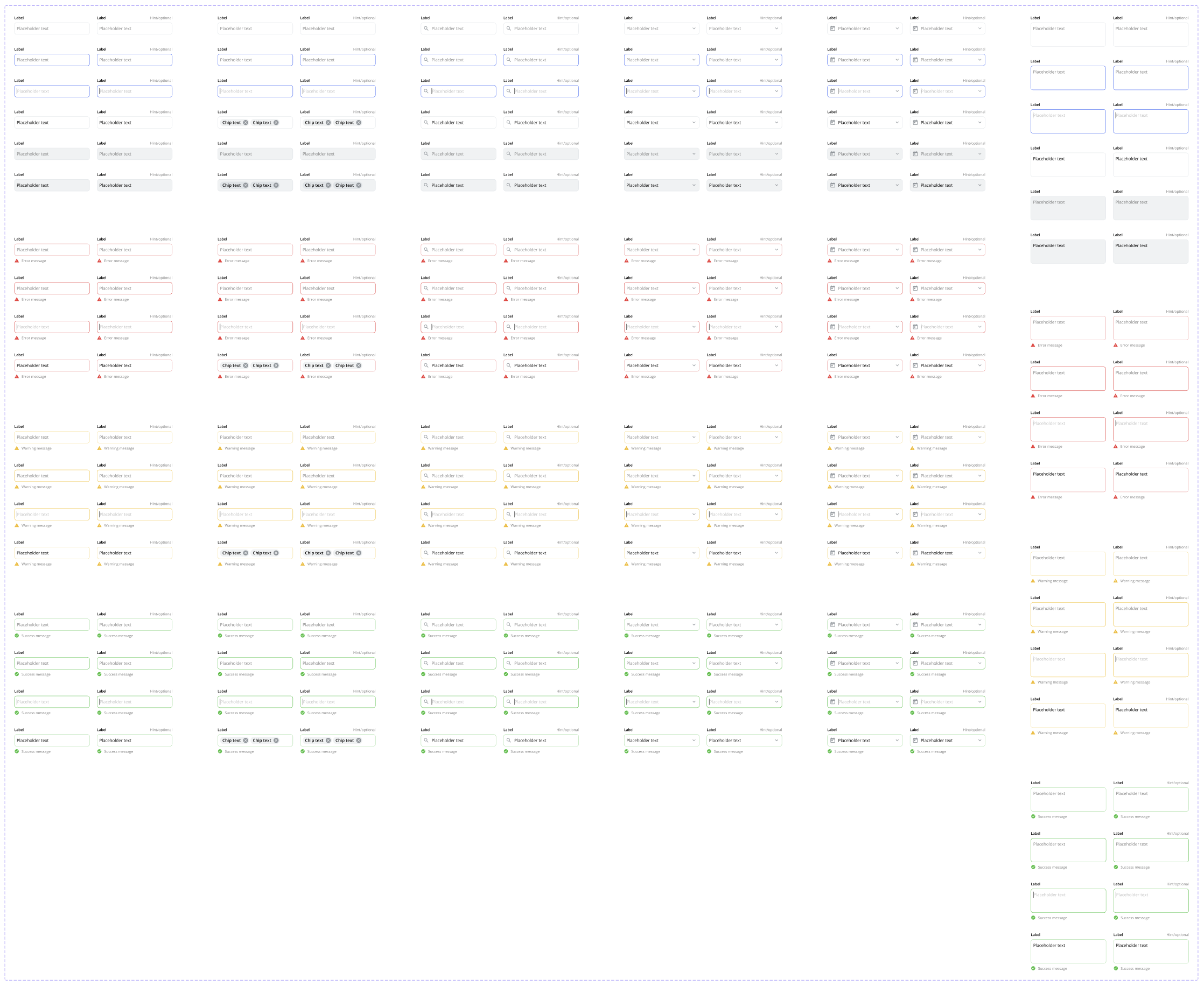
Inputs are the perfect use case for variants because there are so many different versions of the same component (e.g. types, states, feedback messages, etc...). By creating them in advance, you'll enable your design system to scale with your product, maintaining perfect consistency.
To create input variants, design every possible version of your input, turn them into components, then combine all of them as variants. You can learn more about this process in Figma Variants 101.
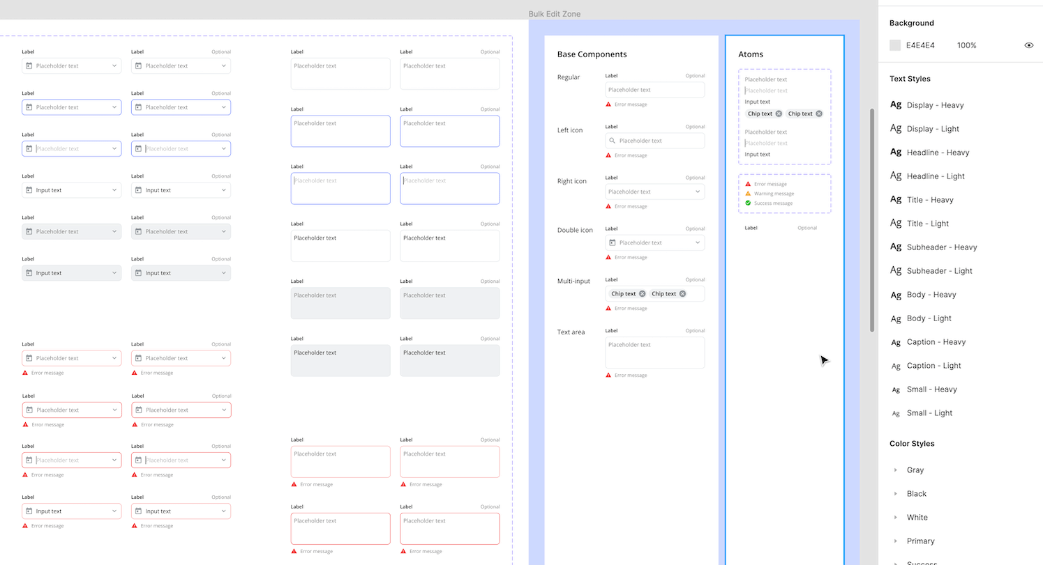
2) Use Base Components
Creating a brand new component for every possible version of your input (200+) takes time and is difficult to maintain. Instead, create a "Base Component" for each input type (e.g. right icon, left icon, double icon, text area, ect.) and nest an instance of that base component into each version. The nested base component can then have overrides applied to create a unique state (e.g. focused)
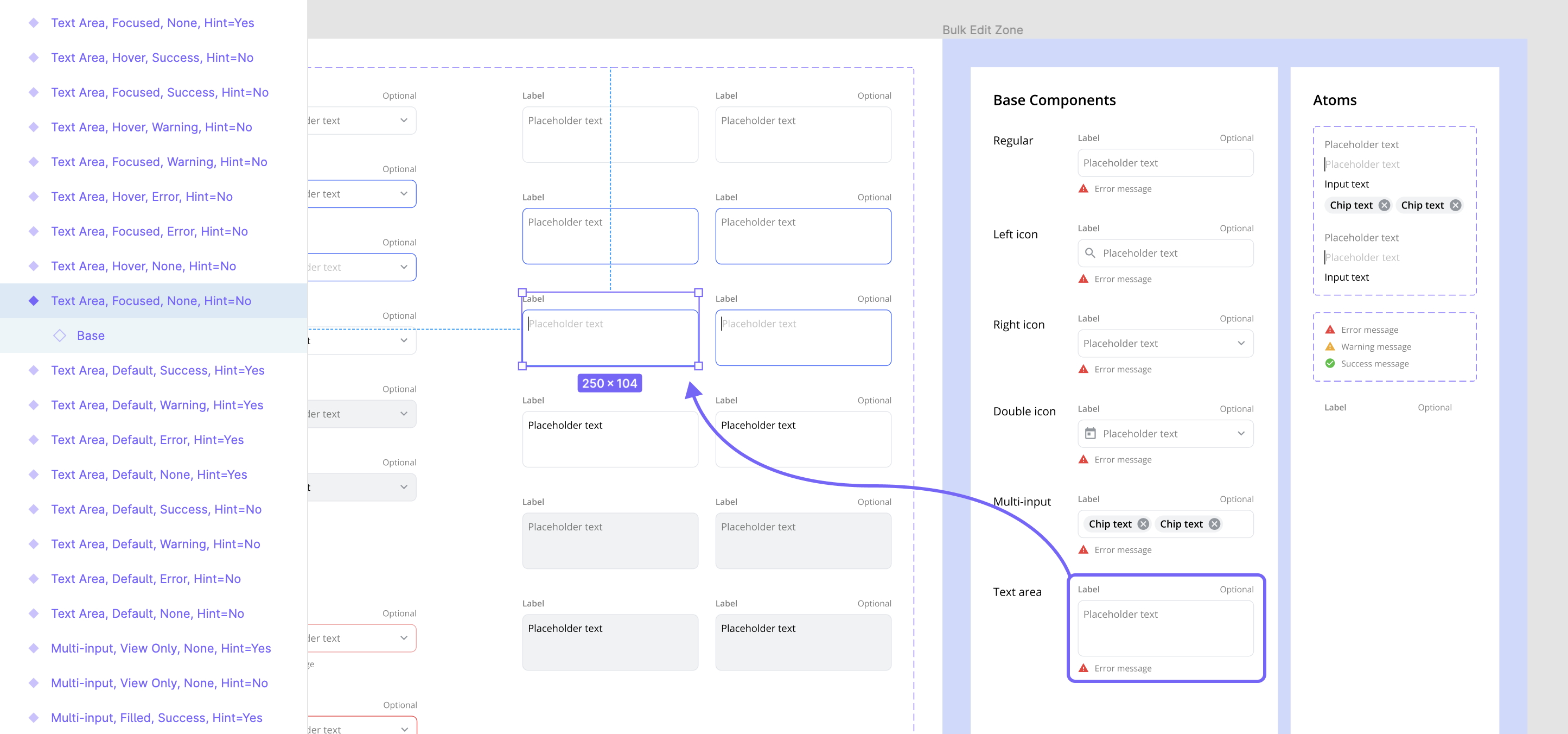
This method makes bulk customizations, or updates, quick and easy. Simply edit the base component(s) and watch all the variants follow suit. For example, to update the spacing on all 36 "Text Area" inputs, just edit the 1 "Text Area" base component.
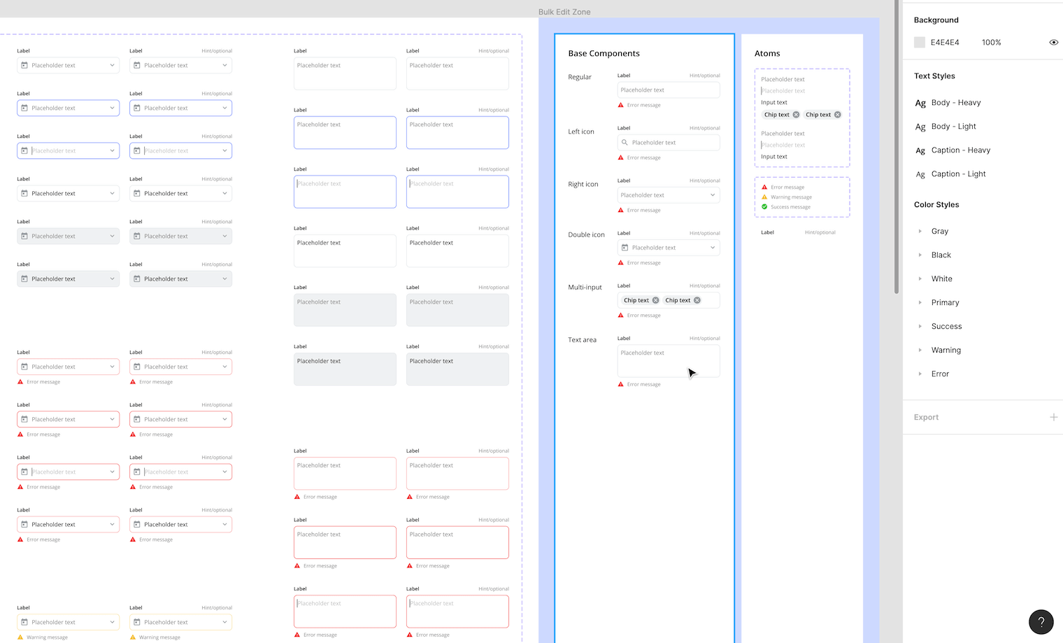
3) Use Atoms
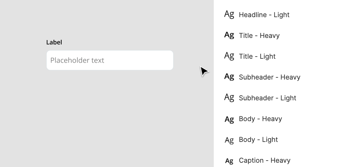
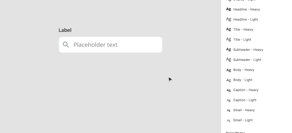
Atoms are small master components whose instances are used as building blocks in other, more complex components. Inputs can use atoms for things like the label, placeholder text, input text, feedback messages ect.. Once your inputs have been built with atomic elements, making bulk edits is very easy. All you need to do is edit the atom's master component and all of the instances will update to match. For example, to update the label on all 216 inputs, just edit the 1 "Label" atom.
4) Use Auto Layout
Use auto layout to give your inputs multiple resizing behaviors for different amounts of content and container sizes. Below are three ways auto layout can make designing with inputs easier.
A. Dynamic width
Determine how the input contents will behave when the width changes to fit different container sizes. The width for each child (nested layer) should be set to "fill container" so they expand and contract with the input parent frame.
B. Dynamic height
Make the input height dynamic to fit different amounts of content. The input parent frame height should be set to "hug contents" so it can expand and contract for new lines of text or feedback messages. "Text Areas" should set their input field height to "hug contents" as well to allow for multiple lines of text.
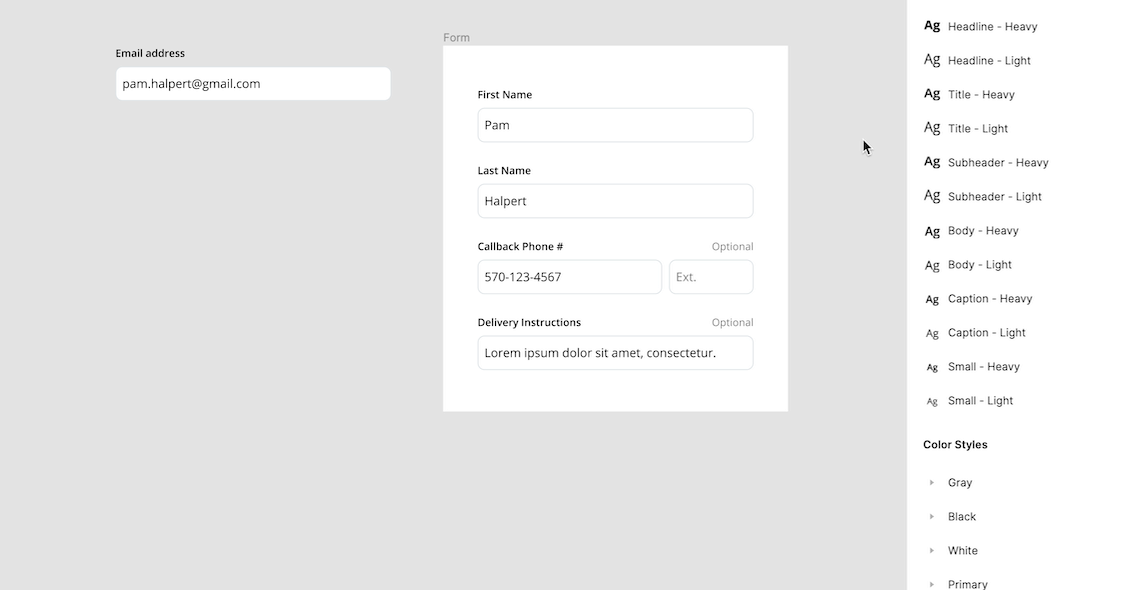
C. Dynamic forms
Apply auto layout to forms to make them dynamic and perfectly fit any number of inputs and their changing sizes. The form frame's height should be set to "hug contents" and the input's widths should be set to "fill container".
5) Override instances while designing
Overrides allow you to customize instances depending on the context of your designs while remaining attached to the master component. For example, you can apply overrides to an input by changing the copy and swapping out the icons. These overrides will only affect that instance and will persevere when the variant property values are updated.
Note: Style overrides (e.g. input color, font-weight, ect.) will never need to be made while designing as they were already made when creating the variants.
Skip the setup
As you've seen, setting up maintainable input components is very important but takes a lot of work. That's why we made a (free) Figma Input UI kit! The kit includes the full set of UI Prep inputs using all the tips mentioned above. Use it to learn best practices or get a jumpstart on your next project.
👉 Get the (free) Figma Input UI kit
Want more design insights like this?
See our full catalog of articles covering Figma tips and Design System best practices.