
Advanced Figma Variants
After optimizing our design system UI kit to include Figma's new variants feature, we wanted to share everything we learned along the way to help fellow designers improve their own systems! In this article, I'll explain some advanced methods that will make building and maintaining complex components much easier.
If you're unfamiliar with variants, checkout our previous article "Figma Variants 101". There, you'll learn why variants are valuable and how to get started using them.
👀 Keep an eye out for our design system and some freebies at the end of the article.
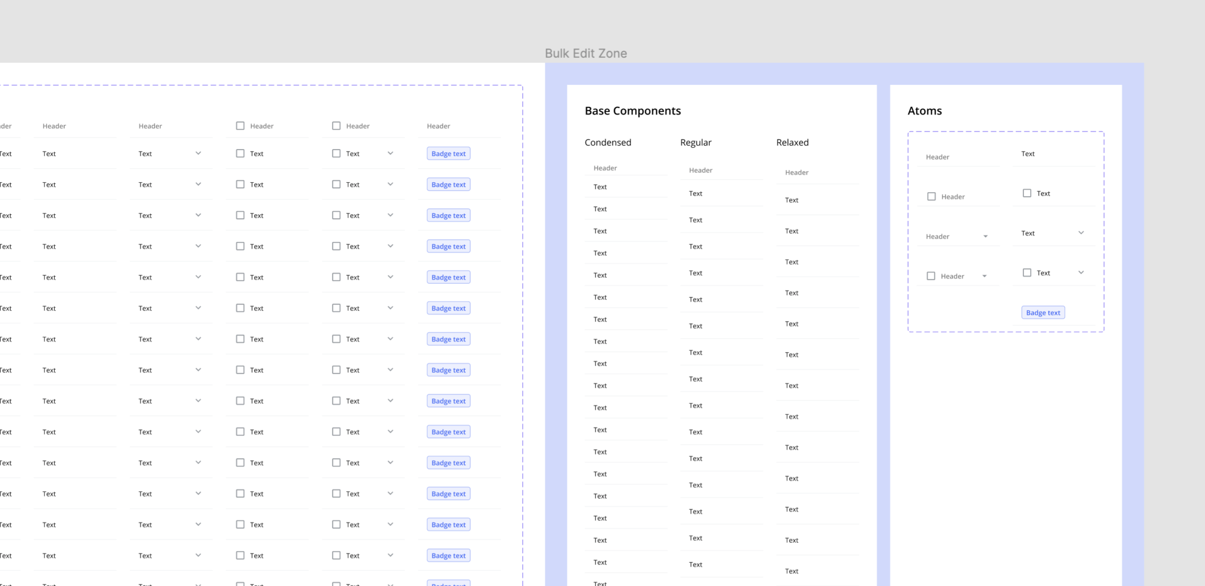
Base components
Creating a unique variant for every possible size, type, state, ect., can result in a LOT of components that need to be created and maintained. The most efficient way to handle this is to have all variations share one, or a few, base components. These base components will provide consistency and be used to make bulk changes.
How to use base components
- Create the base component(s)
- Turn base component(s) into master components
- Add instances of the base component(s) to a separate frame
- Customize each instance to create unique variants
- Turn all instances into master components (the base component is now nested inside)
- Combine all master components as variants
Pro tips
- Give every base component the same name (e.g. "Base") to preserve text and icon overrides while designing.
- Use placeholder text and icons in both the base components and variants. These can be overridden and swapped while designing.
- Keep base components on a separate frame, with a separate name (e.g. "Bulk Edit Zone") to keep the assets panel well organized and easy to navigate.
- Add all possible layers to the base component and toggle their visibility on/off depending on the needs of each variant.
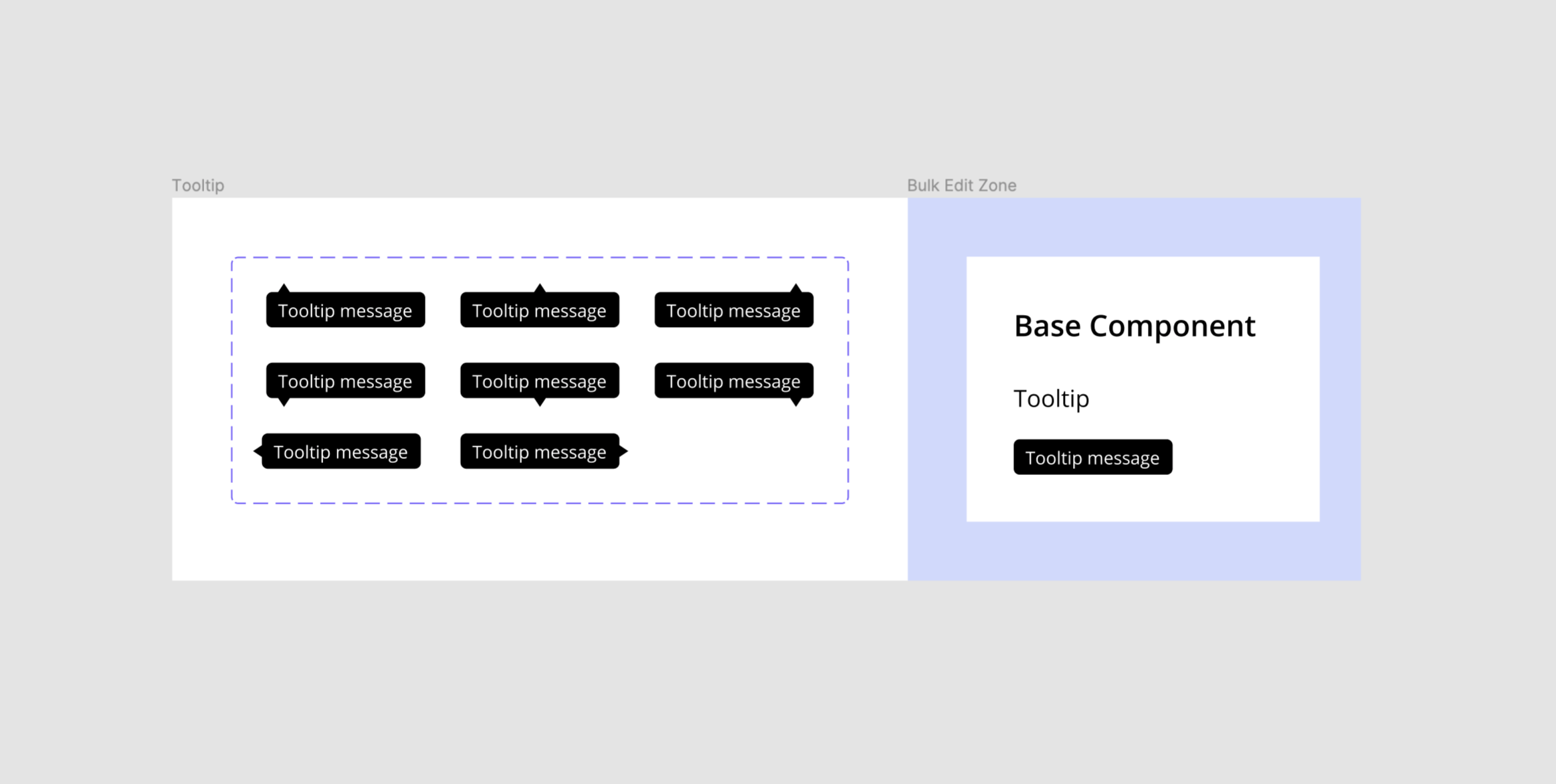
Example: Tooltip
Create one base component with every possible pointer placement (hidden) and use to create multiple variants. Then, customize each variant by toggling the pointer layer visibility on/off so every variant has a unique pointer placement.
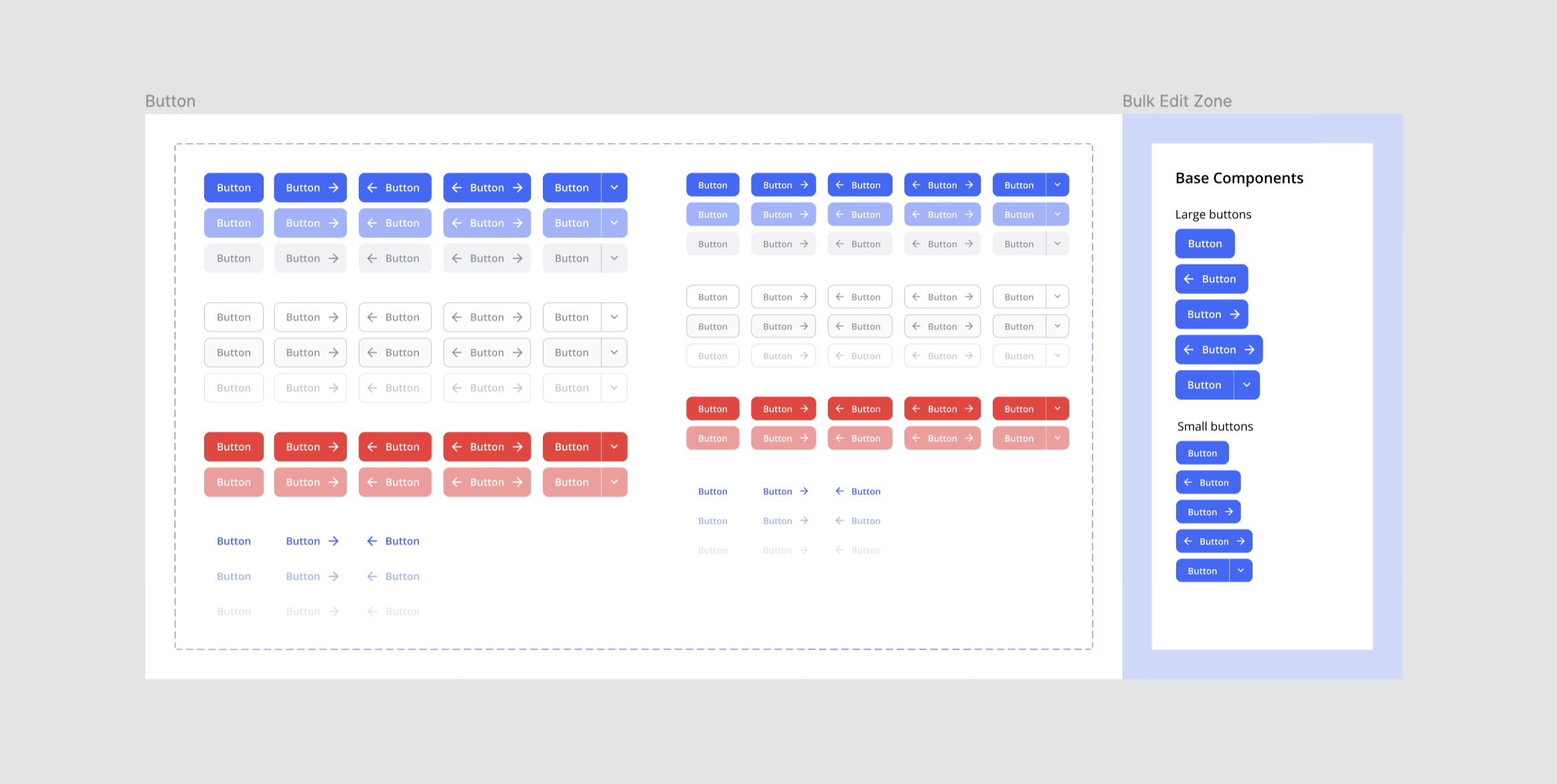
Example: Buttons
Create multiple base components, one for each size & icon placement, and use to create multiple variants. Then, customize each variant by overriding the color styles to create different types and states.
Use component atoms
For more complex components, create atoms that can be nested inside the variants directly, or in their base components. These atoms will provide additional consistency and allow for easy bulk edits across a large number of variants.
If you're unfamiliar with the concept of "atoms" checkout Brad Frost's online book "Atomic Design".
How to use component specific atoms
- Create all atoms needed for the component
- Turn atoms into master components
- Nest atoms into their base component(s) or variants
- Customize base component(s) and/or variants
Pro tips
- Keep atoms on a separate frame, with a separate name (e.g. "Bulk Edit Zone") to keep the assets panel well organized and easy to navigate.
- Use the forward slash naming system and add "atom/" to the beginning every atom name.
- Combine like atoms as variants to make swapping them easier.
- Toggle layer visibility off for non default atoms in the base component.
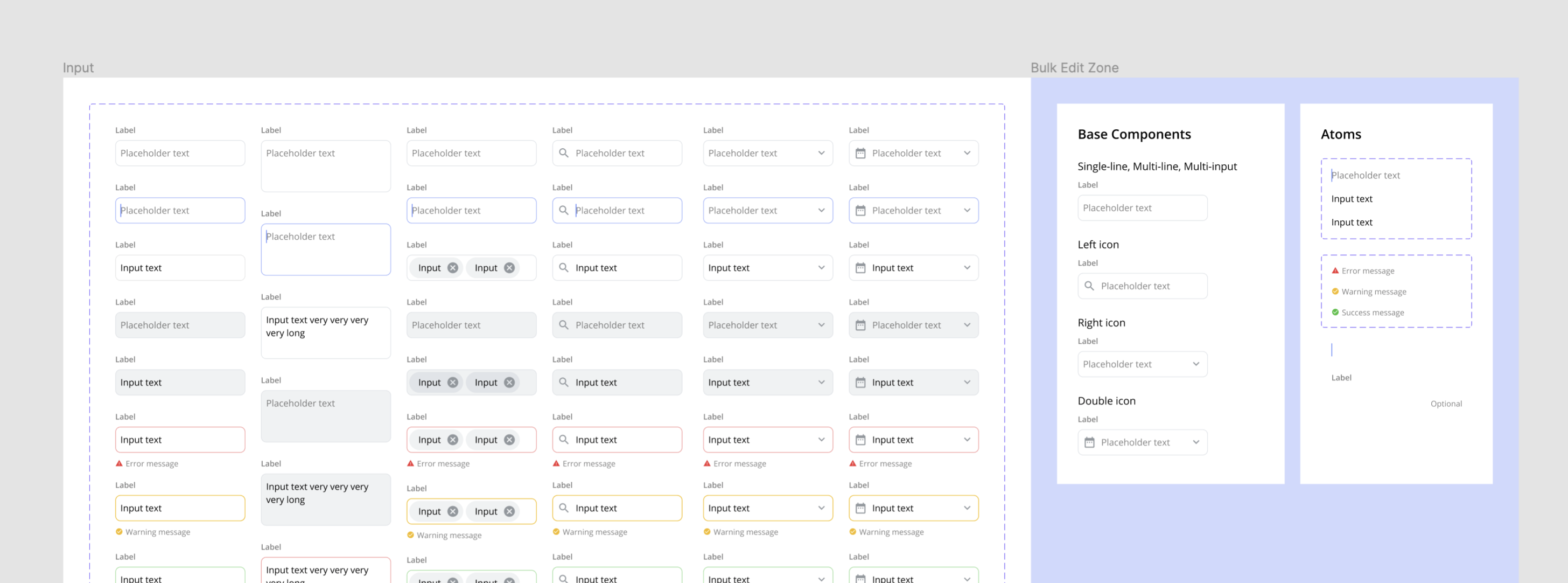
Example: Inputs
Create atoms for the label, carrot, hint text, feedback massages, and placeholder/input text. Then nest them into each base component and create variants. In each variant, toggle the atom's layer visibility on/off or swap with like atoms (e.g. feedback messages) to create unique states.
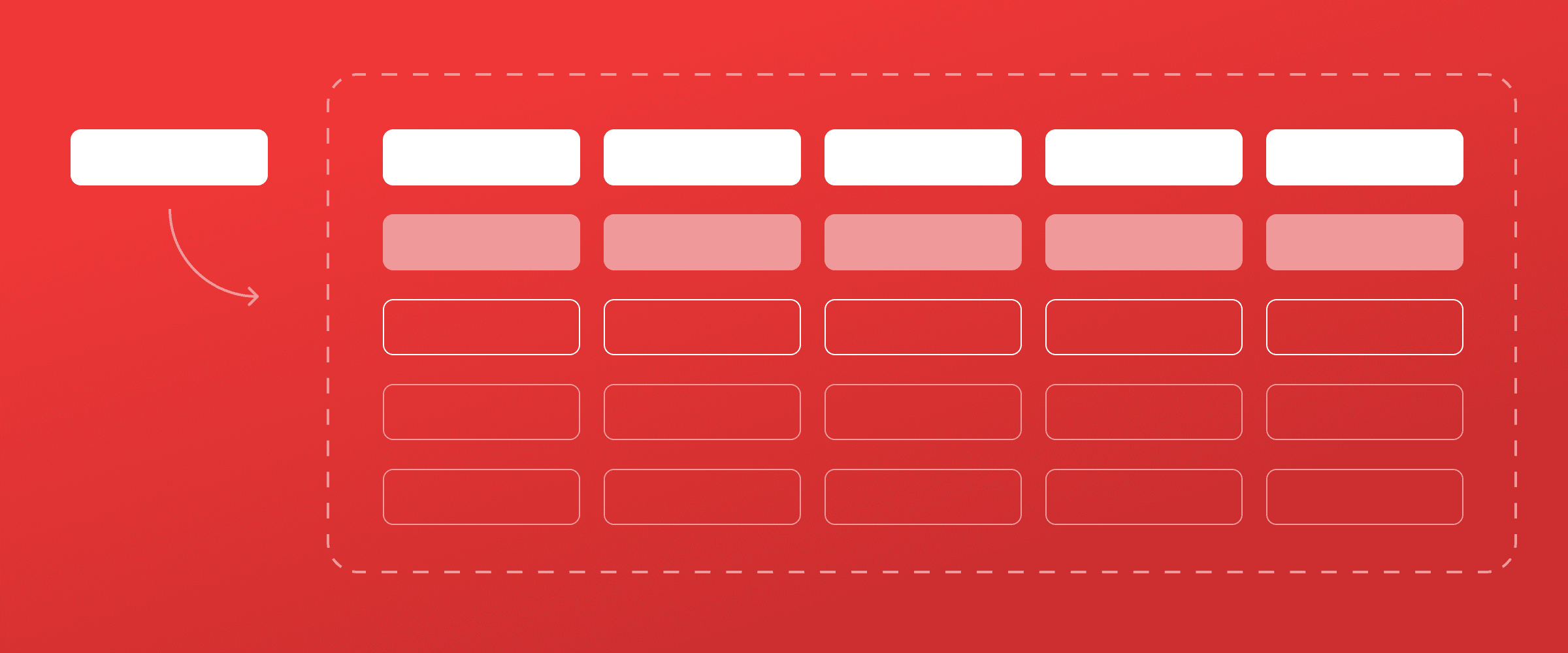
Example: Tables
Create atoms for every possible header and cell type. Then nest them into each base component and create variants. In each variant, swap atoms to create unique columns types.
Learn by doing
Learn the best, most efficient, way to build and use every component with UI Prep's Design System UI Kit. It has all the components and styles you need to get started and can be completely customized in less than 2 minutes.
🧠 Learn More about UI Prep Design System

Want more design insights like this?
See our full catalog of articles covering Figma tips and Design System best practices.