
Design Smarter with Themed Components
Here at UI Prep, we obsess over the best way to structure each component. This is especially important for dynamic components that require several states or variations (ie, buttons and inputs). Is it better to build one master component and make overrides while designing? Or maybe build a separate master component for each state? What about including nested instances that can be swapped out depending on the situation?
After building over a dozen design systems from scratch, we've found the best, most efficient strategy for dynamic components is to build themes for each state or variant. In this article I'll go over what themed components are, why they'll improve your workflow, how to use them in your designs.
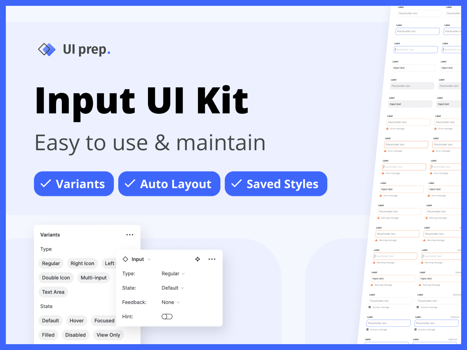
👀 Keep an eye out for the Freebie at the end of article. It includes an example of themed components using the input component strategy from UI Prep's Design System.
What are themed components
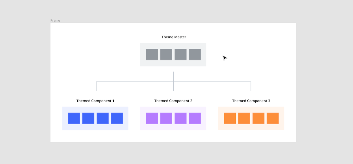
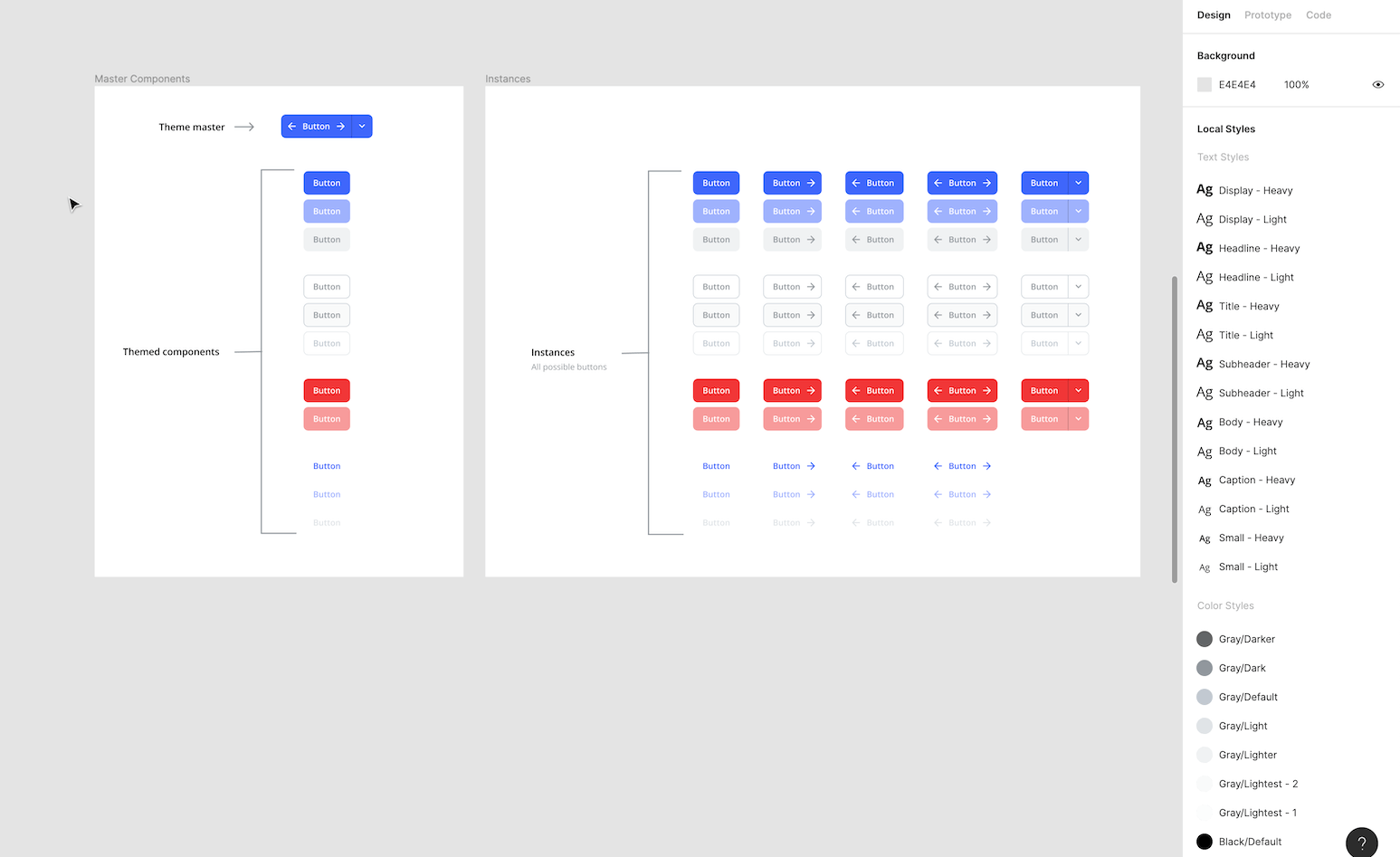
Themed components are a way of managing component states and variations efficiently. They work by taking an instance of a component, overriding its properties, and then turning the altered instance into a master component of its own. This component building strategy allows you to have separate master components for each state or variant while only needing to build and maintain one "theme master". The theme master is the original component, now nested inside of each themed component. Editing the theme master automatically updates all themed components.
Why you should use themed components
If you understand why using master components and instances in your designs is valuable, just imagine applying that same logic within the ecosystem of your master component library. You get all the value of making a master component for every state and variation, without the downside of having to maintain several components. Below are a few reasons themed components will improve your workflow.
They reduce decision making
Having a master component for each state or variant reduces the number of decisions needed to be made while designing. For example, instead of overriding multiple properties of a default input to create an error state, simply swap the instance. Not having to remember which icon or shade of red to use will save time and make your designs more consistent.
They are easy to build
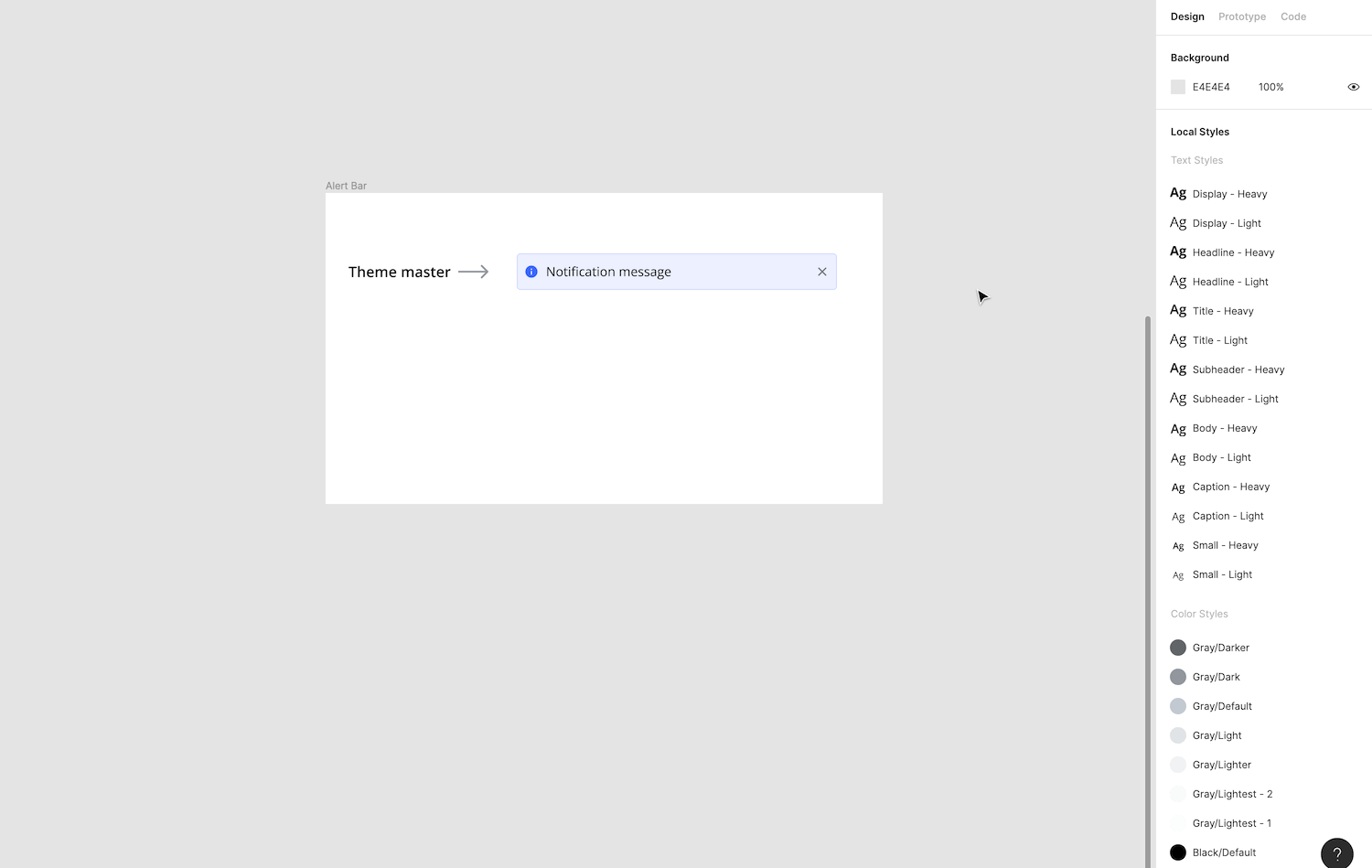
Building a series of themed components is very easy to do. Rather than rebuilding a new component for each state or variation, they're built by overriding an instance of the theme master. For example, to create multiple themed alert bars, build one default state as the theme master, then override the colors and icons of each instance.
They are easy to maintain
All themed components can be updated by editing their one shared theme master. For example, if you have 52 possible buttons, all of them can be updated by editing the theme master. Editing individual themed components will only update that state or variant.
How to build & use themed components
Outlined below are step-by-step directions for building and using themed components.
1) Create a theme master
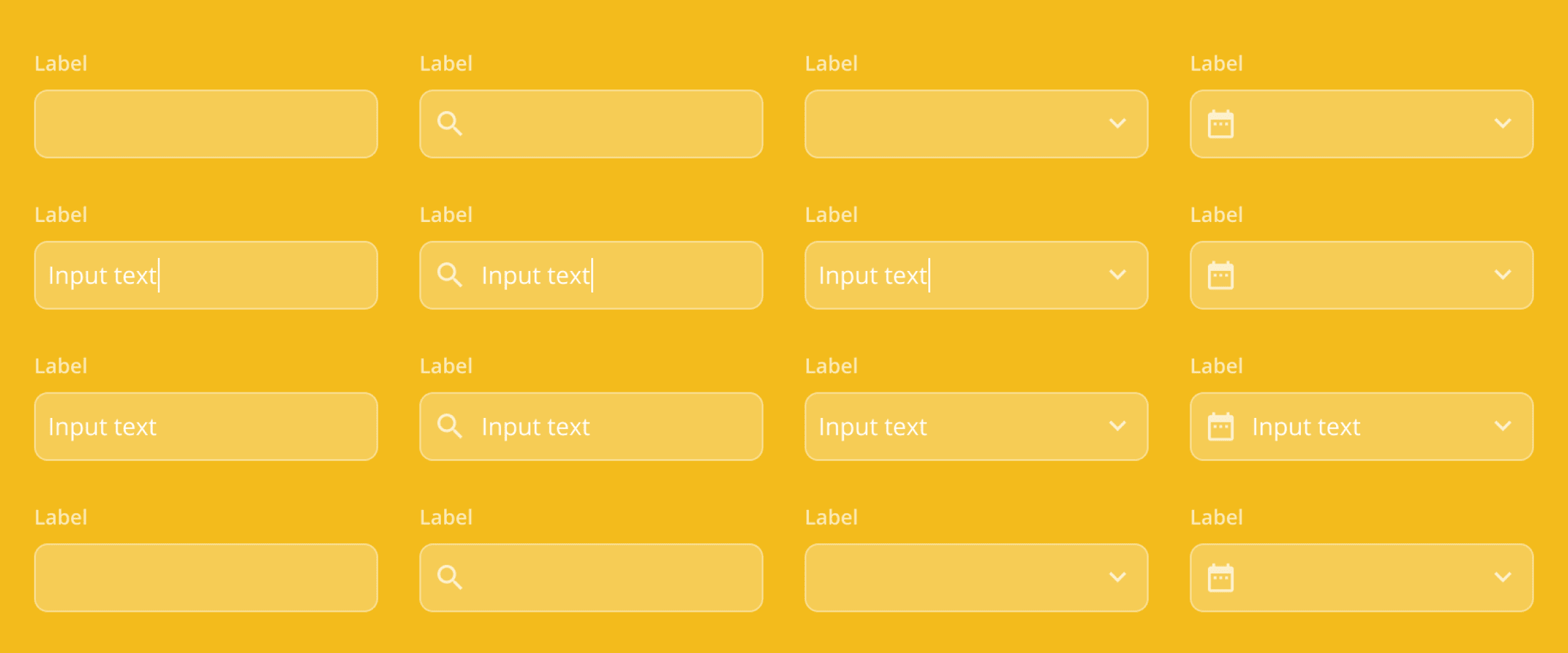
Build the default version of your component (ie. input) with all possible elements required for the supported themes. Elements that are not needed for the default state should be added in their correct placement and hidden by toggling their visibility off. Once assembled, turn into a master component.
Theme masters can be made either as a stand-alone component that will not be used in your designs (see button example above) or as the default version of your component (see input example below).
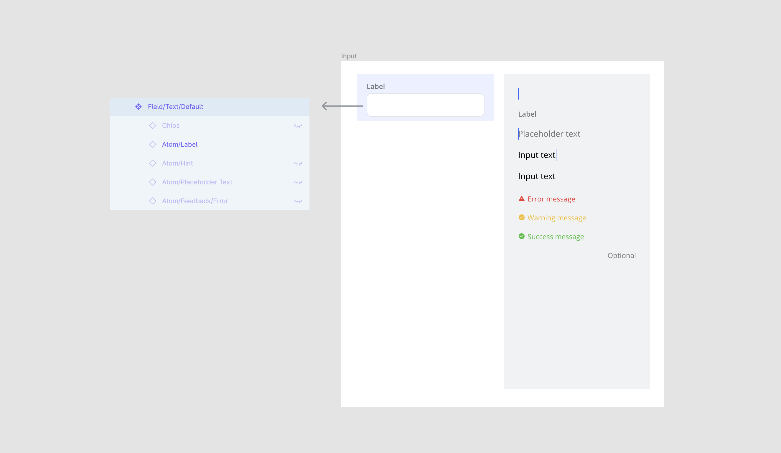
Pro tip: Use the Atomic Design Method and turn each element (aka atom) into a master component for bulk editing and the ability to swap nested instances (ie. swap feedback messages)
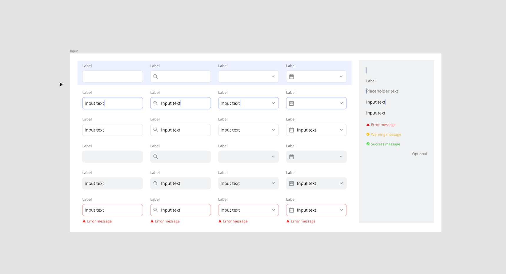
2) Create themed components
Copy the theme master to create an instance for each theme you wish to support (ie. default, active, filled, ect.). For each instance, apply overrides to create a unique theme. Overrides can include changes to any of the styles, swapping nested instance, toggling visibility on/off, or updating text. Once the themes are ready, turn them into master components.
An instance of the theme master is now nested inside each of these new themed components.

Pro tip: Organize your collection of themed components in a neat column with the theme master, clearly highlighted, at the top.
3) Update themed components
Update all themed components by editing the theme master. Or, update a specific state by editing an individual themed component. All updates made will be applied to the instances used in your designs.
4) Use themed components
Use themed components the same way you would use any other master components. They can be added, overridden, and swapped as needed.
See for yourself
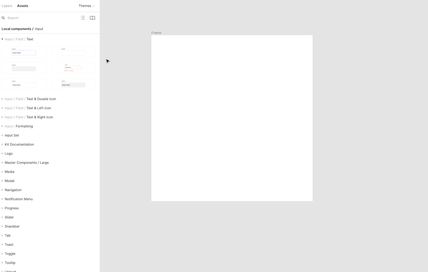
Download the freebie below 👇 to see theme masters and themed components in action. Included in the file is the entire input component system from UI Prep's Design System. Use this freebie as a playground to learn how to use themes in your own designs or use this file as the starting point for your next project.
👉 Get the (free) Input UI Kit here
Want more design insights like this?
See our full catalog of articles covering Figma tips and Design System best practices.