
Everything you need to know about spacing & layout grids

The key to every great design is the organization of its information. Spacing methods and layout grids define structure, hierarchy, and rhythm in your design. When correctly used, they reduce decision making and help establish a rational approach to type scales, positioning, sizing and spacing.
This guide will walk though spacing and layout grid best practices based on Material Design, Bootstrap, and Figma.
👀 Keep an eye out for the free layout grids UI kit at the end of the article. It contains layout grid styles, responsive behavior, and constraint examples to help you learn and jump start your design process. ⚡️⚡️⚡️
Spacing Basics
Before we dive into layout grids, let’s review some of the spacing basics that impact all sizing, measuring, and spacing decisions (including grid configuration).
Base unit
The base unit defines what every measurement will be a multiple of. This keeps designs consistent, improves communication with developers, and reduces the number of decisions a designer has to make. The most recommended base unit is 8px because it makes scaling for a wide variety of devices easy and consistent. This is because most screen sizes are divisible by 8 and because 8 is itself an easily divisible number (8/2=4, 8/4=2).
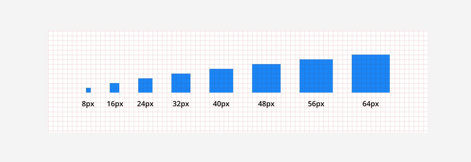
Tip: Icons, text and some elements within components can align to a 4px grid to improve spacing in small areas and make implementation easier.
Sizing
The height and width of UI elements should be measured in increments of the base unit (ie. 8, 16, 24) when possible. This creates clear hierarchy, aligns elements neatly, and provides a consistent visual rhythm. For example, line height, buttons, and form inputs can be expected to have the same incremental heights across all your designs.
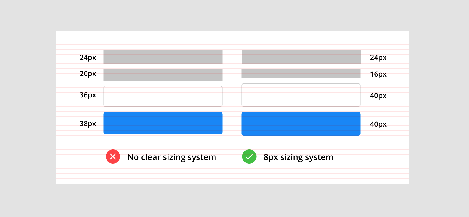
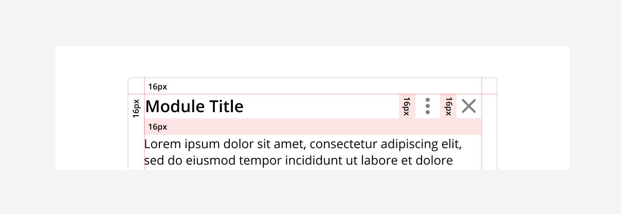
Padding
Padding refers to the space between UI elements and is also measured in increments of the base unit. Consistent, predicable padding is aesthetically pleasing, clarifies the relationship between elements, and improves readability. For example, the padding inside a component should create a holistic spacing pattern between all its elements.
Tip: In Figma you can save yourself some headaches by updating the “nudge” amount from 10 to 8 (Menu > Preferences > Nudge amount > 8).
Layout Grid Basics
Layout grids originated in early print design to define text and image blocks, and their basic principles still apply to how we organize two dimensional information on the web today. With the growing number of devices and screen sizes, grids are vital to maintain consistency and create a cohesive design experience.
Recently, grids have become more flexible and powerful in tools like Figma with advanced functionality like styles, sizing constraints, and nested frames (more on that later).
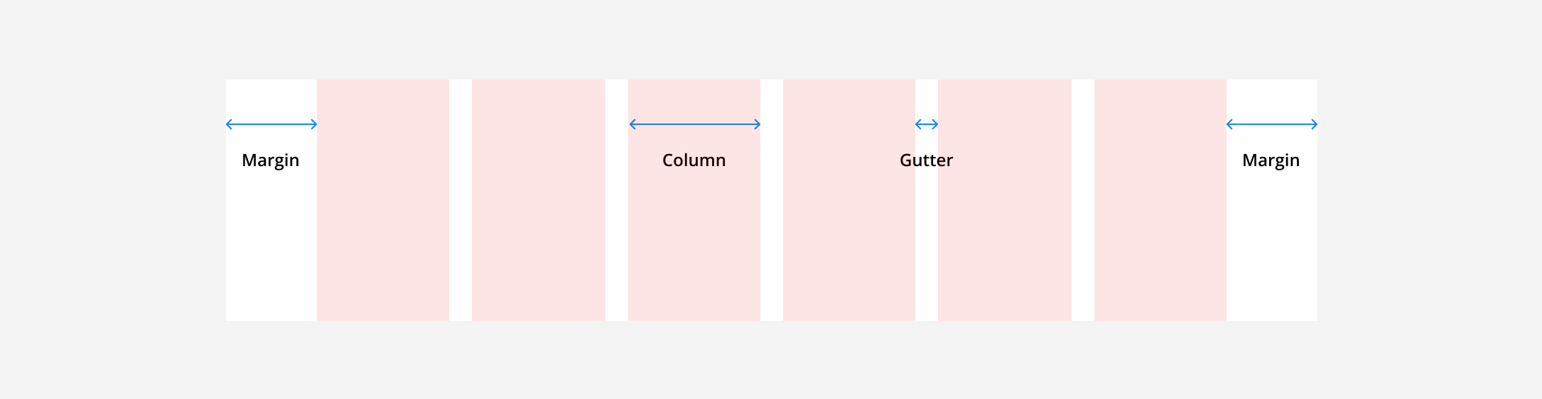
Grid Anatomy
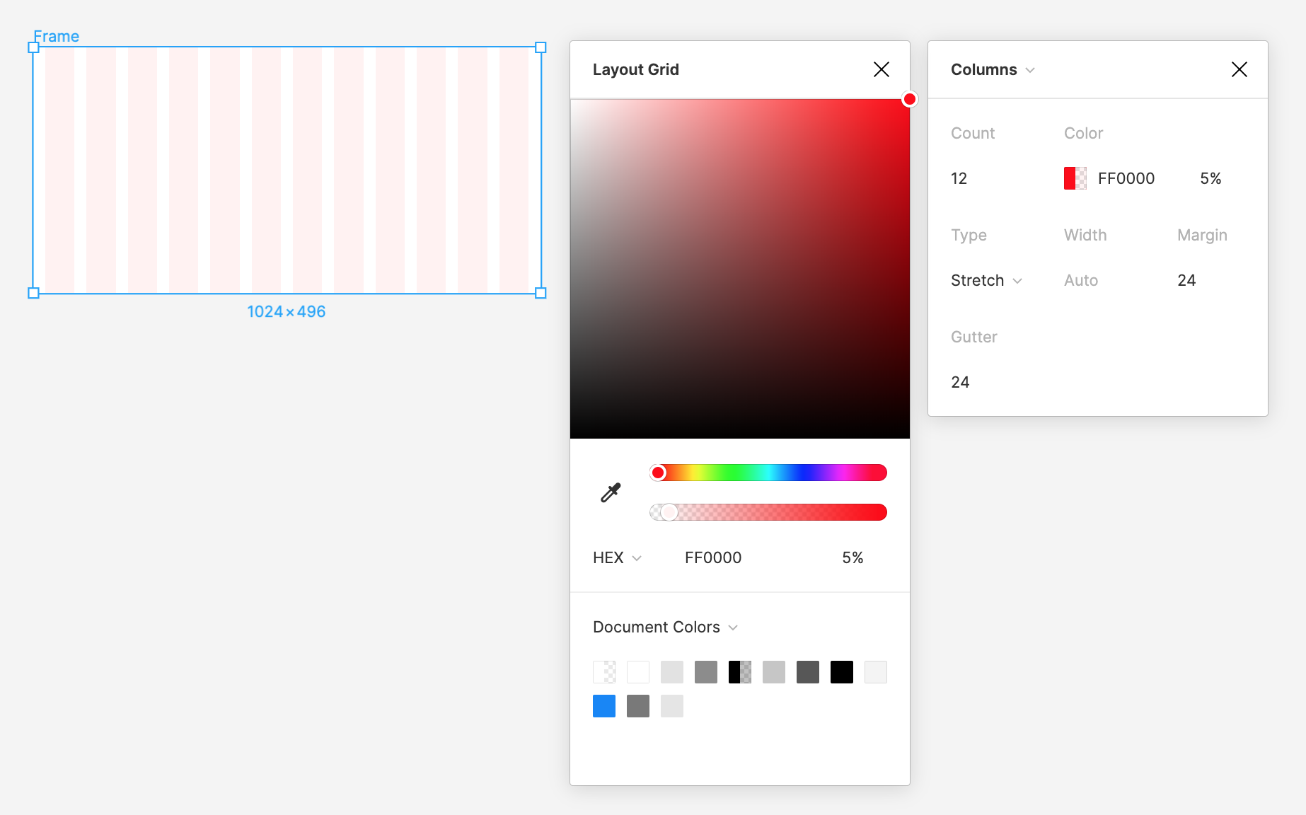
All grids are made up of three elements: columns, gutters, and margins. Columns are the building blocks of a grid and mark where elements should be placed. Gutters are the negative space between columns and their width should be a multiple of the base unit. Margins are the negative space between the edge of the outside column and the frame.
There are many ways to combine columns, gutters, and margins to create different grid layouts. Below are a few standard grid types.
Manuscript Grid
This is simplest layout with only one column spanning the width the entire content area. The manuscript grid can be useful when defining the margins on a block of text (like in a manuscript).

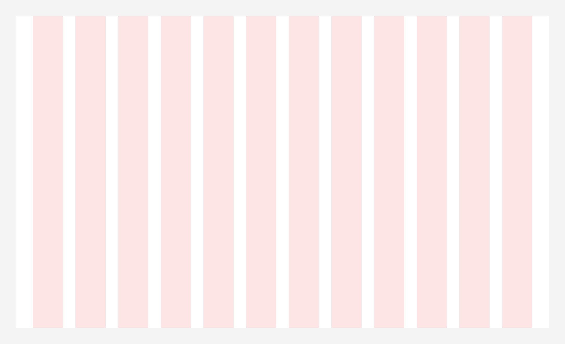
Column Grid
Column grids are the most common layout used for web applications. The grid splits the frame into evenly spaced vertical fields which objects are aligned to. These grids are typically made of 12 columns which can then be divided into halves, thirds, fourths, and sixths, when designing responsive screen sizes (more on that later).
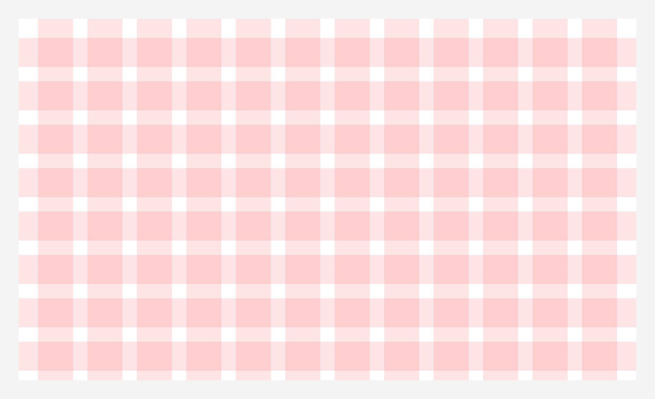
Modular grid
This is a variation of the column grid. Modular grids have both vertical columns and horizontal rows which intersect and create a matrix of cells, or modules. These modules provide additional layout guidelines as single units or as larger blocks when combined.
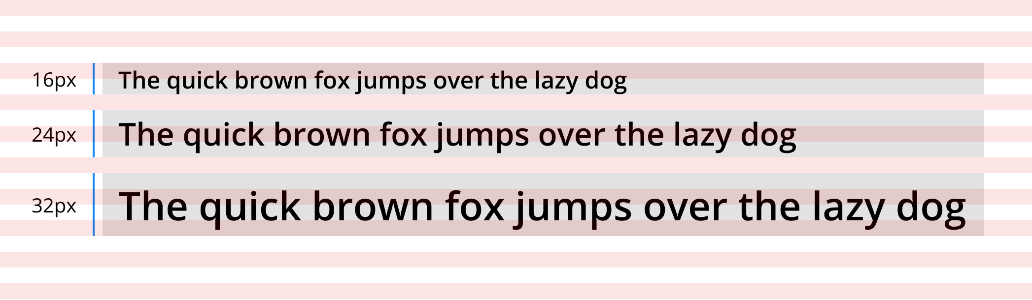
Baseline grid
Baseline grids consist of dense horizontal rows that provides alignment and spacing guidelines for text, similar to how you would write on sheet of ruled paper. In the example below, each 8px row alternates between red and white.
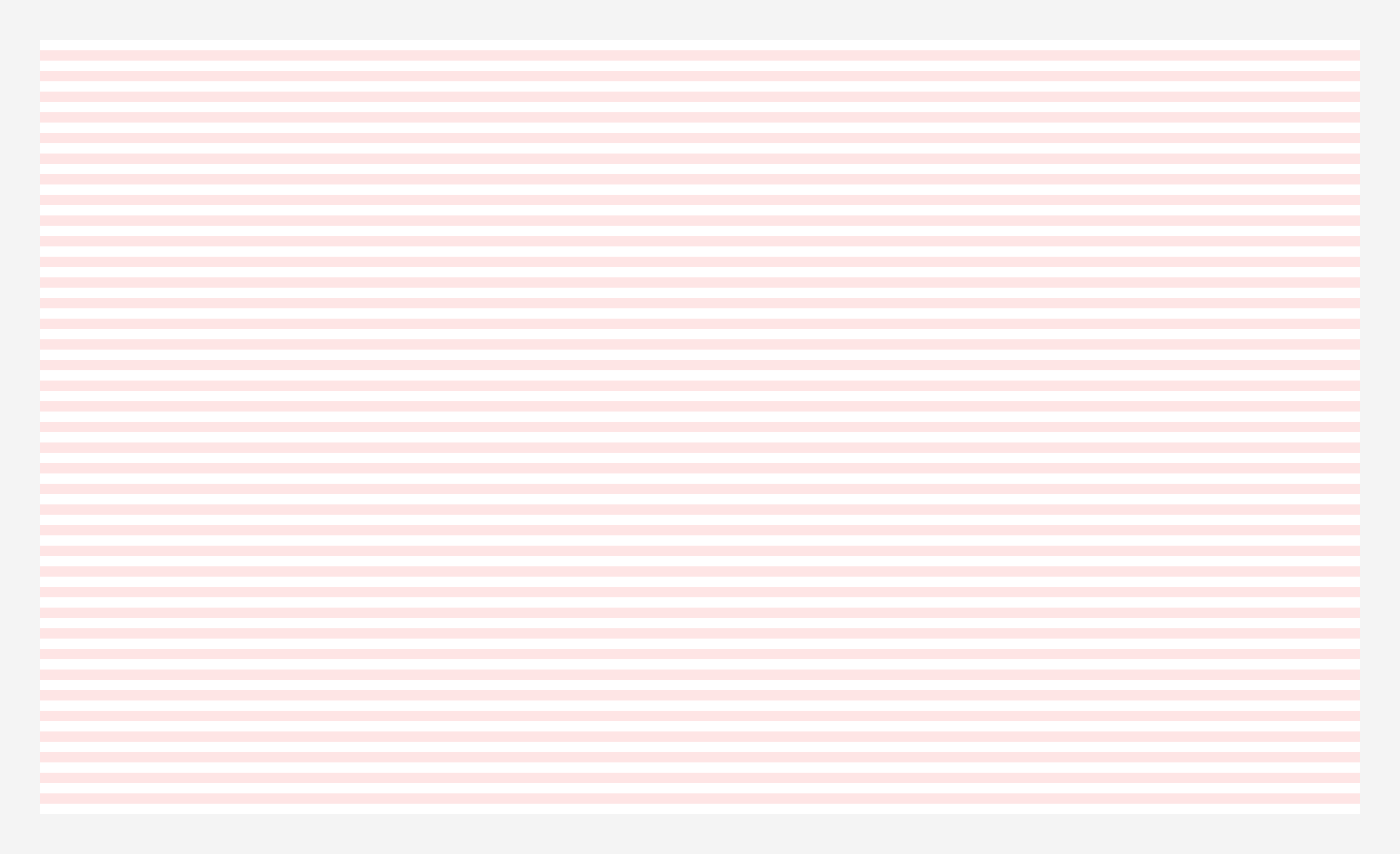
Tip: It’s important to set all line heights to an increment of your base unit (8x or 4px) so your text will align perfectly with the baseline grid.
Responsive Layout Grids
Layout grids are required to be responsive, scale up and down, to display information on a wide range of screen sizes in order to maintain usability. This is accomplished by establishing a consistent layout grid behavior and setting determined breakpoints to support across your designs.
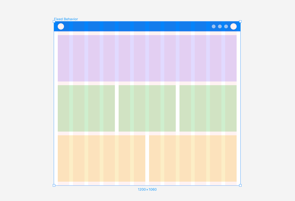
Fixed Behavior
This behavior has a “fixed” container width and position. As the screen size changes the container maintains all of its exact measurements while the margin size increases or decreases. This allows all elements to stay proportional but can result in too much empty space in margins on extra large device sizes.
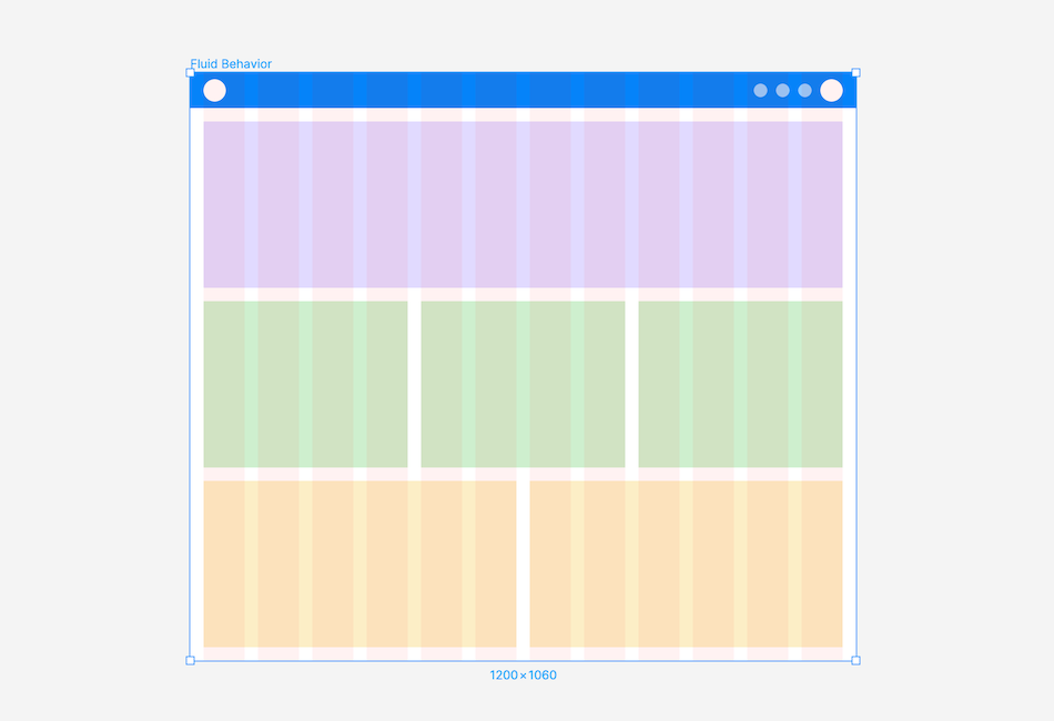
Fluid Behavior
Fluid layouts are measured in percentages rather than pixels so the container width increases and decreases as the screen size changes. The container width adjusts by having the margin and gutter widths remain constant while the column size increases or decreases. This behavior utilizes available screen space but can cause elements to appear stretched out.
Breakpoints
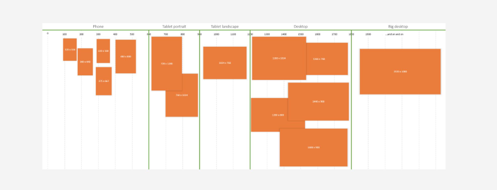
Breakpoints give designers and developers an easy way to control the layout of a design as it scales up from mobile to desktop. This helps us cater our designs to all types of device sizes without compromising on the UX. Establishing a set of breakpoints makes it easier to communicate the correct behavior of designs across devices sizes.
Breakpoints are typically represented in “px” units and come in ranges. While there’s no “must-have” set of breakpoints, here’s a set of breakpoints to get you started.
Breakpoints:
• Small (0px-599px)
• Medium (600px-899px)
• Large (900px-1199px)
• Extra large (1200px and up)
Tip: these breakpoints are based on David Gilbertson’s article “The 100% correct way to do CSS breakpoints” if you want to dive in and learn more.
What does this mean for you? When you need to show how a design scales up and is responsive, use the following frame sizes in Figma:
Frame sizes:
• 375px to show “Small” breakpoint behavior
• 600px to show “Medium” breakpoint behavior
• 900px to show “Large” breakpoint behavior
• 1200px to show “Extra Large” breakpoint behavior
Other than the “Small” breakpoint, we default to using the smallest device size in a given breakpoint’s range when showing responsive design behavior.
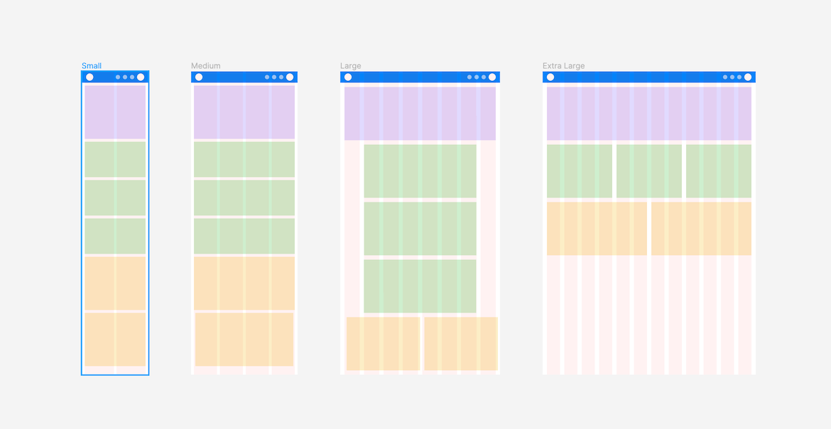
Modified layouts for each breakpoint can change slightly (ie. increasing gutter size), or more dramatically (ie. changing column count, content layout, and UI elements used).
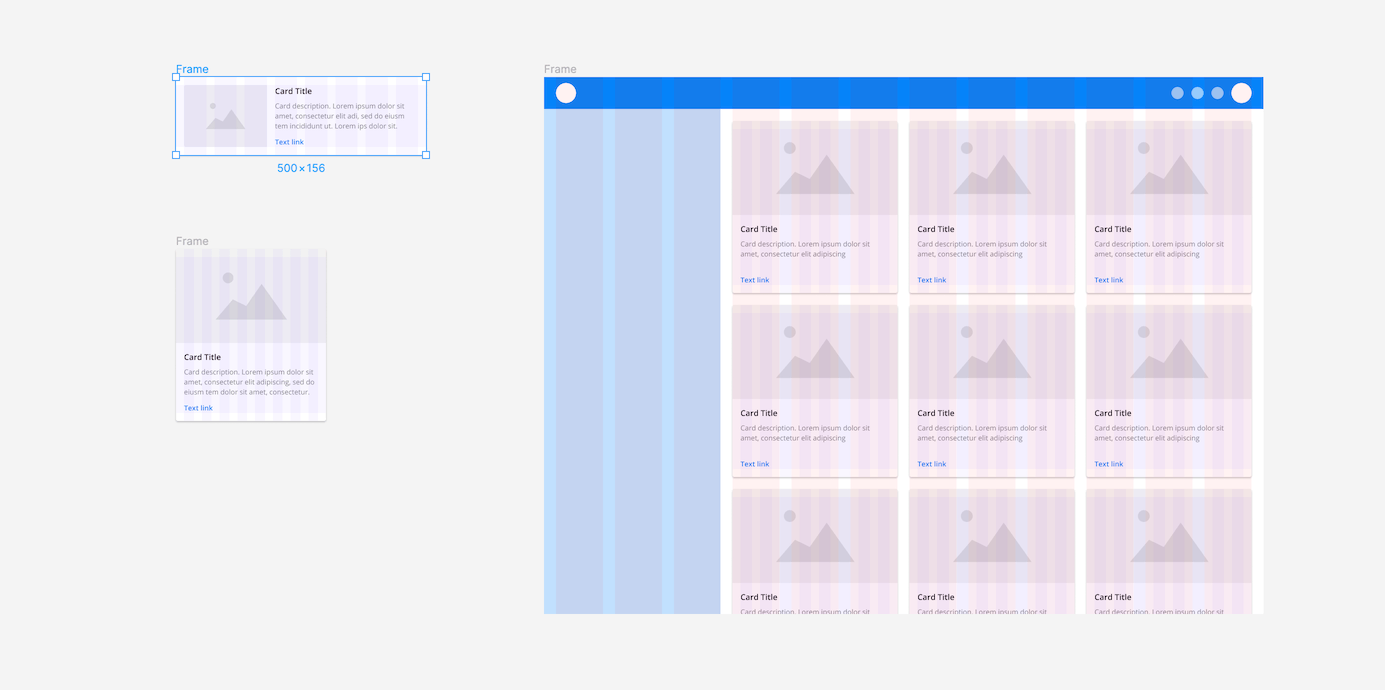
Below is a responsive interface using fluid behavior. Each layout expands until it hits a breakpoint, at which point the layout updates to the next breakpoint size. For example, when the small layout reaches 600px it updates to the medium layout.
Designing with Grids in Figma
Figma is one the most powerful and flexible tools for designing with layout grids because of their use of nested frames, styles, constraints, and customizability.
Apply layout grids to any frame
In Figma, grids can be applied to any frame, rather than only at the artboard level. This means grids can be applied to top level frames (desktop, tablet, mobile) as well as nested frames (ie. framed content areas or components within your design).

Apply Constraints for Responsive Designs
Constraints allow you to control the resizing behavior of any element in relation to their parent frame. For example, you can pin an element (like a button) to the corner of a frame and maintain the exact size and padding when the frame is expanded or contracted.
When used with a stretch layout grid, constraints will be relative to their nearest column to maintain a fixed space (gutter) between elements. This is especially useful when designing for multiple device sizes.
Save Grid Styles
Create and save multiple custom grid styles. This is extremely useful for maintaining consistent sizing across related content areas, component types, and devise sizes.
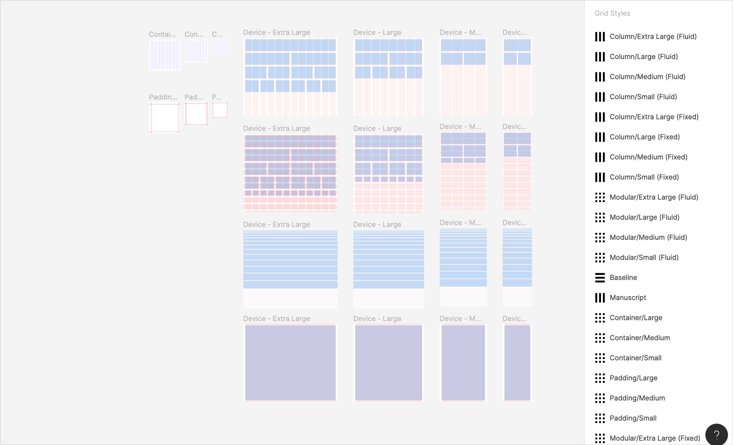
Customize Grid Appearance
Make grid layouts easer to view and differentiate by updating their color and opacity.
Jumpstart your Layout Grids workflow
Spacial methods and layout grids are necessary for all web design projects. They should be defined early on in the design process with buy in from everyone on the team. This will ensure designs stay consistent, development has clear requirements, and products are delivered faster.
Want to apply these best practices to your designs? 🙌 Jump start your design process with prepared layout grid styles, responsive behavior documentation, and constraint examples with our free Layout Grids UI Kit built exclusively for Figma. 👩💻🎉
👉 Get the (free) Layout Grids UI Kit here
Want more design insights like this?
See our full catalog of articles covering Figma tips and Design System best practices.