
The Ultimate Guide to Designing Data Tables
Data tables vary in size, complexity, content and purpose. Regardless of use-case all well-designed data tables provide clarity on the information presented and help users make insights and take action.
This article is a collection of best practices to help you design better data tables in your applications. It’s broken into two sections: Table Style and Table Functionality.
Like what you see? 😍 Put these best practices to good use with our free Data Table UI Kit built exclusively for Figma. It has everything you need to quickly design world class data tables.
Table Style
When deciding how to style and format your table, prioritize readability and remove any visual clutter that may distract the eye.
1. Choose The Best Row Style
Row style helps users scan, read, and parse through data. Choose the best style for the type and amount of data in your table.
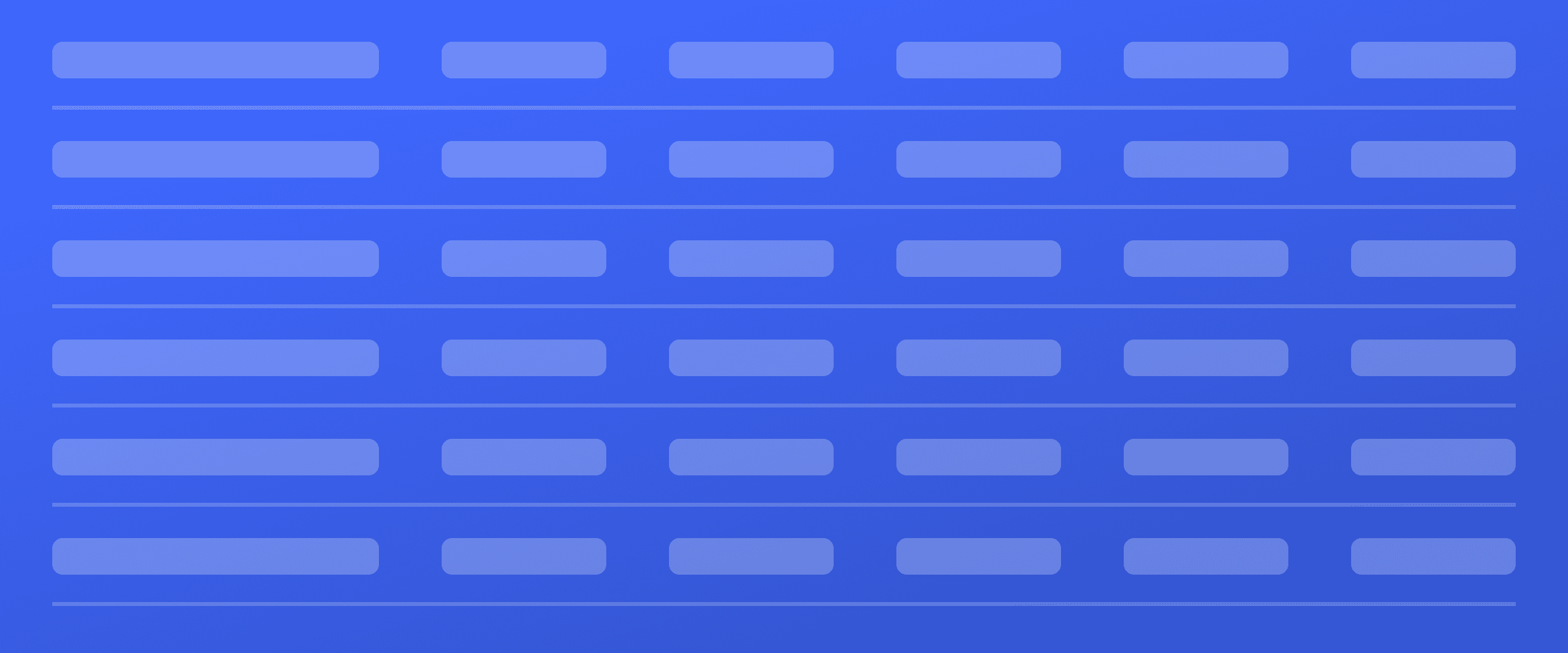
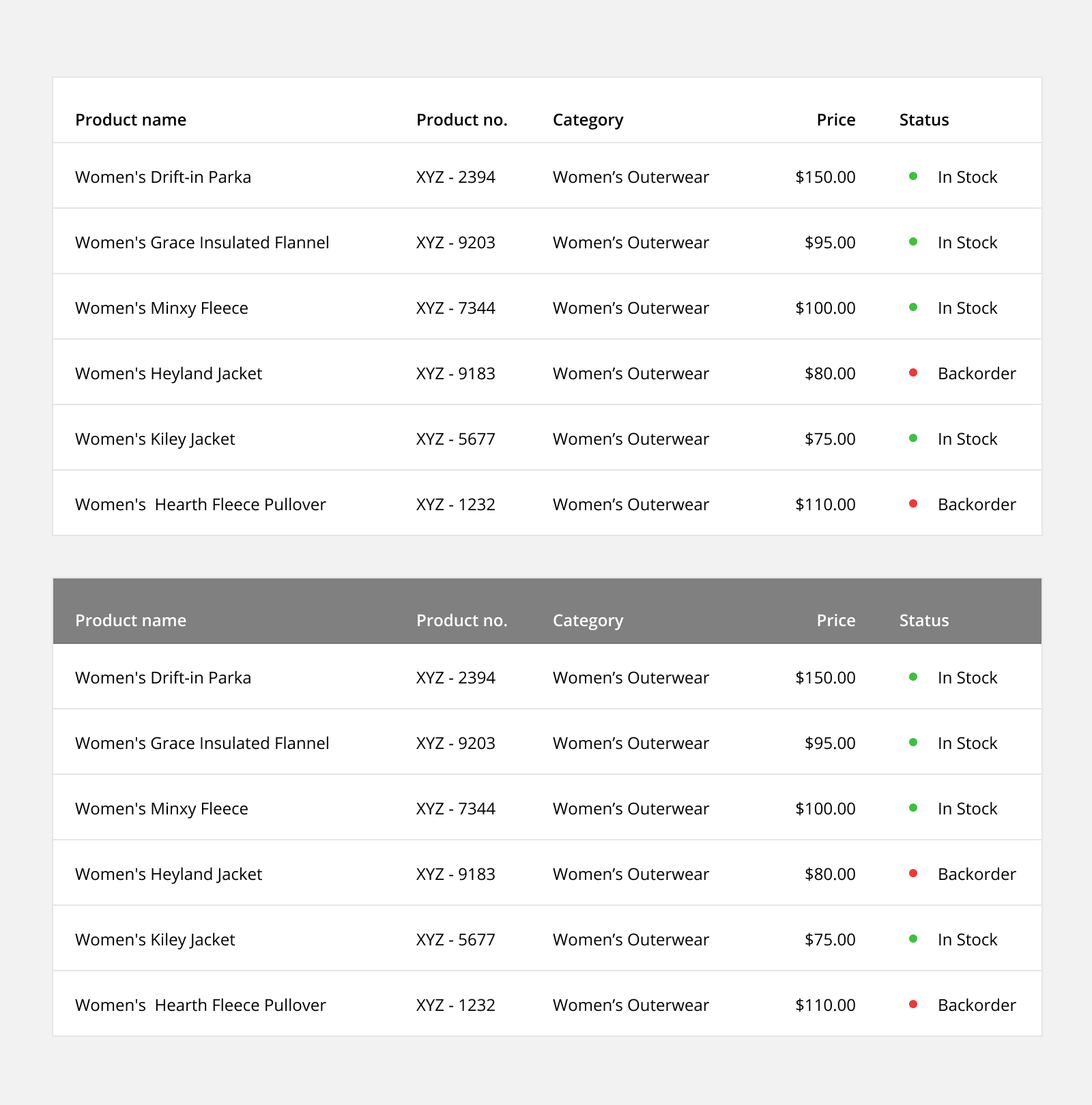
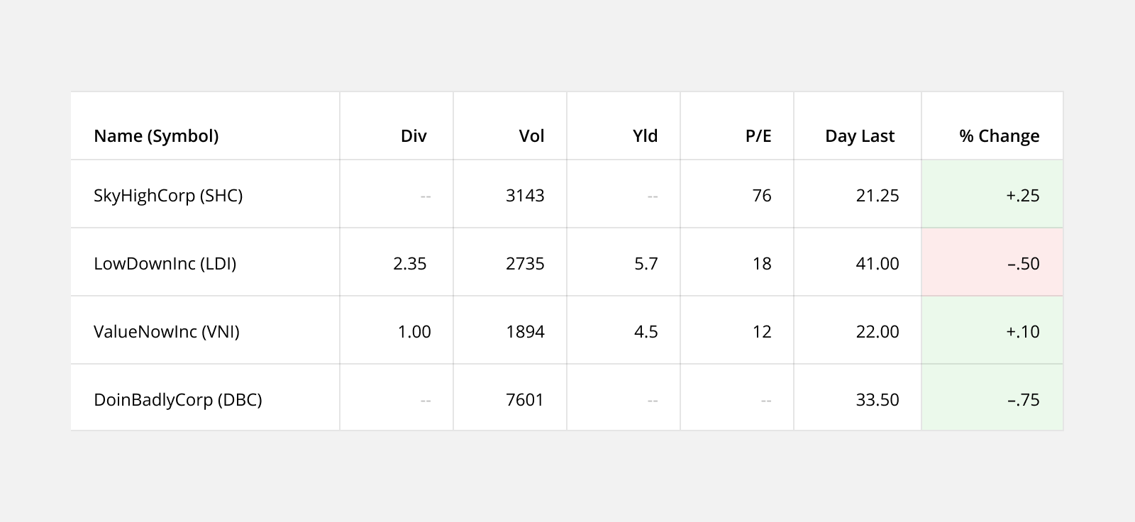
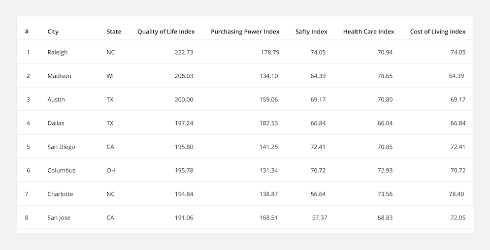
Grid: Including both horizontal and vertical lines provides the most separation between data points, but the excess visual noise can be distracting. This spreadsheet-style is recommended for dense, data heavy tables.
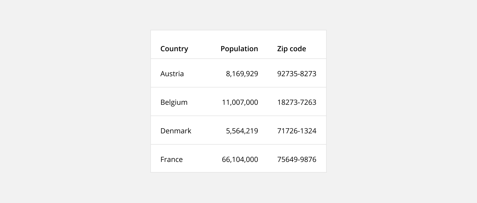
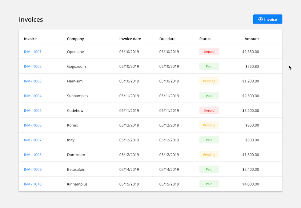
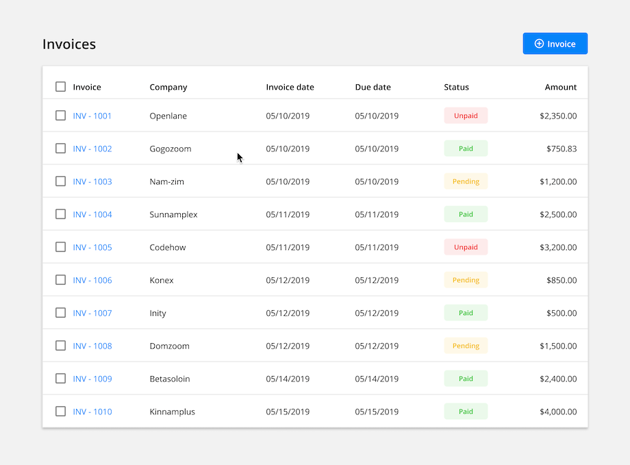
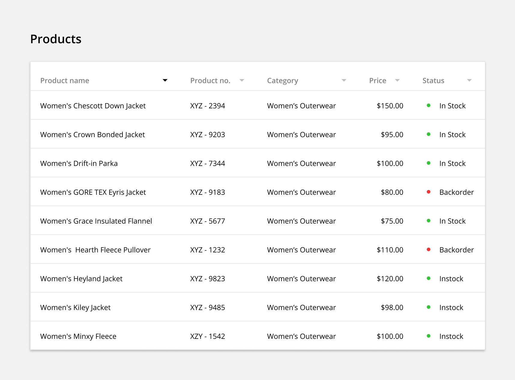
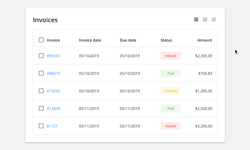
Horizontal Lines: Only showing horizontal lines reduces the visual noise of a full grid. This style includes plenty of white space while still helping the user keep their place while reading. This style is the most common and recommended for all data set sizes.

Zebra Stripes: Alternating different color backgrounds for each row is another good way to help users keep their place while reading. This style is recommended for larger data sets where the alternating pattern will be clear and not cause confusion that a particular row is highlighted.

Free Form: Removing all dividers creates a minimalist look by reducing visual noise as much as possible. This style is recommended for small data sets where the users wont need help keeping their place while reading.

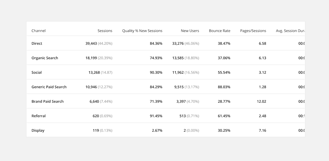
2. Use Clear Contrast
Establish hierarchy by adding contrast to your table. This can be done with different text styles and backgrounds.
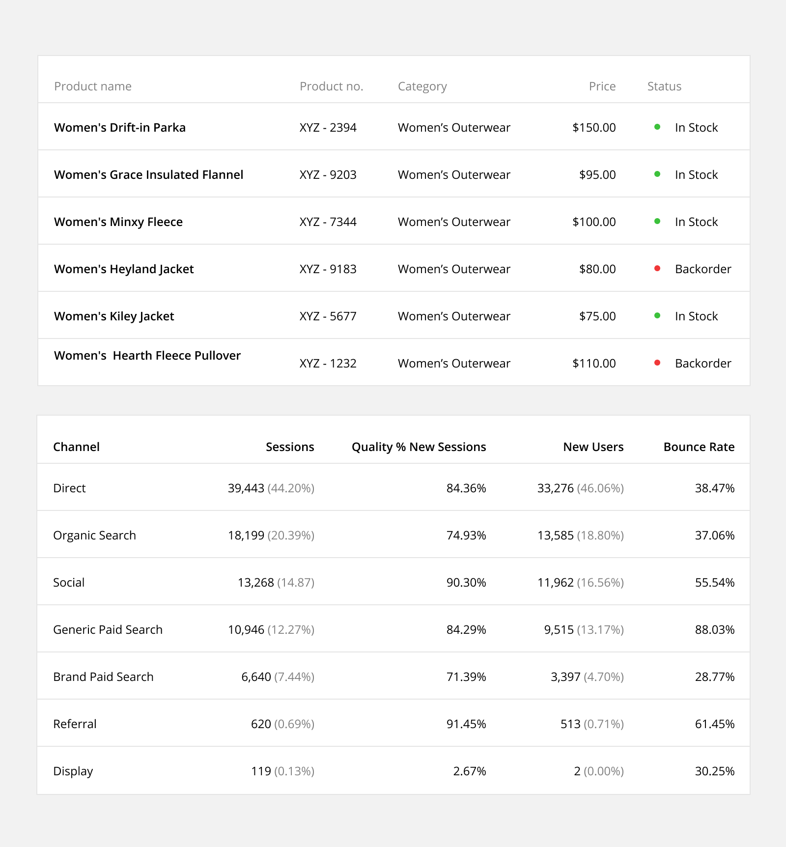
Header Contrast: Differentiate header text from column text by changing the weight and color. Applying a different color background to the header can provide additional contrast if desired.
Column data: Column data can also use different weights and colors to emphasize certain data like the row identifier (first column) or a primary data point in a single cell (ie. cell data: 1,234 34%).
3. Add Visual Cues
Use different colored backgrounds to add organizational context and meaning to your table. These visual cues help present the data in a way that is easier to scan and understand.
Row Background: Change the color of an entire row to highlight a difference in the domain of data (ie. switching between single values and sums or averages).
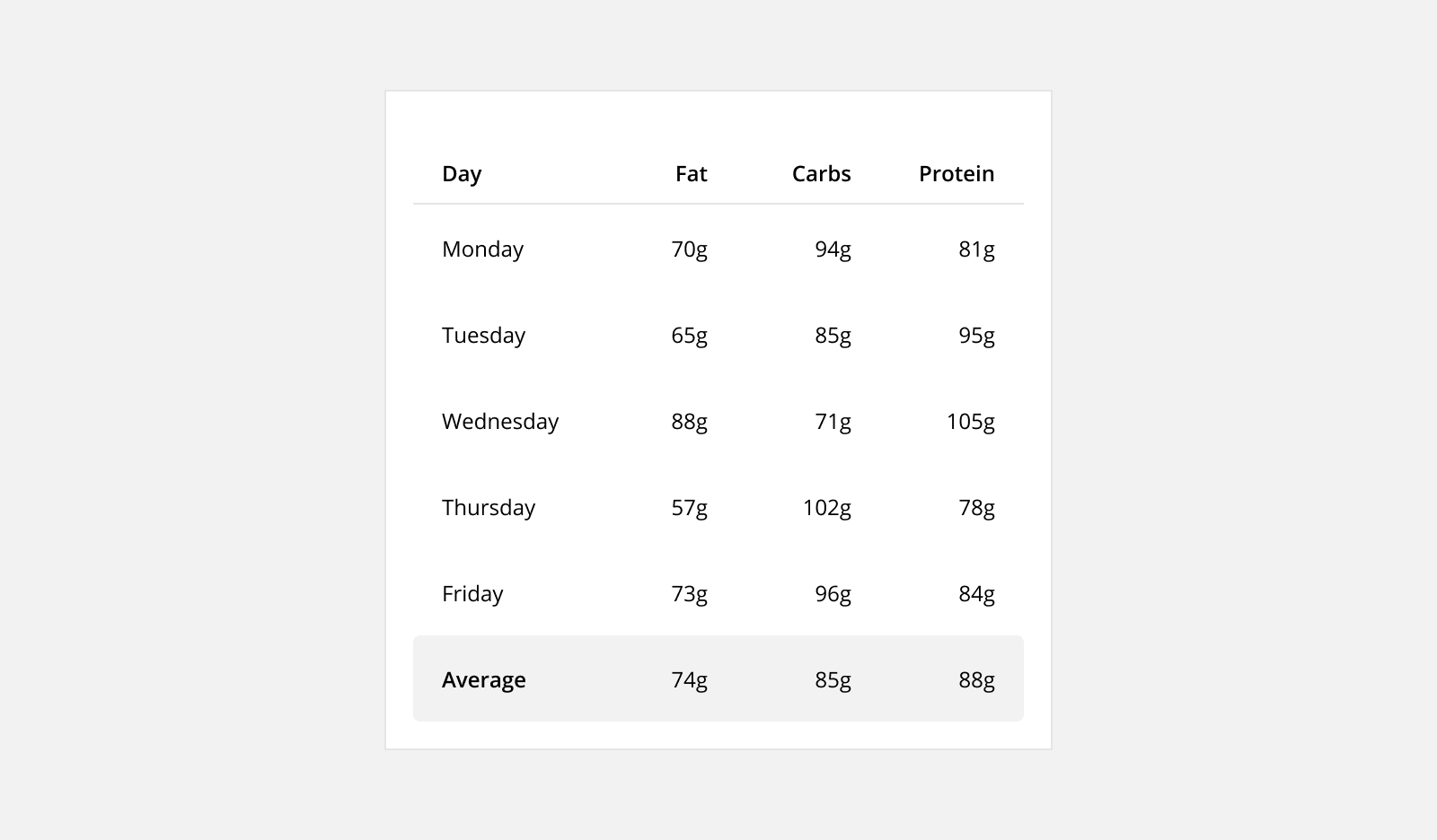
Cell Background: Change the color of a cell to highlight the status of a data point (ie. trending up, trending down).
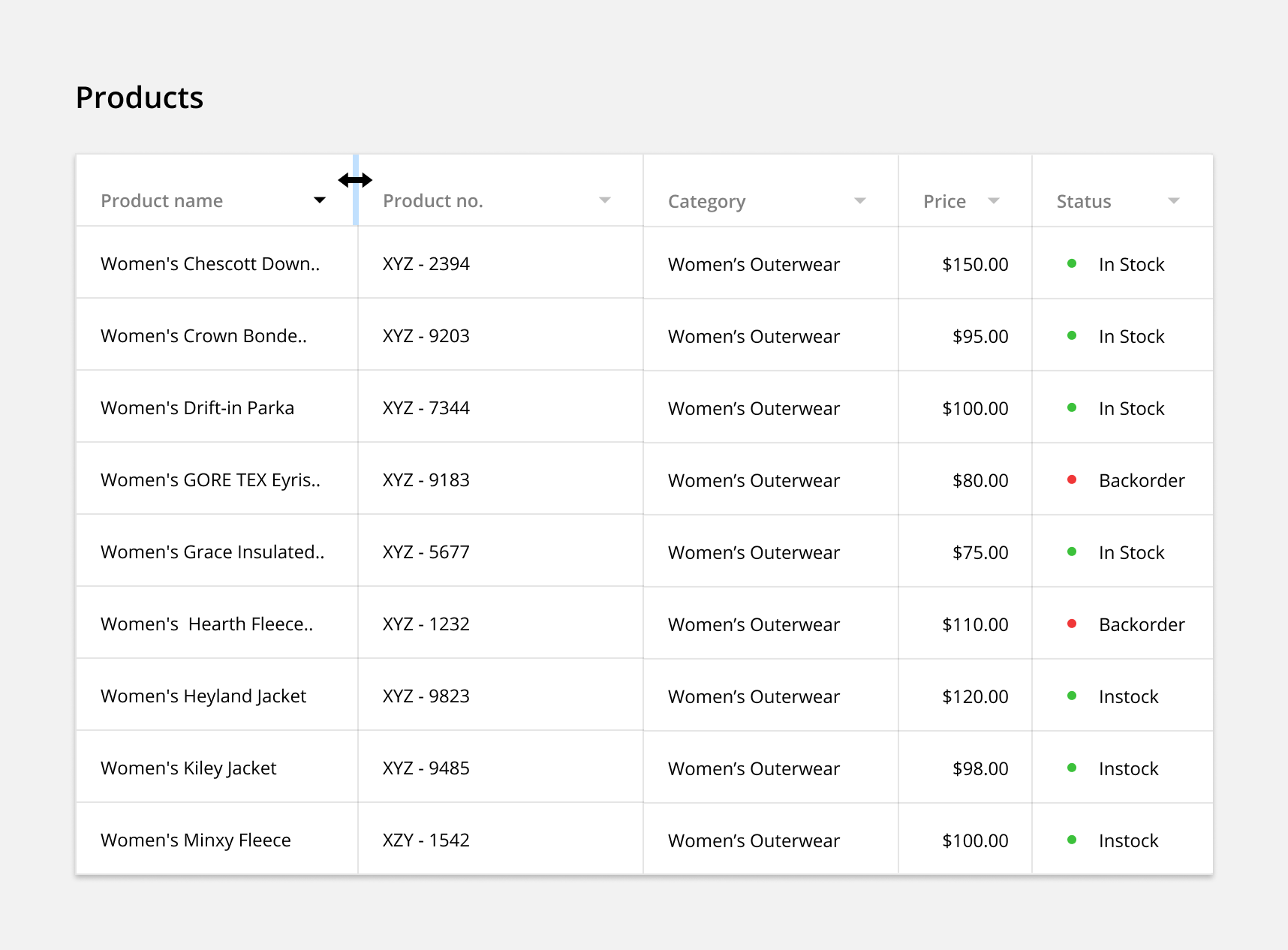
4. Align Columns Properly
By default, most column data is left aligned. This helps make the data easily scannable, readable and comparable. The one exception is numeric data related to size. These numbers should be right aligned to help users identify number size.
Rules to follow:
- Align textual data to the left (ie. Name)
- Align numeric data not related to size (ie. date, zip code, phone number)
- Align numeric data related to size (ie. count, percent)
- Align headers according to their column data
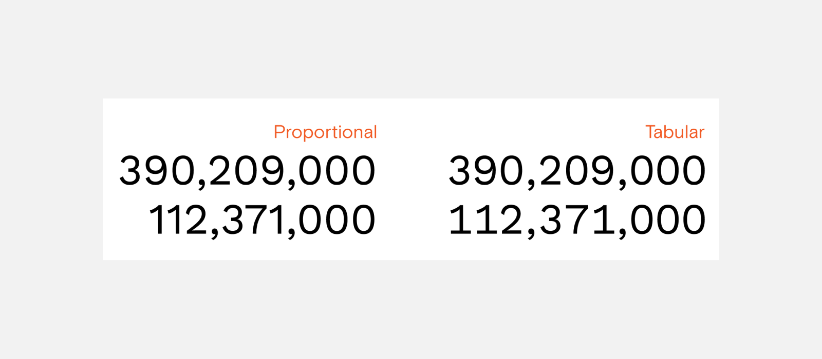
5. Use Tabular Numerals
Use a tabular (or monospaced) font when displaying numbers. This means, rather than having proportional spacing (ie. “W” is wider than “I”), each figure is the same width. This makes columns of numerical data easier to scan.
For your table, you can use an inherently monospaced font (ie. Courier, Courier New, Lucida Console, Monaco, ect.) or the monospaced numeric set sometimes included with proportional fonts.
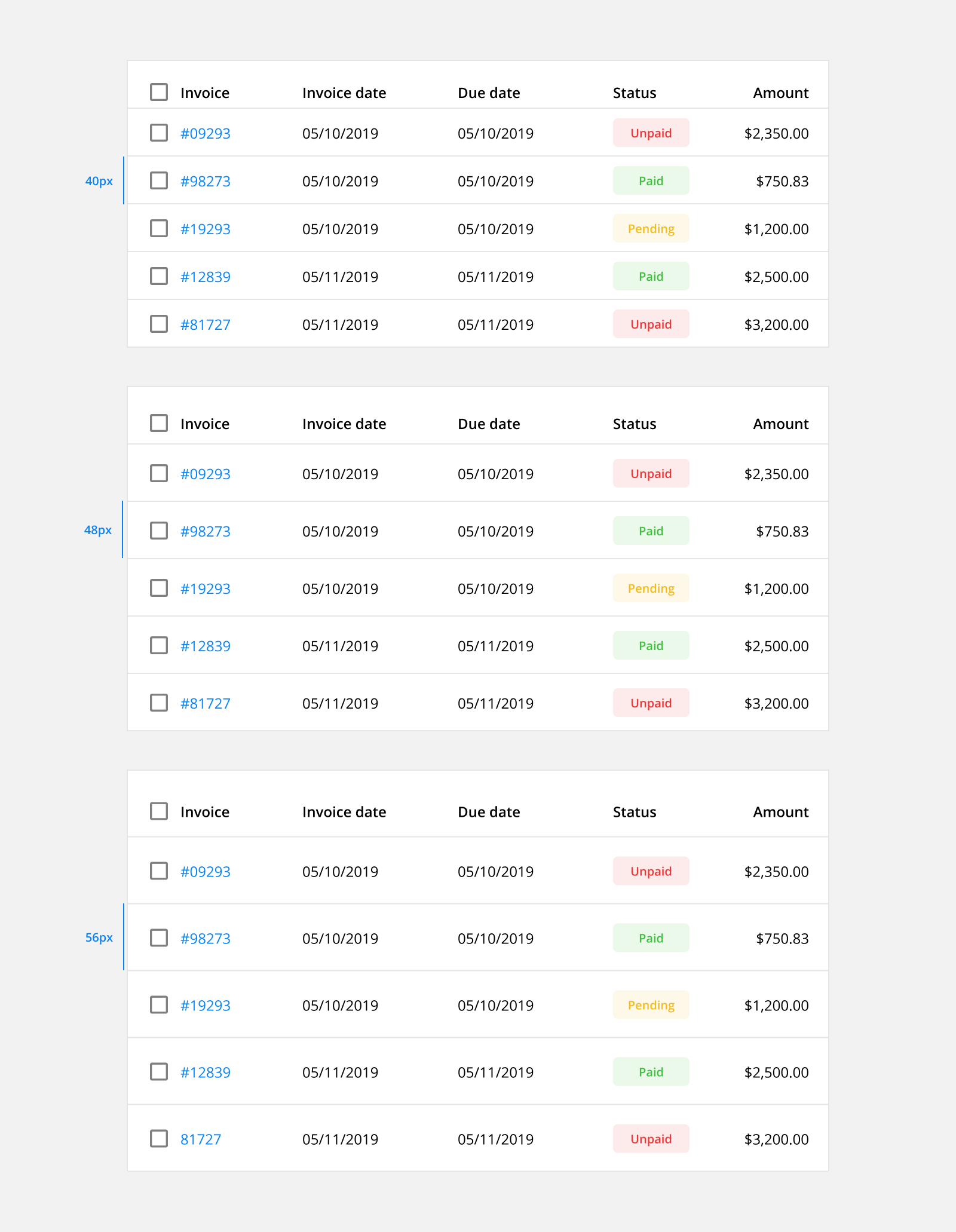
6. Choose an Appropriate Line Height
Choose a line height most appropriate for the type and amount of data in your table. Regular and relaxed row heights offer more white space, and are more comfortable for reading large data sets. Using a condensed row height will allow the user to view more data at once without having to scroll, but will reduce the table’s readability and potentially cause parsing errors.
Row heights
- Condensed: 40px
- Regular: 48px
- Relaxed: 56px
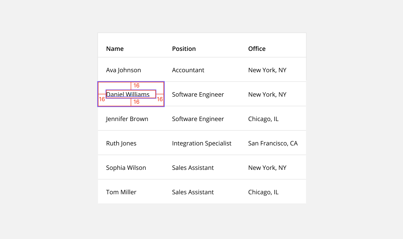
7. Include Enough Padding
Maintain a minimum of 16px padding on both the right and left of each column. This means the space between each column should total at least 32px.
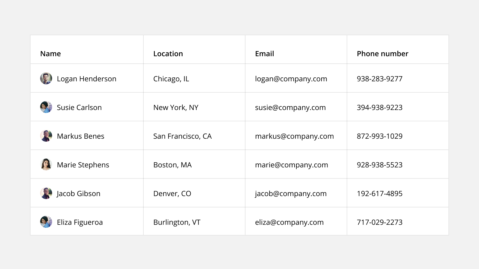
8. Use Subtext
Subtext can provide timely context and helpful details without taking up space or cluttering the table. It can also be used to combine columns.
For example, instead of having separate columns for user and email, the email can be added as subtext below the user’s name.
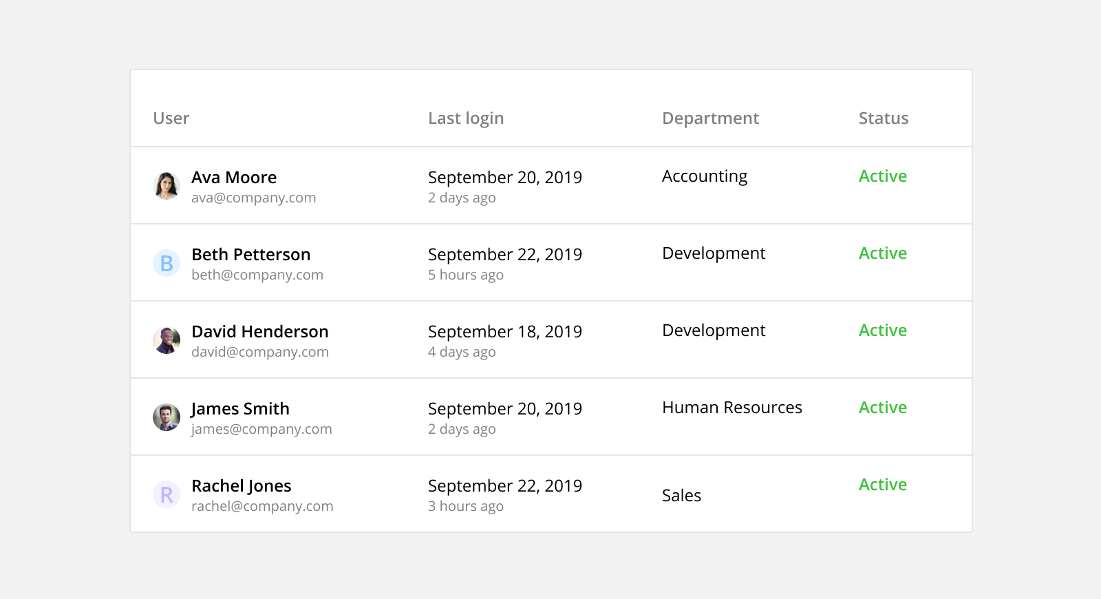
Table Functionality
Data tables should enable users to scan, understand, analyze, compare, and act upon the information within them.
1. Maintain Context When Scrolling
Anchor contextual information to help users understand what data they’re looking at while scrolling down or across a table. This functionally is important when designing tables with large data sets or on smaller screen sizes.
Fixed Header: Fix the header to the top of the table when a user starts to scroll vertically. This provides context by keeping the column labels in view at all times.
Fixed Column: Fix the first column (with identifying information) to the side of the table when a user starts to scroll horizontally. This provides context by keeping the row identifier in view at all times.
2. Prioritize Common Actions
Allow users to complete common actions quickly and without having to navigate to a new page. This will save users time and frustration from having to complete simple, repetitive tasks.
Hover Action: Present common actions when a user hovers over a row. This reduces visual clutter but may cause discoverability issues for new users.
Bulk Action: Allow users to select and update multiple items at a time. Once the rows are selected, common actions are made available at the top o the table. This feature can save users a lot of time by batching together repetitive tasks.
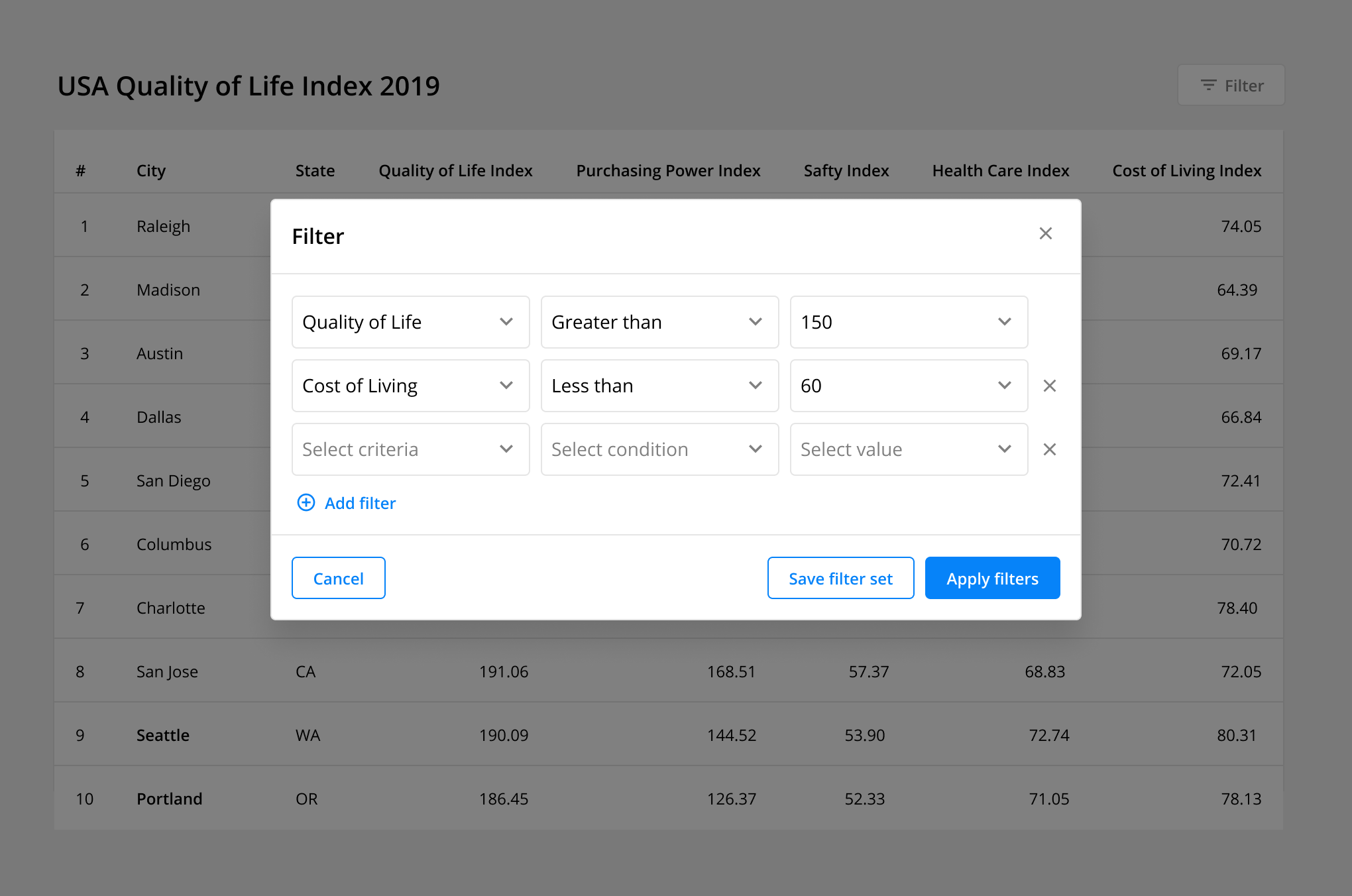
3. Manipulate Data With Filters
Enable users to manipulate data presented in the table. Filtering data helps users find what they’re looking for, gain different insights, and make comparisons.
Basic Filters: Allow users to apply preset parameters to the data set. This feature is very versatile and appropriate for most data tables.
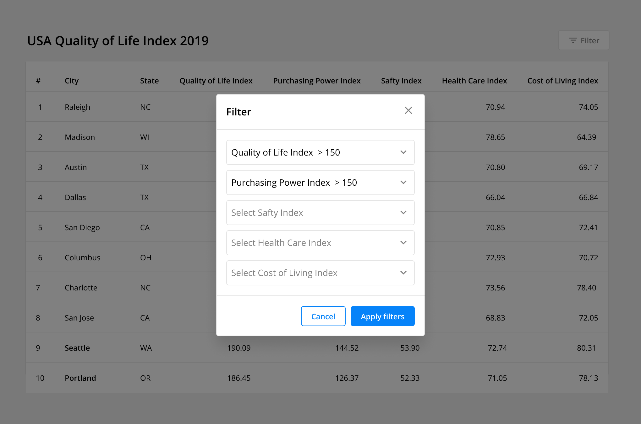
Complex Filters: Allow users to apply custom parameters to specific columns. This advanced functionality enables users to analyze and compare very specific results for complex numeric data tables. Additionally, this feature can include the ability to save a “filter set” to save users time and effort if repeated use is likely.
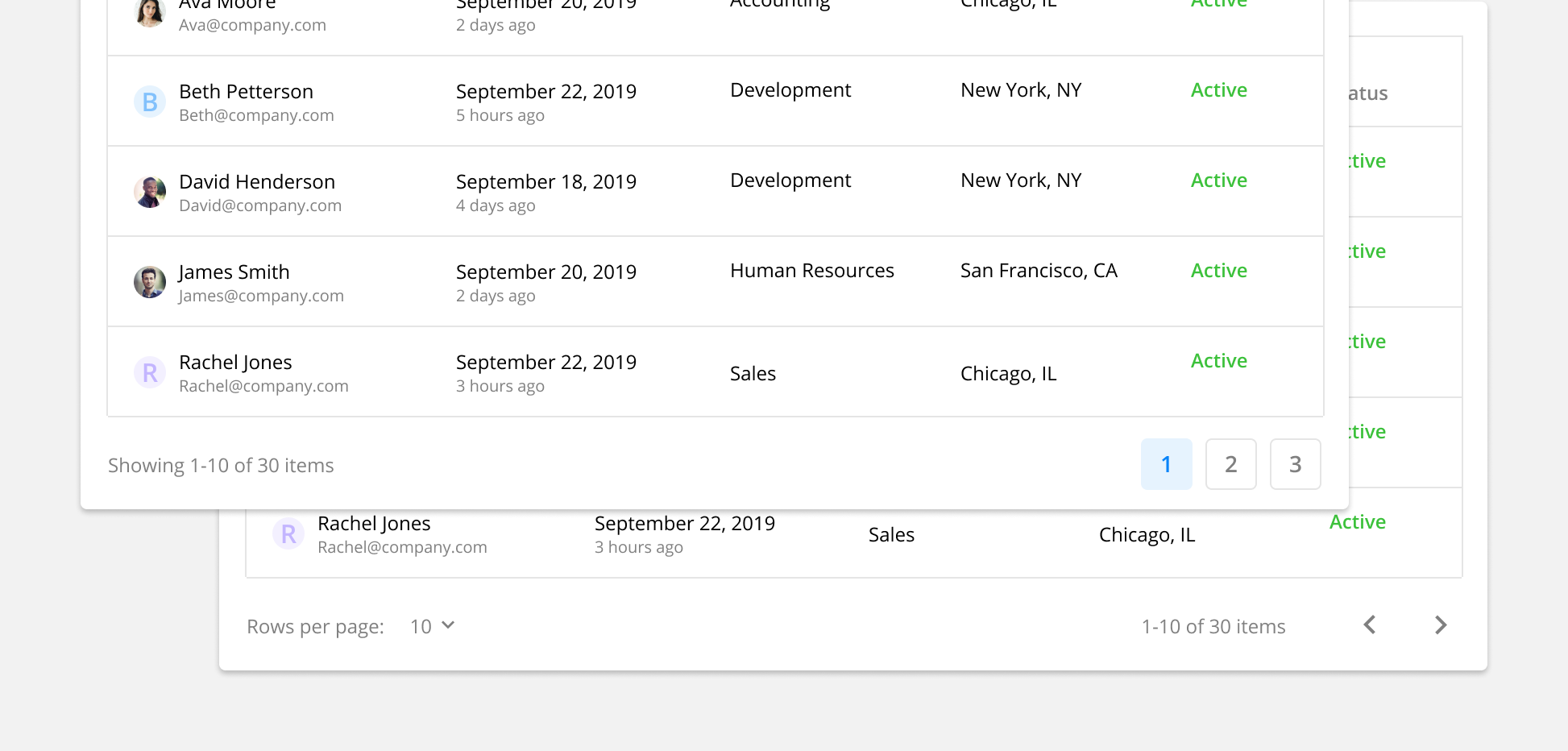
4. Include Pagination
Break long tables down into multiple pages with a set number of rows on each page. Users need to understand what page they’re currently on and have the ability to navigate to other pages. Additionally, users can have the ability to customize how many rows are included on each page.
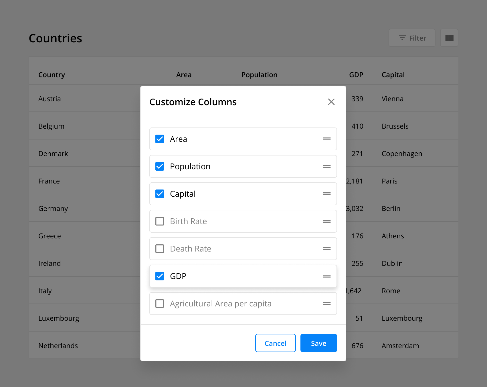
5. Make Column Data Customizable
Enable users to choose what data is included in their table. This functionality allows the user to add, remove, and reorder columns based on their use case. Additionally, this feature can include the ability to save column preferences if repeated use is likely.
6. Make Table Display Customizable
Enable users to customize the order and display of the available data. These customizations can serve different work flows, surface new insights, and aid users with impaired vision.
Sort Columns: Allow users to organize rows by a specific category. Any column can be ordered alphabetically or numerically by clicking the sort icon next to the column label.
Resizable Columns: Allow users to expand and contract the width of any column to expose eclipsed data in full.
Display Density: Allow users to toggle between row heights depending on their use case and visual accessibility.
Get a head start on designing data tables
Good data table design delivers outsized utility and value for users. Use the best practices you learned in this article to rethink your existing data table UX or apply them to your next app design project.
Get our Data Table Design System UI Kit below. It uses all the tips and tricks you learned in this article and example data tables to jumpstart your workflow. It’s 💯 free.
👉 Get the (free) Data Tables UI Kit
Want more design insights like this?
See our full catalog of articles covering Figma tips and Design System best practices.