
Ultimate Guide to Mastering Auto Layout in Figma

Figma's newest version of Auto Layout allows you to create highly responsive components with similar rules and behaviors used by developers. These powerful features allow you to add, remove, and resize layers without having to manually update the layout. In this article, I'll go over all the necessary basics and breakdown how six different example components can be built using Auto Layout.
👀 More of a hands on learner? Give our free Auto Layout Playground a try!
Auto Layout 101
Before we get started, let's go over the basics. There are many different Auto Layout and Resizing settings that can be used to achieve different goals. See each one in action to understand how they work.
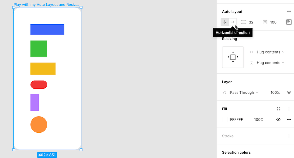
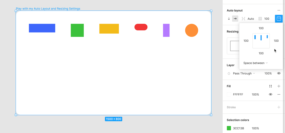
Direction: Use the two arrows to determine the direction (horizontal or vertical) your layout will flow when items are added, removed, or reordered. As of now, only one direction be can be used at a time. Think of all your items as being stacked horizontally, side-by-side, or vertically, one on top of another.
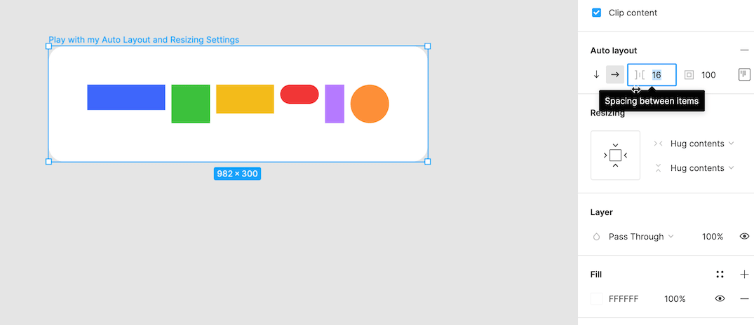
Spacing Between Items: Use the second input to adjust how much spacing is between each item. This spacing amount will be applied to the current items, as well as any future items that are added.
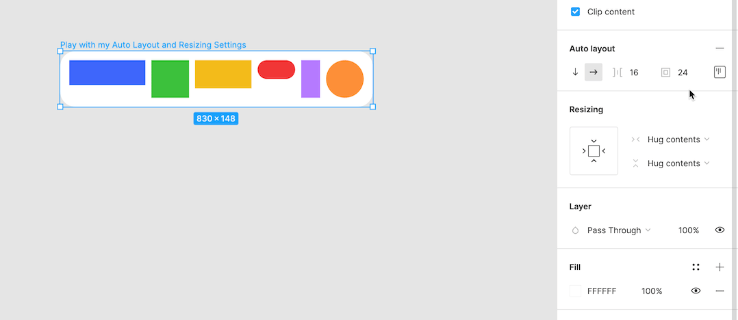
Padding Around Items: Use the third input to evenly adjust the padding between all your items and the boundaries of your parent frame. Or, click into the "alignment and padding" option and individually adjust the padding between the items and each boundary (top, bottom, left, right).
Alignment & Distribution: Choose the desired alignment (eg. top & left) inside the "alignment and padding" option. By default, the distribution will be set to "packed" and will maintain the set spacing between each item.
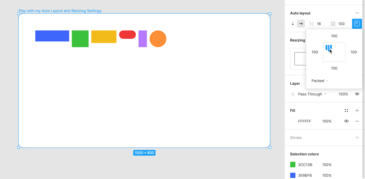
Change the distribution to "space between" to have items space themselves evenly across their horizontal or vertical direction. Doing this will update the spacing between items to "auto", allowing for the space to be dynamic and change as needed.
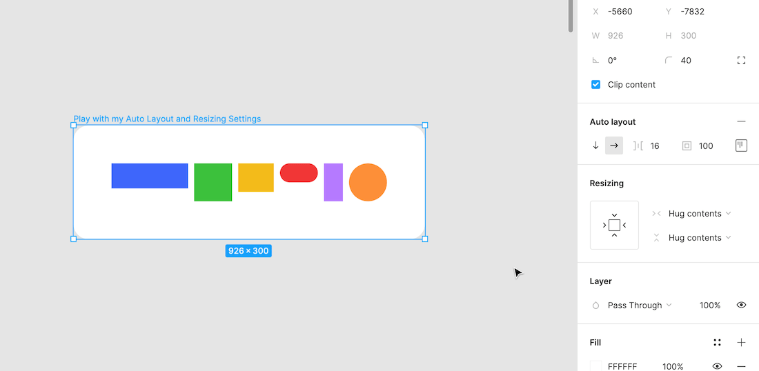
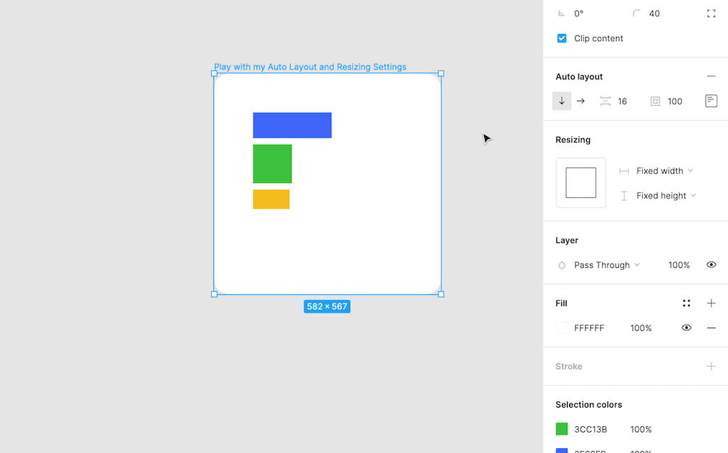
Resizing parent Auto Layout frames: Use the dropdown menus to change the resizing behavior for the width and height of the parent frame. Setting the behavior to "hug contents" means the parent frame size is dynamic and will adapt to perfectly fit all of its contents (aka its children) with zero extra space.
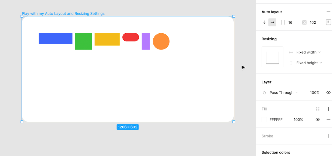
Setting the behavior to "fixed width/height" means the parent frame will maintain its dimensions despite the size of its contents. When the resizing behavior is set to "fixed width/height" it is possible to have extra space, or not enough space, for the contents.
Resizing child Auto Layout objects: Use the dropdown menus to change the resizing behavior for the width and height of each object. Setting the behavior to "fill container" means the object size is dynamic and will stretch itself to either end of the parent frame. This is useful for objects like text boxes and images. They will change their size to fill the available space.
Setting the behavior to "fixed width/height" means the object will maintain its dimensions despite the size of its parent frame. This is useful for objects like icons and buttons. They will maintain their same size despite the available space.
Now that we understand the basics, lets put them together walkthrough some examples..
Auto Layout Buttons
The button is probably the easiest and most valuable use case for Auto Layout. Auto Layout allows for buttons to have dynamic text, icon usage and resizing behaviors without having to make any manual adjustments. Buttons can either hug their contents and have dynamic sizing, or they can have a fixed width and maintain their original size.
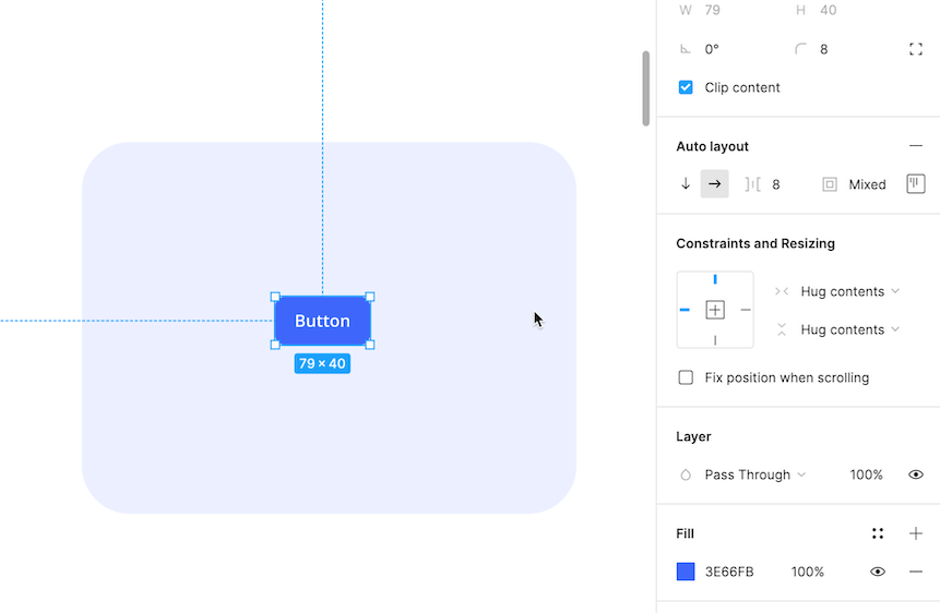
Example 1: Simple Button
How does the button grow wider as text is added?
- The parent frame resizing behavior for the width is set to "hug contents" so it will expand to adapt to the different amounts of text.
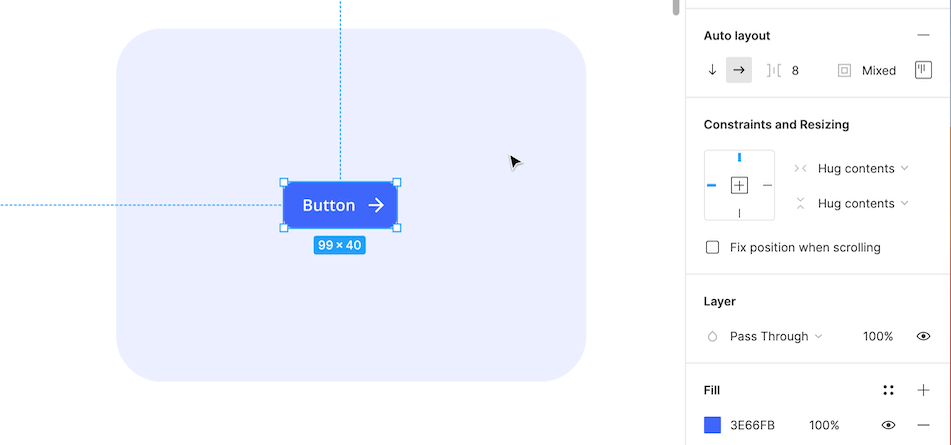
Example 2: Icon Button
How does the button look so nicely spaced?
- The spacing between items has been set to 8px, so the text and icon will stay the same distance from each other no matter how much text is added.
- The parent frame uses different amounts of padding for different boundary walls (Left: 16, Top:10, Right: 8, Bottom:10). Being able to set the left padding to 16px and the right padding to 8px creates a more balanced look when using an icon.
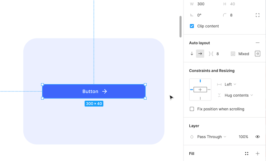
Example 3: Fixed button
How does the button stay the same size when text is added?
- The parent frame resizing behavior for the width is set to "fixed" so it will maintain its size despite changes to the text.
Auto Layout Cards
Cards are another great use case for Auto Layout. Auto Layout allows cards to have responsive sizing for different devices and varying amounts of content. They can be simple with only a few objects inside, or more complex with multiple nested auto layout frames inside.
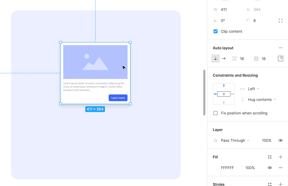
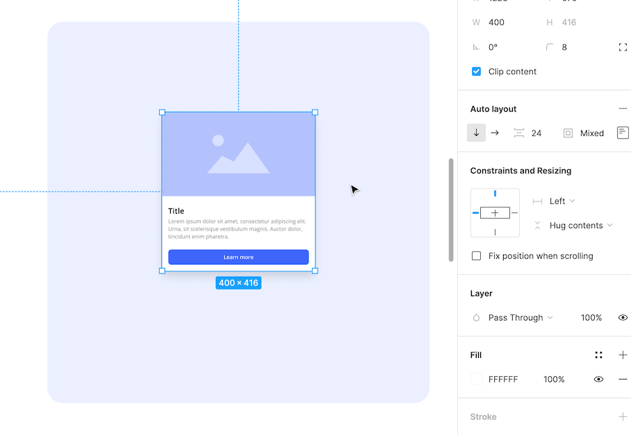
Example 1: Simple Card
How does the card grow longer when more text is added?
- The parent frame direction is set to "vertical" so the card will grow longer, rather than wider.
- The parent frame resizing behavior for the height is set to "hug contents" so it will expand when content is added/removed/resized.
- The text box resizing behavior for the height is set to "hug contents" so it will expand when content is added/removed/resized.
How do the image and text box stretch when the parent frame size changes?
- The image and text box both use the resizing behavior "fill container" for their widths, so they can be dynamic and fill the amount the space given.
How does the button stay pinned to the corner?
- The parent frame alignment is set to the right.
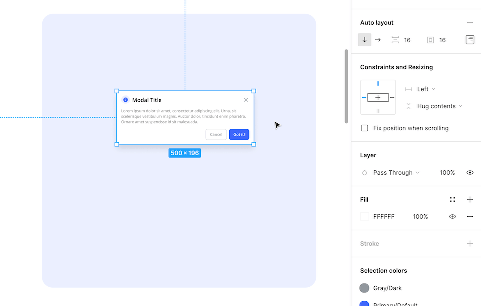
Example 2: Card with Nested Auto Layout Frames
How is there padding on the bottom half of the card but not the top half?
- The parent frame padding is set to 0px everywhere, except for the bottom which is set to 16px.
- The text layers are inside of a nested auto layout frame with left and right padding set to 16px.
- The button is inside a nested auto layout frame with left and right padding set to 16px.
How is the button able to resize with the card?
- The resizing behavior for the width of the button, and its nested frame, is set to "fill container".
- The button's alignment is set to "center & center"
Example 3: Card with Double Nested Auto Layout Frames
How are items pinned to each corner in the header?
- The header items are inside of a nested auto layout frame with its resizing behavior for the width set to "fill container", so it will fill the amount the space given.
- The header distribution is set to "space between", pushing its contents (aka its children) to either end of the frame.
- The icon badge and title are inside of a nested auto layout frame, keeping them grouped together.
Learn by doing
Reading about Auto Layout is great, but hands on learning is better! Master Auto Layout by completing the 6 step-by-step Auto Layout exercises in the (free) UI Prep Auto Layout Playground.
Learn how to create a simple button, icon button, fixed button, simple card, intermediate card (with nested auto layout frames), and an advanced card (with double nested auto layout frames).
👉 Get the (free) Auto Layout Playground here
Want more design insights like this?
See our full catalog of articles covering Figma tips and Design System best practices.