
Mastering Constraints & Auto Layout
Constraints and Auto Layout are powerful tools in Figma that allow you to automate different sizing behaviors. While they have a shared goal, less manual resizing, they function in opposite ways. Constraints allow you to control how objects respond to changing frames, while auto layout allows you to control how frames respond to changing objects. In this article, I'll explain how they work and when to use each.
👉 Practice with, and use, all the examples you see in this article by downloading the UI Prep Design System.
Auto Layout
Auto Layout should be used with components that change size based on their content rather than their environment. This is a game changer for any components that needs to change size when objects inside them are edited, added, or removed (e.g. text or icons). This automation will save you time and result in more consistent designs.
Auto layout works by stacking objects next to each other (horizontally or vertically) inside a frame and setting the padding and spacing to fixed amounts. The frame's height or width will then change to accommodate the objects while maintaining the same internal padding and spacing.

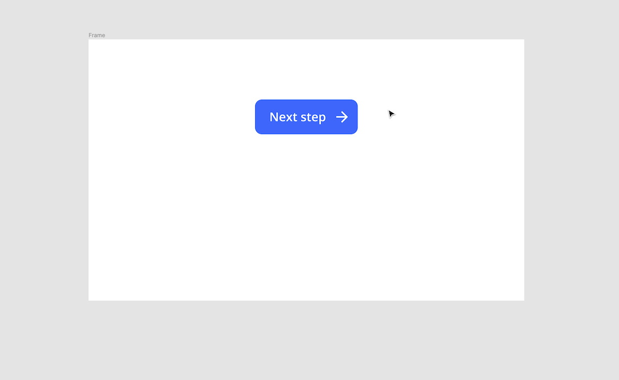
Buttons
Use a horizontal auto layout to allow the width of the button change based on the content inside. For example, a button with multiple words and an icon will be wider than a button with just one word.
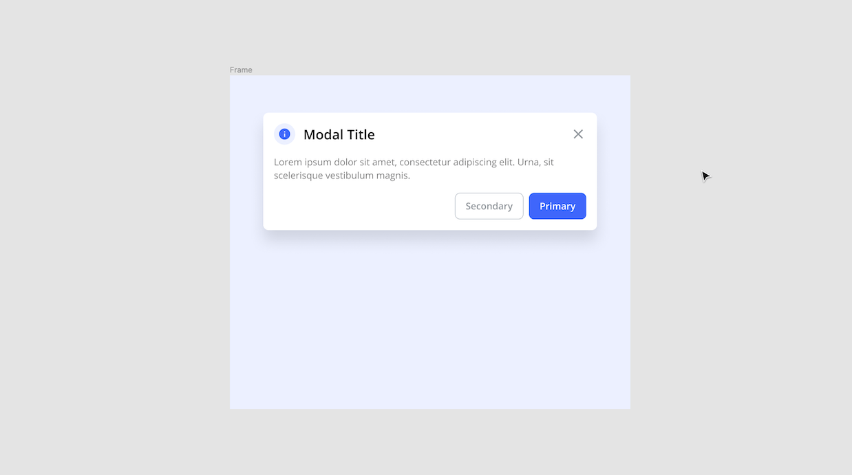
Modals
Use a vertical auto layout to allow the height of the modal change based on the length of its message. For example, a modal with two lines of text will be shorter than a modal with eight lines of text.
Tabs
Use horizontal auto layout settings to control the width of both the individual tabs and the series of tabs. Each tab should have the same internal padding (similar to a button) and the spacing between those tabs should be consistent as well. For example, a tab with a long title should be wider than a tab with a short title. Additionally, a series of five tabs should be wider than a series of three tabs.

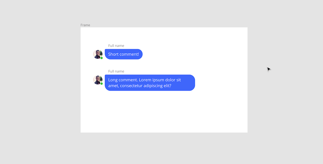
Chat bubble
Use a horizontal auto layout to allow the width of your chat bubble expand until it reaches a max width. Once the max width is met, a second component should be created using a vertical auto layout that allows the chat bubble to grow taller to accommodate multiple lines of text.
Constraints
Constraints should be used for components that change size based on their environment rather than their content. This is especially helpful for when components need to be resized for different use cases or devices. Constraints are an essential feature when designing responsive websites and products.
Constraints work by telling Figma how objects should respond when their frames are resized. Every object is pinned to one or multiple directions (left, right, top, bottom, center, ect.) or set to "scale", meaning it will stretch out in proportion with the frame size.
Inputs
Input fields should have flexible widths so they can adapt to the size of their container (e.g. form card), or be customized based on the length of the expected answer. For example, an input field for a credit card number should be wider than an input field for the CVV number.
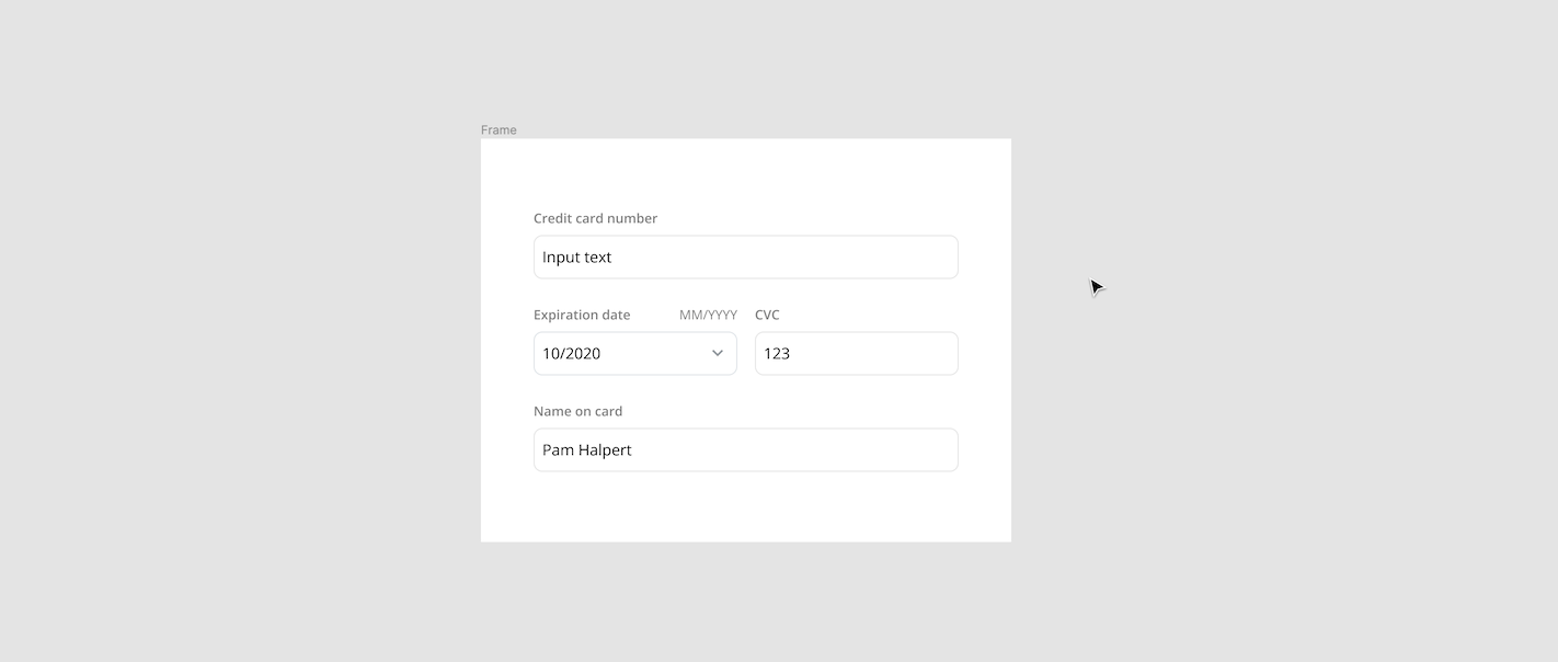
Pro tip: Use layout grids with constraints to maintain gutter spacing between objects (e.g. input fields).
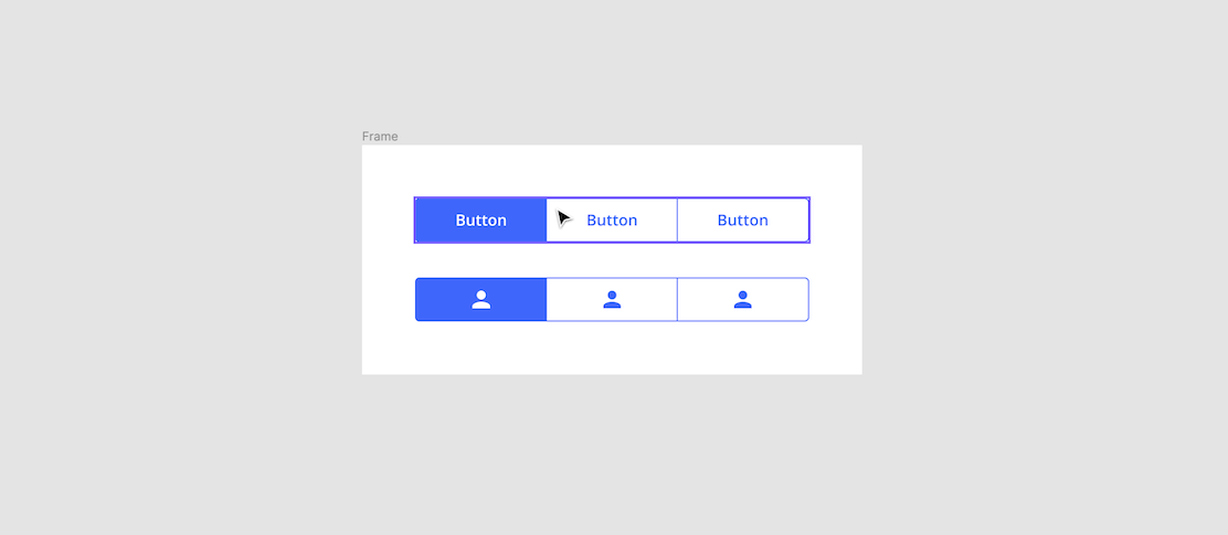
Button Group
A button group, and each of its individual buttons, should have a fixed width depending on the size of its container (e.g. card or panel). If the size of the individual buttons changed based on their text length, the button group would appear uneven and no longer fit perfectly in its container.
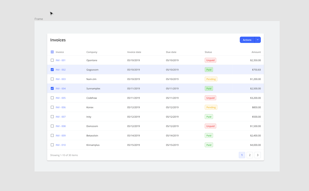
Tables
Table columns and their cells should have flexible widths so they can fill the size of their container (e.g. card) without leaving any empty space. They should also expand and contract when the entire table is resized to fit a different device.
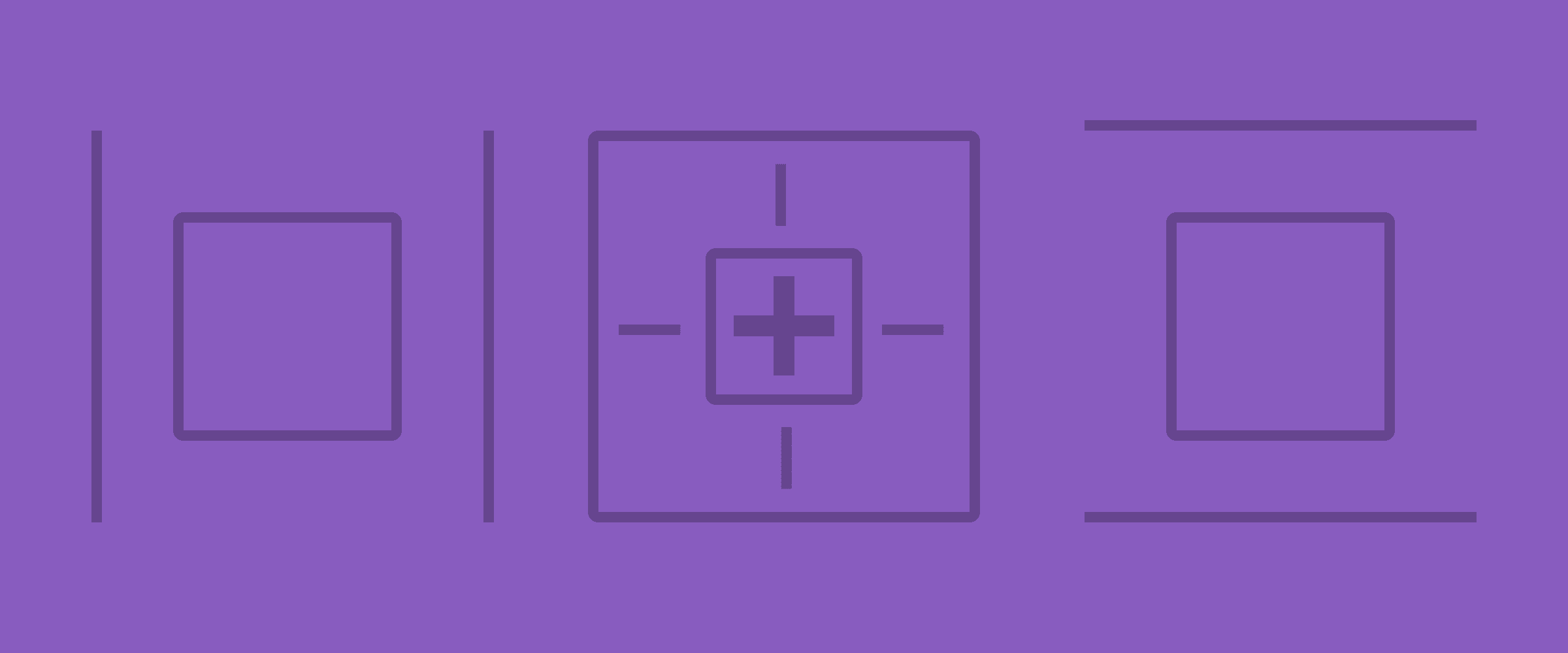
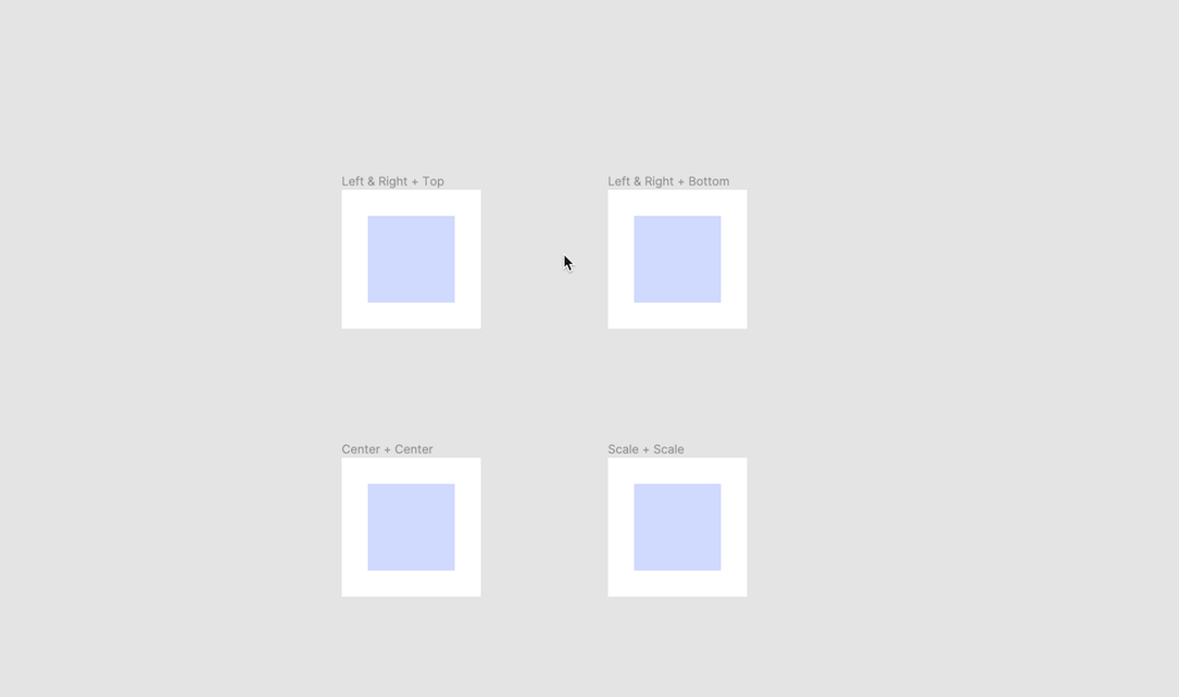
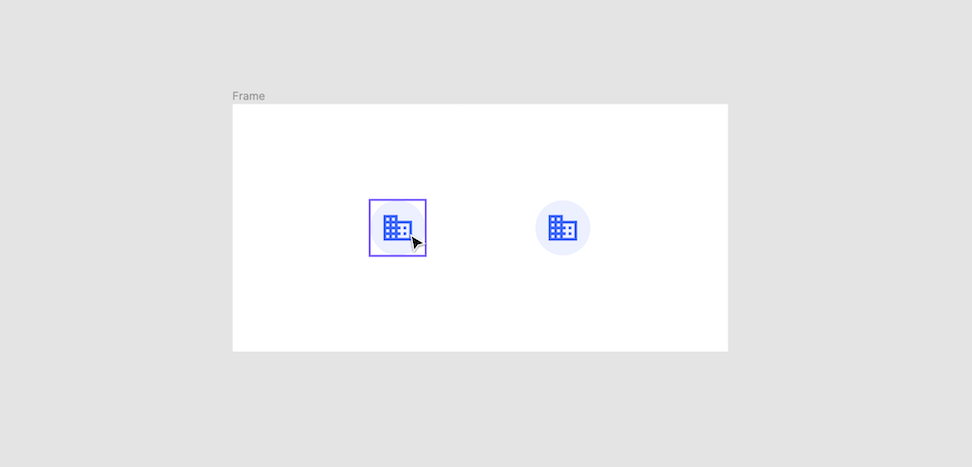
Avatar
Avatars can either have their icons "scale" with the frame so they alway appear centered and proportional. Or they can pin their icon to the "center" of the frame so they stay in the middle but maintain their original size.
See for yourself
Learn from, experiment with, and used all of the components used in this article by downloading the UI Prep Design System. We obsess over every detail, trying to find the most efficient and practical way to build each component, so you don't have to.
🧠 Learn More about UI Prep Design System

Want more design insights like this?
See our full catalog of articles covering Figma tips and Design System best practices.