
UI Prep Quick Start Guide

Thank you for purchasing the UI Prep design system! We've prepared this guide to help you get started as quickly as possible. You'll learn how to download/import the Figma file, customize text & color styes, use instances, and edit master components.
Getting set up
Getting setup with UI Prep is quick and easy. All you need is a free or paid Figma account. Once you purchase the design system, download one or both of the files and import them into your Figma account. The files can be downloaded as many times as you need and used for unlimited projects!
How to download the file(s)
At the end of the checkout flow, select "view content", then download one or both design files. The design files, and all future updates, can also be downloaded from your Gumroad Library at any time. You can do this by navigating to your Gumroad Library, selecting the "UI Prep Design System UI Kit" product card, and then downloading the design files.
How to Import the file into Figma
Once you've downloaded the file, drag and drop it into your Figma Project page, Draft page, or Recents page. This can be done using the browser or desktop app. If you run into any issues, use this Figma Help page.
Take a look around
Take a look around at all the pages in your new design system! The Welcome page has some tutorials and playgrounds to help you get started. All other pages have a "tips" section explaining additional information.
Tip: Keep one "master" version of the UI Prep design system in your Figma account and create a duplicate every time you start a new project.
Get familiar with Figma
If you're new to Figma or want to level up your design skills, take a look at the resources below.
- The UI Prep Syllabus on Learning Figma
- 10 Tips & Tricks to Design Faster in Figma
- Ultimate Guide to Mastering Auto Layout in Figma
- Figma Variants 101
Publish as Team Library
If you purchased a Team license, you can publish the design system as a Team Library to access the styles and components from multiple files. Learn how to use and manage Figma libraries here.
Customize branding
Every text and color used in the design system is an applied style. This makes it possible to customize the design system to match your branding in just a few minutes. By using styles, scaling designs and maintaining consistency is very easy.
Customize color
UI Prep uses light and dark overlays in each of the color style variants to auto-generate a well balanced color range. This means you only need one base hex code to edit all variants of a single color. For example, to edit the primary color, add the new base hex code into each of the 7 variants. Watch the video below and follow along with the mini playground inside the design system.
- Deselect all layers by clicking anywhere in the page background
- Expand the Primary color category in the Styles Panel
- Click the Edit icon next to each color style and replace the default hex code
Tip: Keep the light and dark overlay percentages consistent across your color ranges.
Customize text
UI Prep bases it's text sizing and weight on the Material Design Type System for a well balanced hierarchy. Each of the line heights are also rounded to the nearest 4px to best align with the base unit (8px). Adding and updating the text styles is easy. For example, to update the font family across all your designs, click into each text style and select the desired font family from the dropdown. Watch the video below and follow along with the mini playground inside the design system.
- Deselect all layers by clicking anywhere in the page background
- Click the Edit icon next to each text style in the Style Panel
- Enter the name of your desired font family
Tip: Use the Figma Font Installer to use a local font in your designs.
Using instances
Start designing by adding instances of the master components to your designs. Instances can be added by dragging and dropping them from the Assets Panel. They can also be overridden based on the context of your design. For example, you can override the variant values, nested variants, icons, text, styles (eg. text, color, effects), and size. Watch the video below and follow along with the mini playground inside the design system.
Updating & adding master components
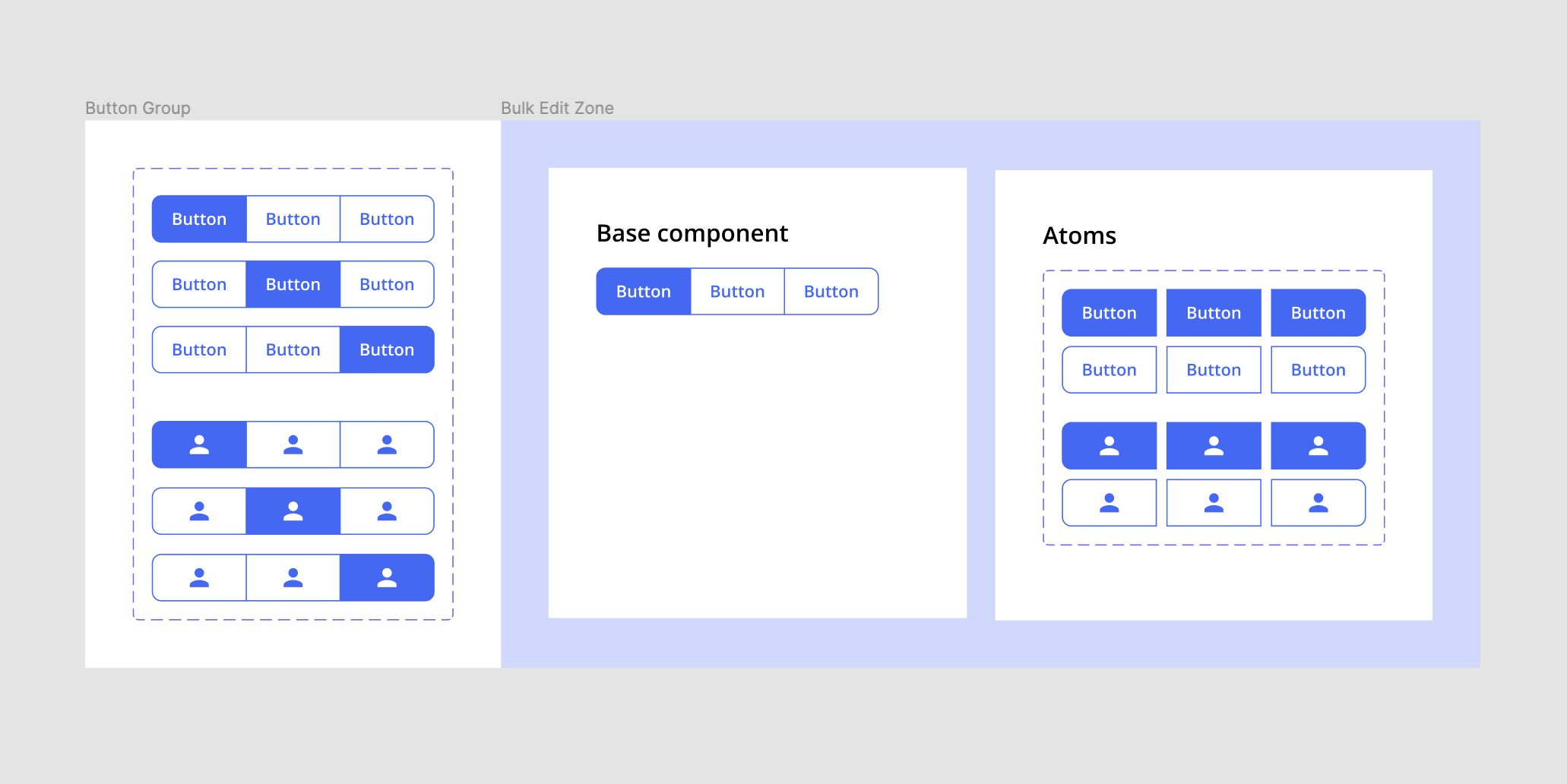
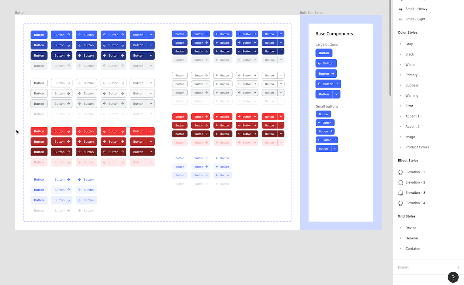
All master components can be found on the "Master Components" page. Here you can add, update, or remove master components as needed. Most components have been combined as variants and use a "Bulk Edit Zone" to organize their atoms and base components.
Tip: Keep all Master components on this page so they can be easily found. This will also keep the Assets Panel organized.
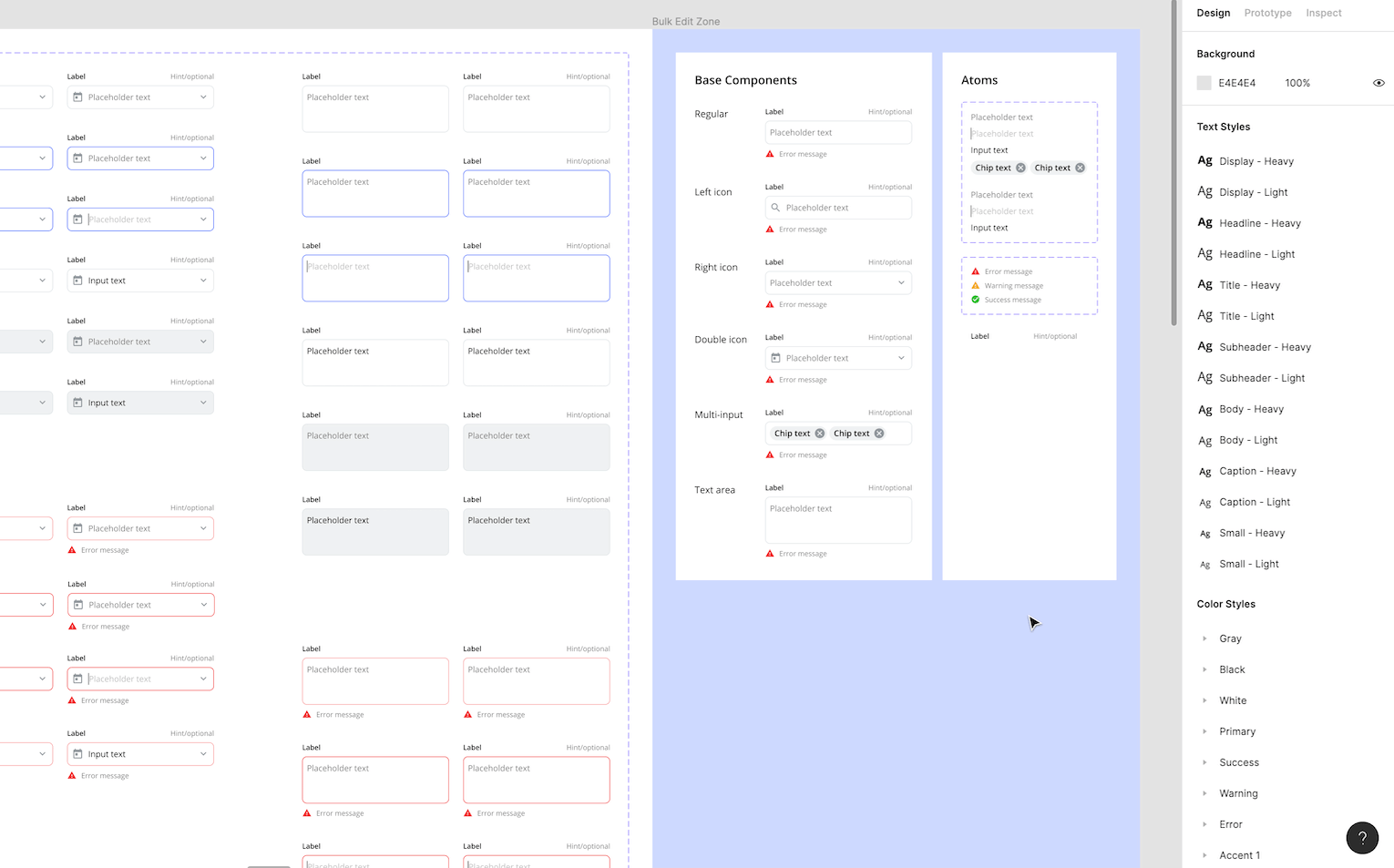
Bulk edit zone
The "Bulk Edit Zone" is unique to UI Prep. It's a space that houses all atoms and base components used to build a particular component. Making changes in the bulk edit zone will impact some or all of its components.
Atoms: Atoms are master components used as building blocks in other, more complex, components. Atomic elements help you build, customize, and maintain components.
Base components: Base components are a way of managing component states and variations efficiently. They work by taking an instance of a component, overriding its properties to create a new state, and then turning the altered instance into a master component of its own. Edit the base component to update the structure and behavior of your variants.
Variants
Components with multiple types, states, sizes ect., have been combined as variants for easer use and maintainability. You can learn more about what variants are and how to use them here.
Editing variants in bulk: To edit variants in bulk, go to that component's Bulk Edit Zone and make changes to the appropriate Atom or Base Component(s). For example, to update the label color for every input, simply edit the "label" Atom.
- Select the Atom "Label"
- Update the text color to "Black/Light"
Or, to update the input stroke thickness, select each Base Component input and edit the stroke.
- Select each input (hold Shift + Command and click each input)
- Update the stroke thickness to 2px

Overriding variants: To update component states and types, select the appropriate variant(s) and apply overrides. For example, to update a button color, select all buttons and override their colors.
- Select a set of buttons (hold Shift + Command while dragging mouse over buttons)
- Update all colors in the "Selected Colors" area
- Update variant value name(s) if needed
Adding variants: More variants can be added by duplicating existing variants or by dragging and dropping master components into the variant bounds. For example, to add a new badge color, duplicate an existing set, update the color, and change the variant name.
- Select a set of badges (hold Shift + Command while dragging mouse over badges)
- Duplicate the badges (press Command + D)
- Override colors for new badges
- Update color value name

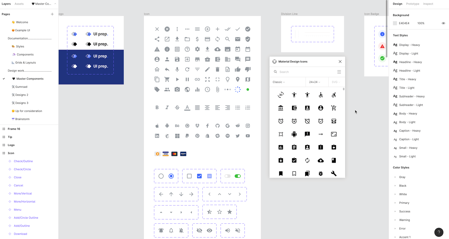
Adding icons
All icons in the UI Prep Design System are from the Material Design library. To add more icons, use an icon plugin or drag and drop icons you've downloaded (svg). For example, use the Material Design Icons plugin to add icons, then turn them into master components.
- Add icon from Material Design Icon plugin
- Remove background vector
- Update color to default icon color
- Turn icon into master component
UI Prep design system
Now that you know the basics, it's time to start designing! If you have any questions, issues, or comments, email me at molly@uiprep.com or DM me on Twitter.
Want more design insights like this?
See our full catalog of articles covering Figma tips and Design System best practices.