
Why you should use Frames, not Groups, in Figma
At first glance, groups and frames seem very similar. They're both a way to organize your file by nesting layers (children) under one top layer (parent). This makes it easy to keep multiple layers together, select them all at once, or move them around your designs. In this article, I'm going to walk through all the ways they're different, and explain why you should only use Frames.
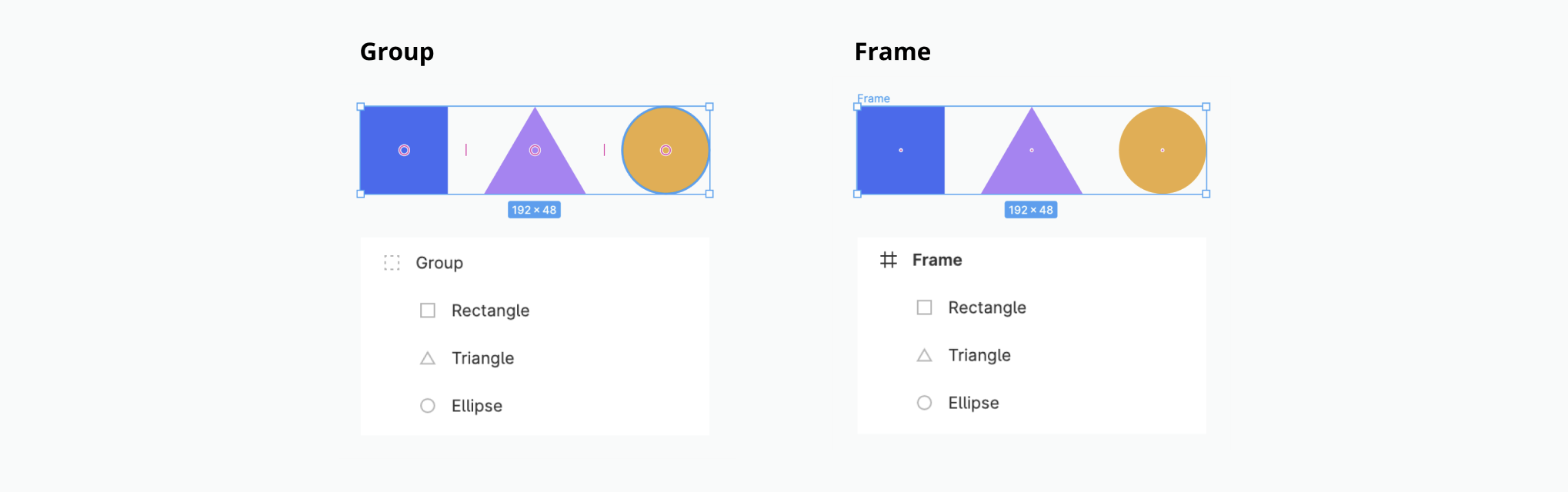
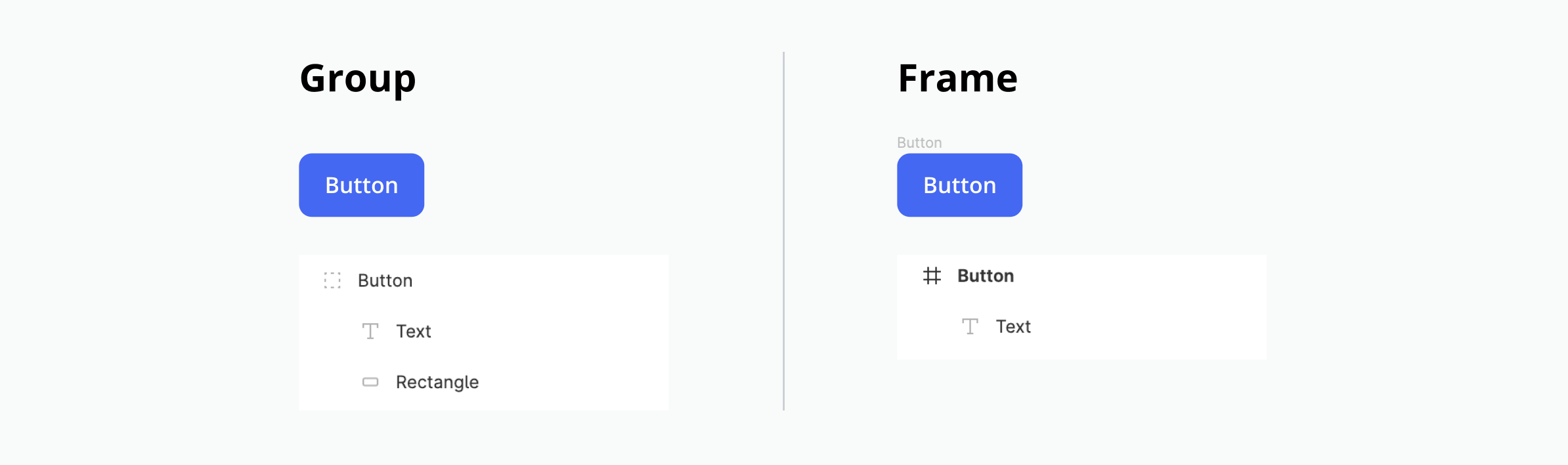
Groups vs Frames
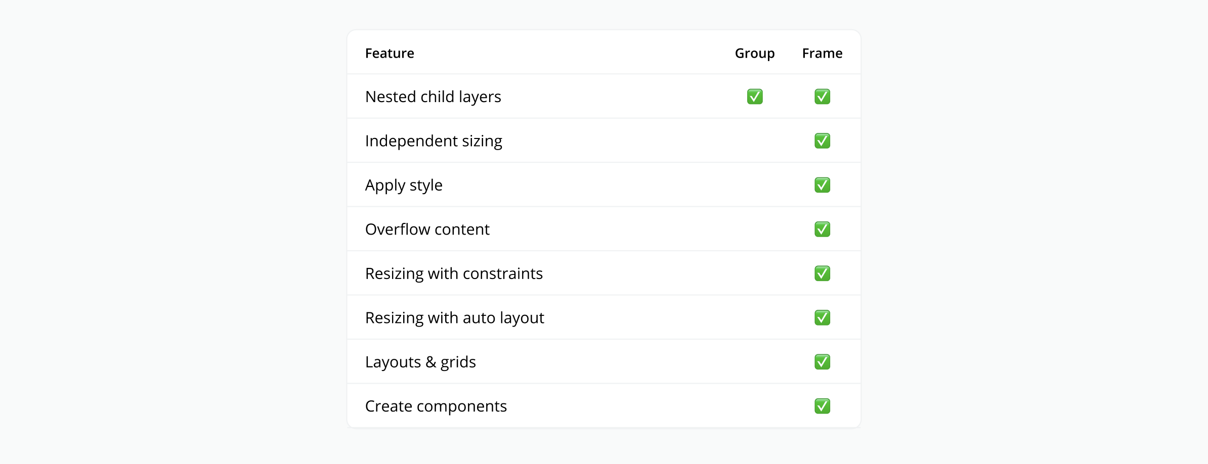
Frames have many special powers that groups do not have. Frames are more than just a collection of nested layers. They are objects themselves that are capable of housing nested layers (like a group), being sized and styled (like a rectangle), using grids & layouts (like an "artboard"), and being resized (with constraints and auto layout). As you can see in the table below, frames are way more powerful 💪.
So why do groups even exist? As far as I can tell, they only exist because designers are used to having them in other design tools, and Figma is easing their transition by including them. By the end of this article, you'll understand the full potential of frames and never want to use a group (or rectangle) again.
Frame super powers
Designing with frames is the key to unlocking Figma's most powerful features. By using them, you'll be able to create deigns that are well organized, beautifully styled, easy to use, scrollable, and resizable. This section walks through examples of what's possible with Frames.
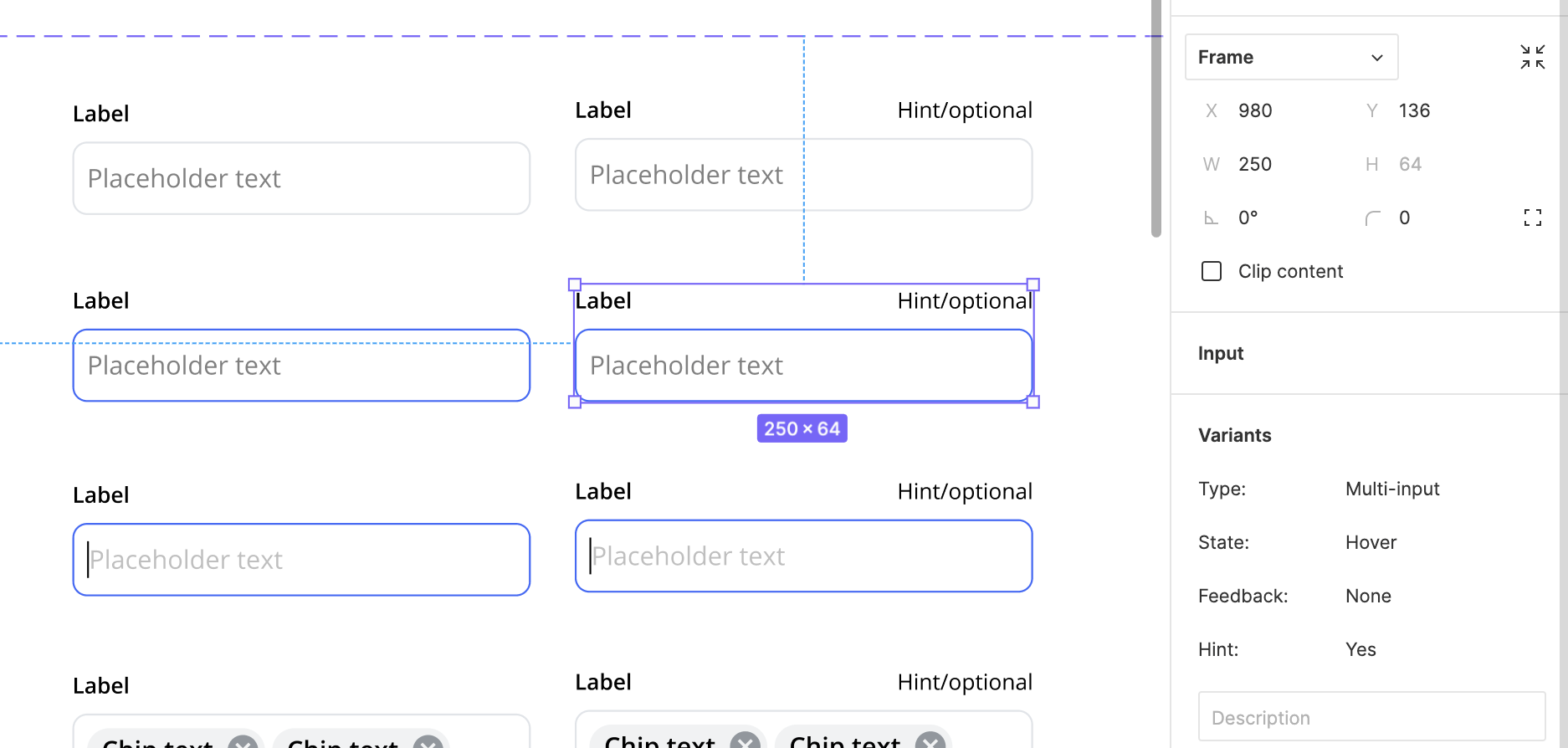
1) Independent sizing
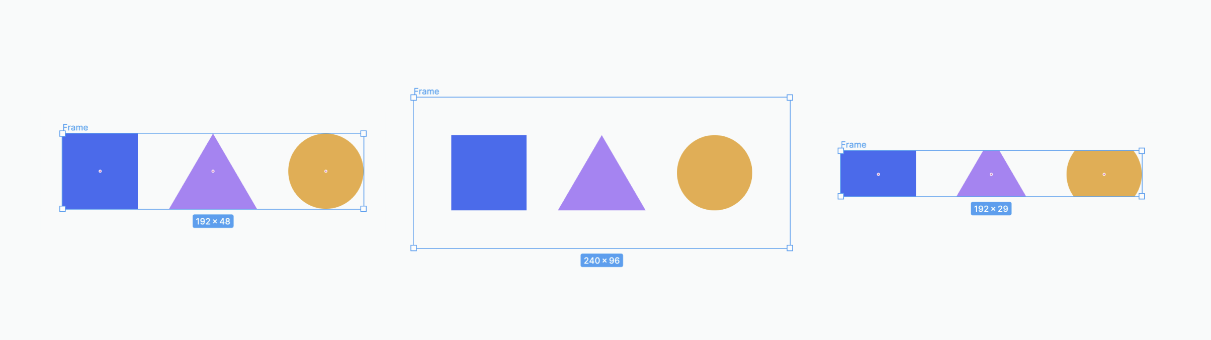
The size of a frame is independent from its children (nested layers). Moving or resizing the children will not change the size of the parent frame. This means the parent frame can be the exact same size, larger, or smaller than its children. Making it possible to do a lot of things, like add internal padding, create a "mask" effect, or enable scroll interaction in a prototype (examples of these below). Unlike Groups, where the group has to be the exact same size as its children.
Tip: Resize a frame to perfectly fit its contents by selecting the frame and clicking the "Resize to Fit" icon in the top right corner of the design panel.
2) Apply styles
Similar to rectangles, frames are objects that can be styled. They can have a fill, stroke, or shadow applied to them. They can also have their corners rounded. This level of flexibility means frames can be used as the base to design (almost) anything. For example, a button can be made with just a styled frame (blue with rounded corners) and a single text layer. Unlike groups, where a second layer would need to be added for the background (making auto layout impossible).
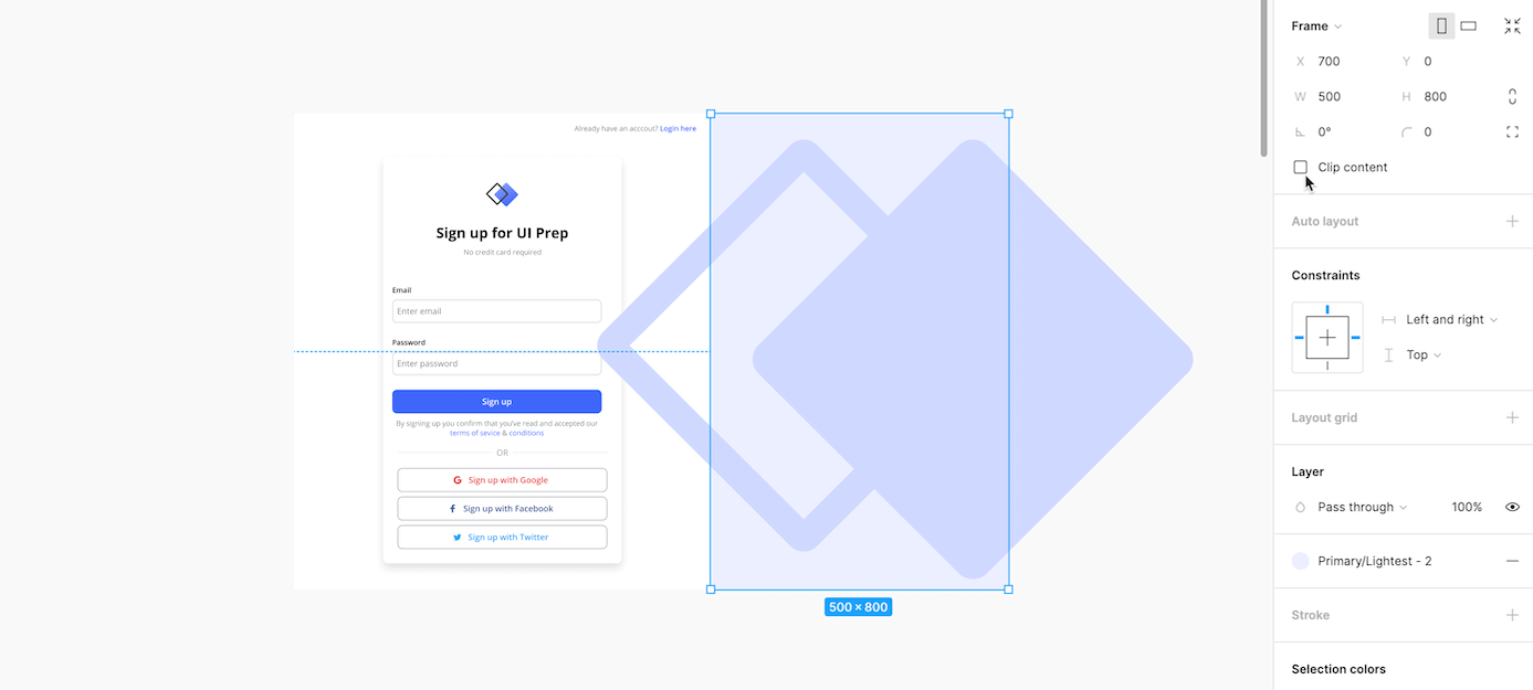
3) Overflow content
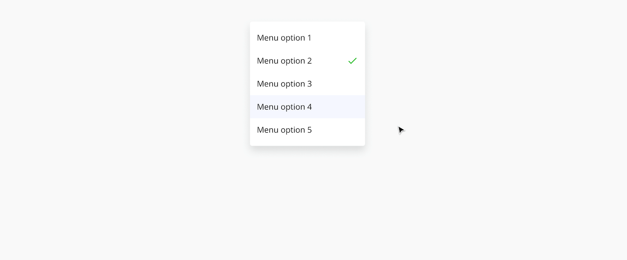
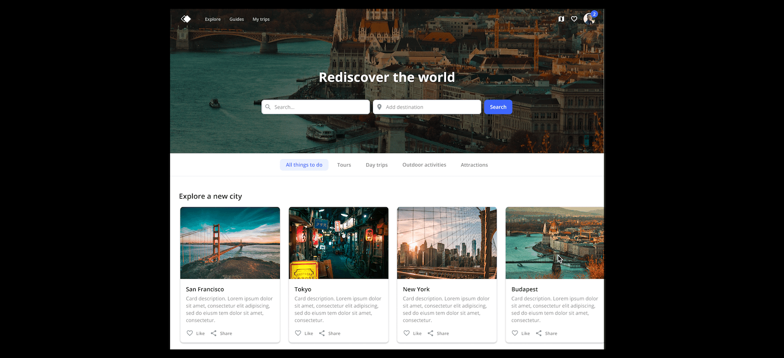
A frame can have it's children (nested layers) "overflow" past it's bounds. Those out-of-bounds children can remain visible or be hidden with the use of "Clip Contents". This allows frames to achieve a number of different effects, as you can see below.
A. Create a mask effect with "Clip Contents" ON. For example, showing part of an object "bleeding" out of frame as a background.
B. Create a hide/reveal effect while designing with "Clip Contents" ON. For example, showing more or less items in a dropdown menu.
C. Create a scroll effect while prototyping with "Clip Contents" ON. For example, scrolling horizontally to interact with a carousel.
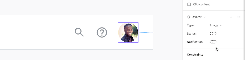
D. Create a floating effect to add content without impacting the frames size/spacing with "Clip Contents" OFF. For example, showing a status or notification badge on an avatar.
4) Resizing with constraints
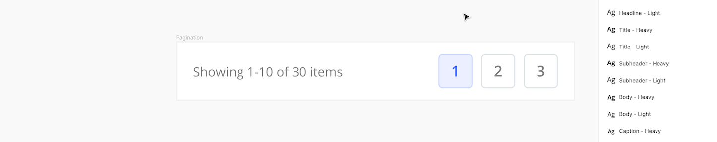
Resizing constraints can be applied to a frame's children (nested layers). They are used to "constrain" or "pin" the children to the top/bottom/center/left/right of the frame, or to scale, as it changes size. For example, some children in a pagination component can be constrained to the right, while others are constrained to the left.
5) Resizing with auto Layout
Frames can have auto layout applied to them to create a wide range of (automatic) resizing behaviors. Auto layout determines the direction a frame will grow, spacing between children (nested layers), internal padding, and how each individual child will respond to changes. This is a very powerful feature that can be used in a number of different ways. Learn more about auto layout and how to use it here. Below are a few examples.
A. Create a component where the width will expand/contract with different amounts of content. For example, a button with dynamic text.

B. Create a component where the height will expand/contract with different amounts of content. For example, a card with dynamic text.

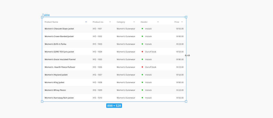
C. Create a component where the content will expand/contract to fit different frame sizes. For example, a table that can adjust for different devices.
Tip: Place multiple layers into an auto layout frame by selecting all of them and pressing "Shift" + "A".
6) Layouts & Grids
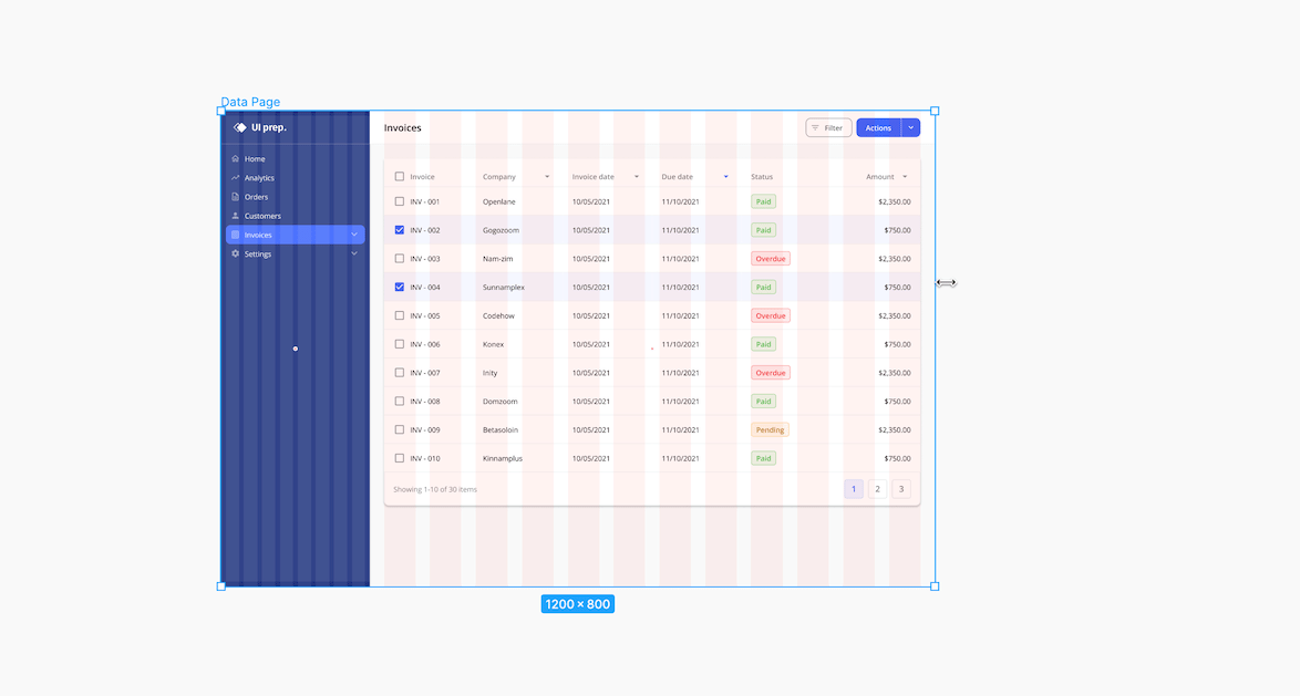
Every frame from a large device "artboard", to a UI region, or small component can have grids & layouts applied to them. These different frames can even be nested within another parent frame. This is handy for maintaining consistent spacing across different container sizes, and configuring resizing behavior when used with constraints. For example, a desktop frame can have one layout for it's nested page frame, and a separate layout for it's nested side nav frame. Each with their own resizing behavior.
7) Create components
In order to create a component, all component layers must be housed in a single frame. Although, if these elements are housed in a group, Figma will automatically turn the group into a frame when you click "create component".
Frame challenge
Now that you know how powerful frames are, challenge yourself to only use frames, and not groups, in your next design project. You'll see that once you're in the habit of using them, there's no reason to turn back.
Tips on how to quickly create frames in Figma
- Draw a new frame: Press "F" and drag your mouse over an empty area, or over existing layers to nest them inside your new frame.
- Place selected layers on a frame: Select one, or multiple, layers and press "Command" + "Option" + "G" to place layer(s) in a new frame.
- Turn a group into a frame: Select the group, navigate to the dropdown at the top of the design panel and change "group" to "frame".
Learn by doing
Reading about all the features you can use with frames is great, but hands-on-learning is better! Master each of these features by downloading the UI Prep design system and practicing with all the components and UI examples. You can then take what you've learned to your existing design files, or start a new project right in the design system.
🧠 Learn More about UI Prep Design System

Want more design insights like this?
See our full catalog of articles covering Figma tips and Design System best practices.